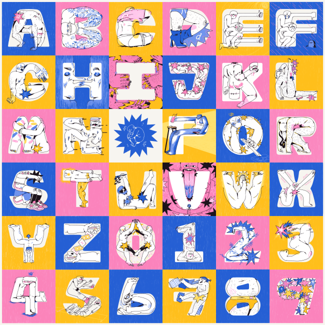
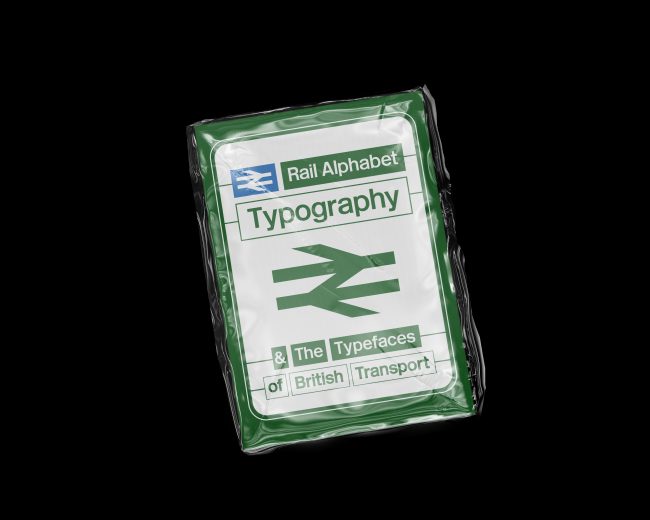
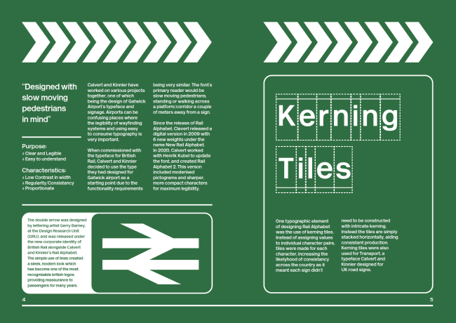
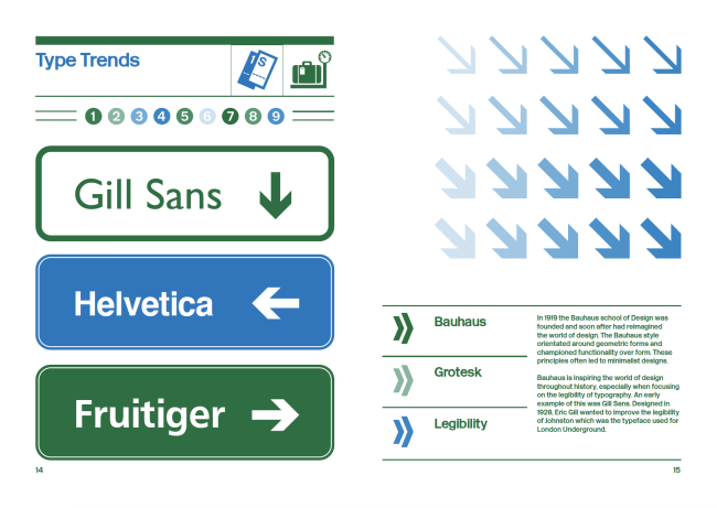
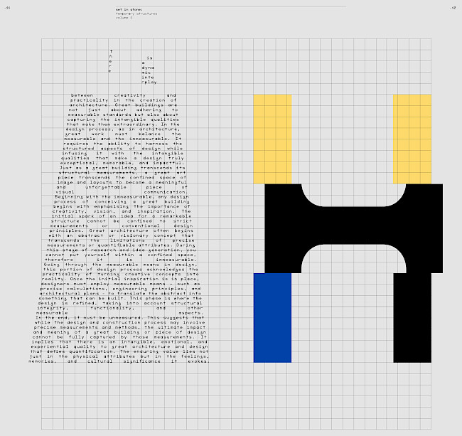
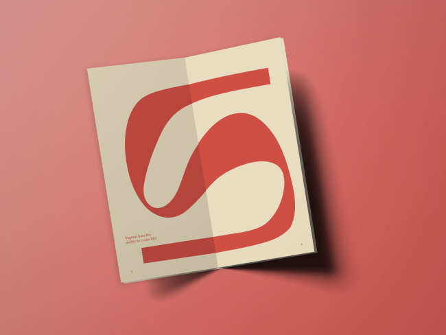
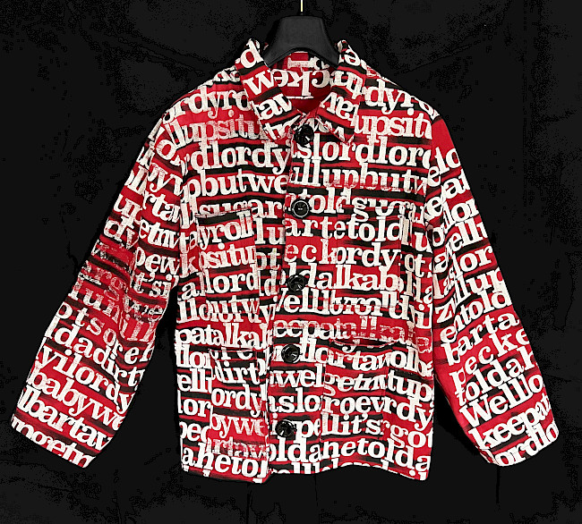
Eve Pemrick
Eve Pemrick
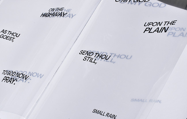
Eve Pemrick
Eve Pemrick
Eve Pemrick
Eve Pemrick
Eve Pemrick
Eve Pemrick
36 days of type
Jack Dean
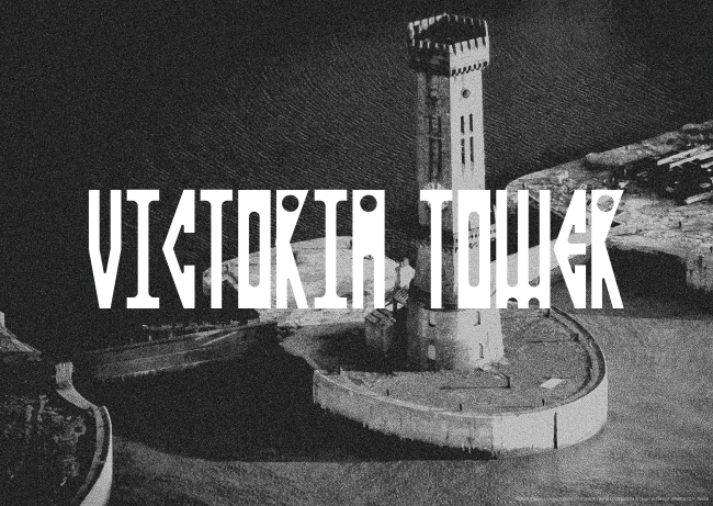
Maritime typeface
Aaron Moss
Maritime typeface
Aaron Moss
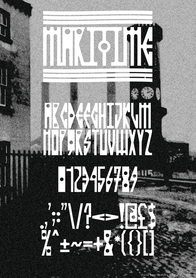
Maritime typeface
Aaron Moss
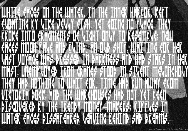
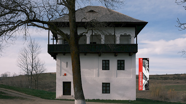
Life, death, and permanence
Aaron Moss
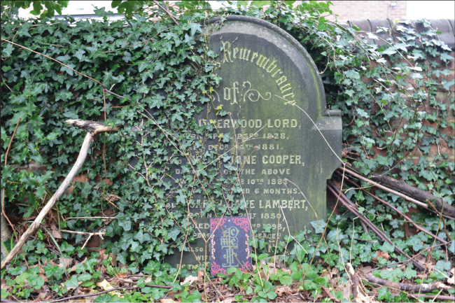
Life, death, and permanence
Aaron Moss
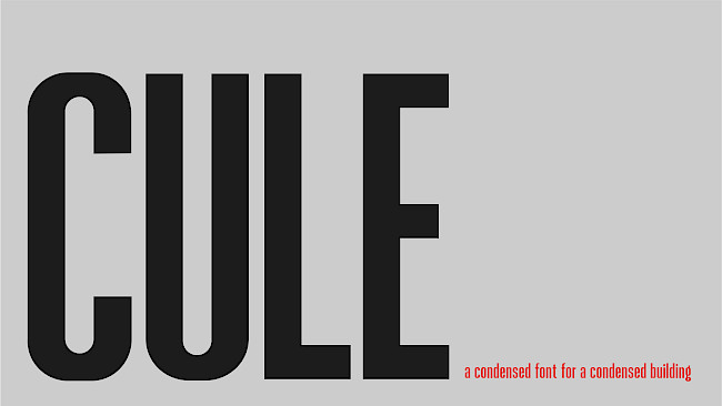
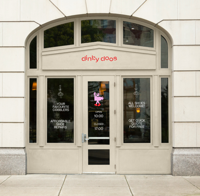
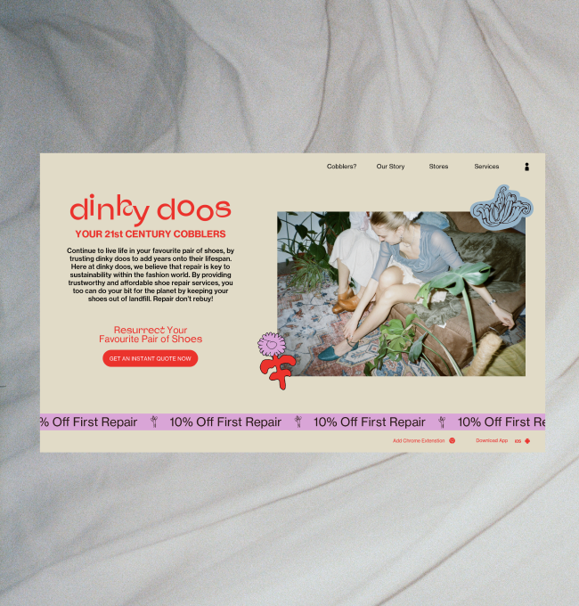
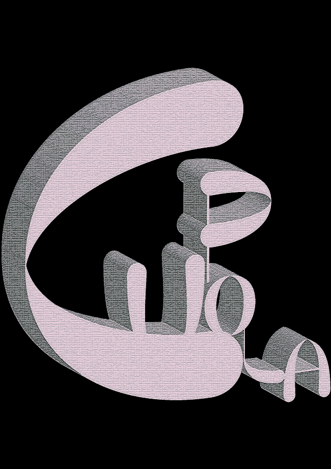
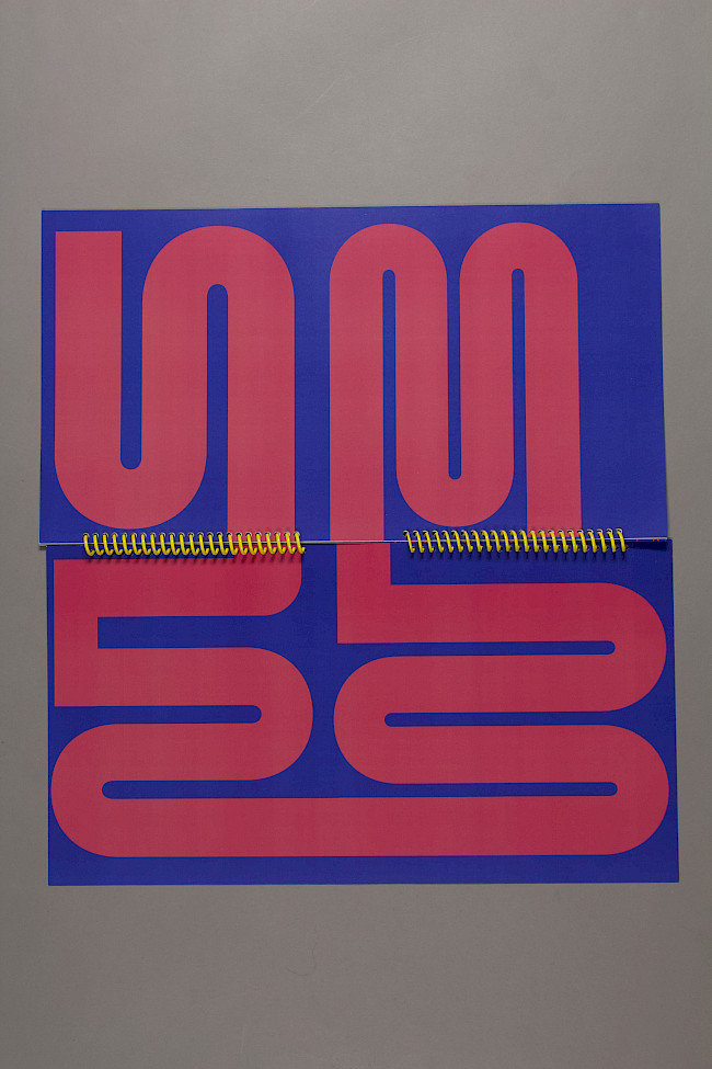
Cule
Teodora Bracau
Cule
Teodora Bracau
Cule
Teodora Bracau
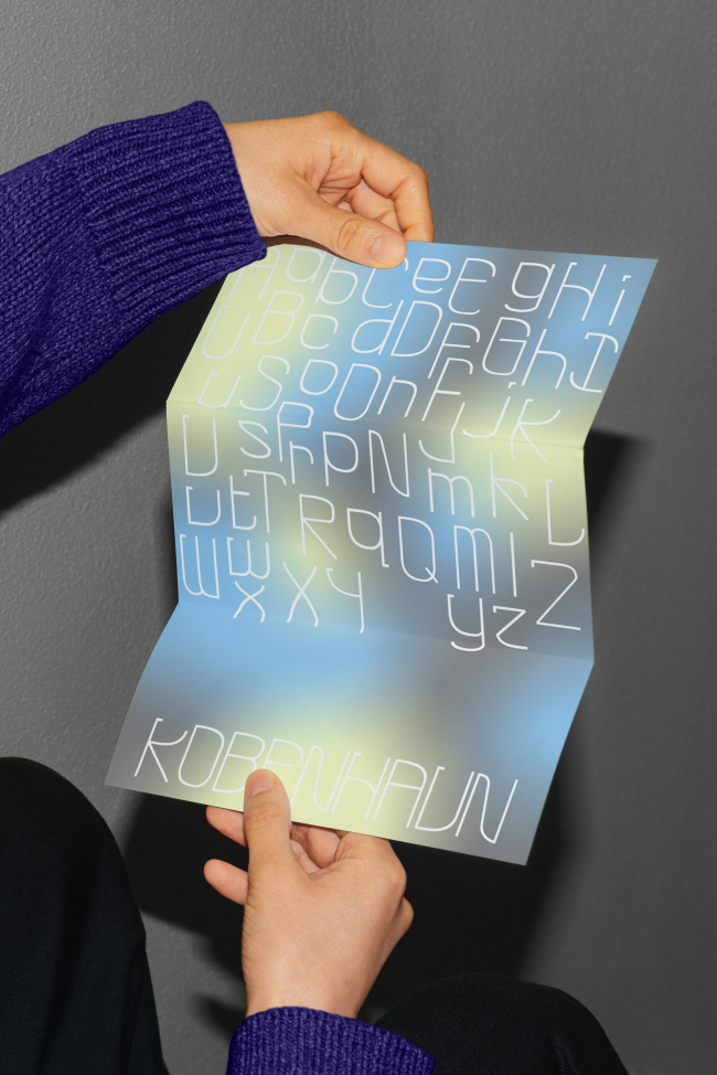
København Typeface
Charlie Cook
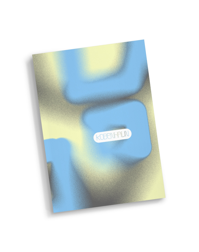
København Typeface
Charlie Cook
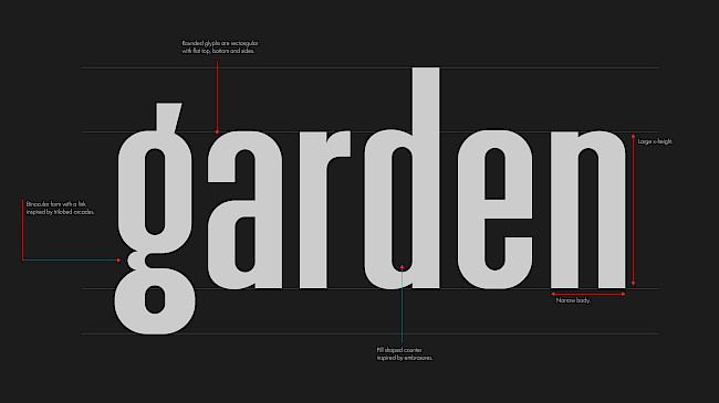
Realm
Lu Michaela
Realm
Lu Michaela
Typography project
Ishita Garg
Triline
Shaurya Mudgal
Triline
Shaurya Mudgal
Interactive water type
Marcus Williams
Road type
Marcus Williams
Abstract type piece
Marcus Williams
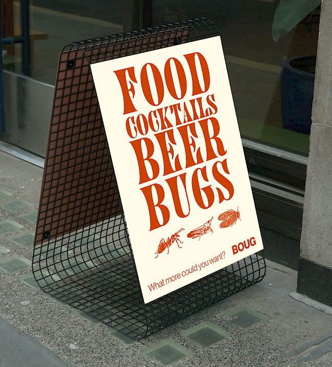
Boug
Kian Repsys
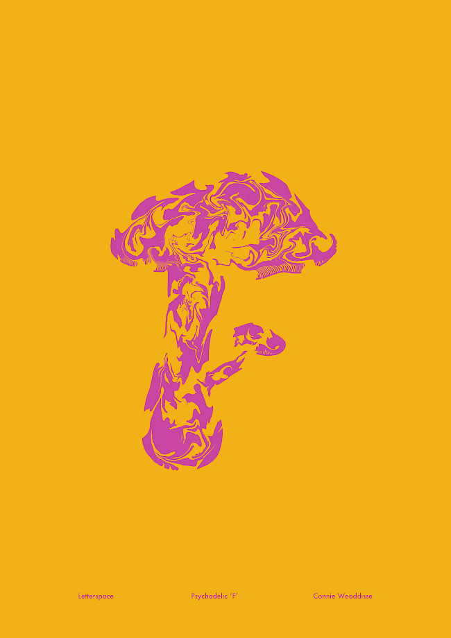
Letterspace
Connie Wooddisse
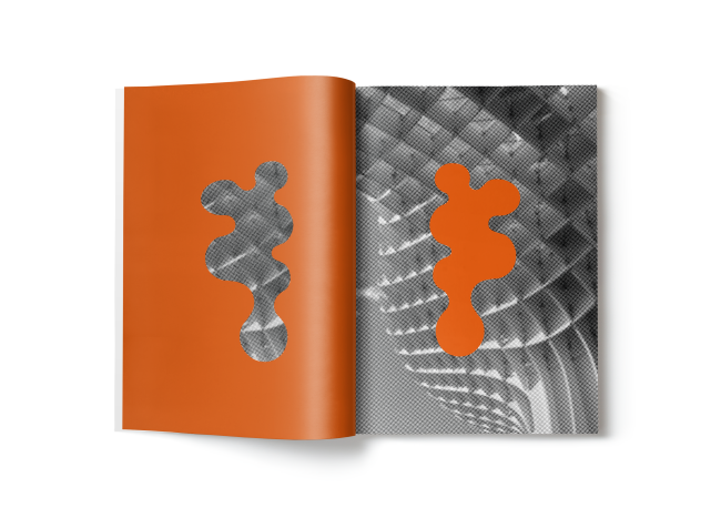
Metropol
Connie Wooddisse
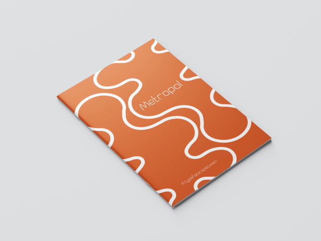
Metropol
Connie Wooddisse
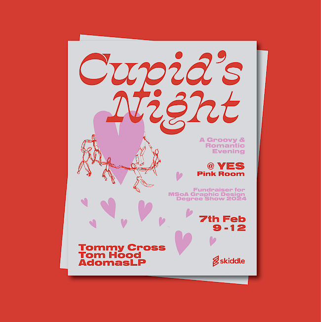
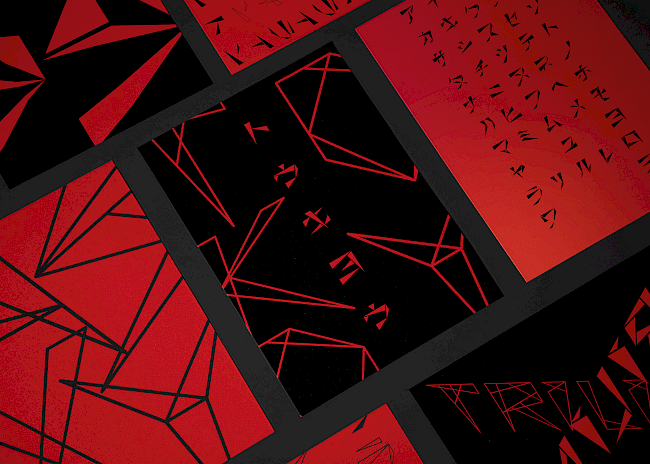
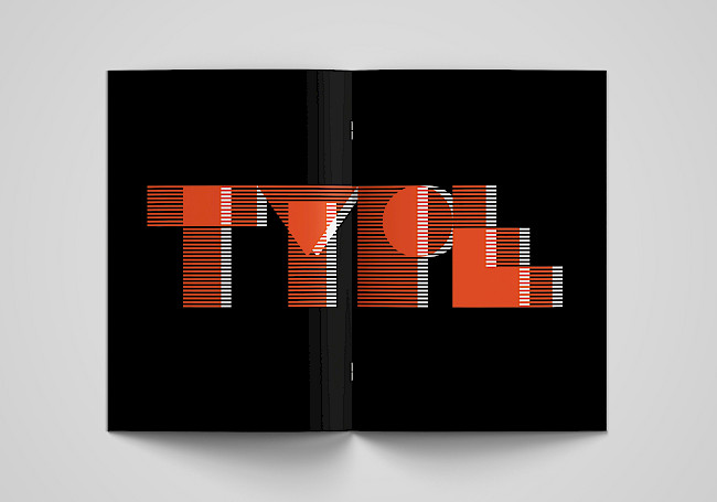
36 Days of Type
Adomas Lukas Petrauskas
36 Days of Type
Adomas Lukas Petrauskas
36 Days of Type
Adomas Lukas Petrauskas
36 Days of Type
Adomas Lukas Petrauskas
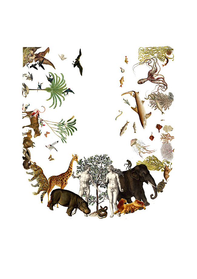
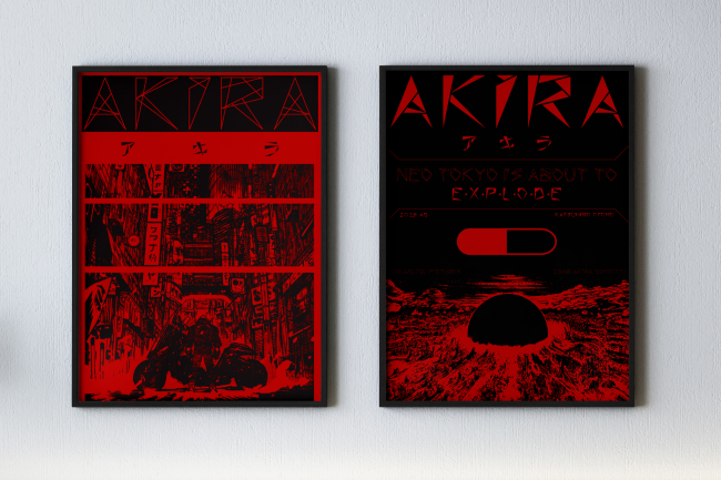
U for Utopia
Vyk Hargreaves
Quietly Boastful
Hannah Quine
Quietly Boastful
Hannah Quine
Quietly Boastful
Hannah Quine
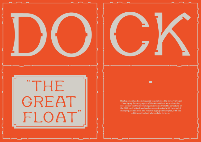
East Float typeface
Hannah Quine
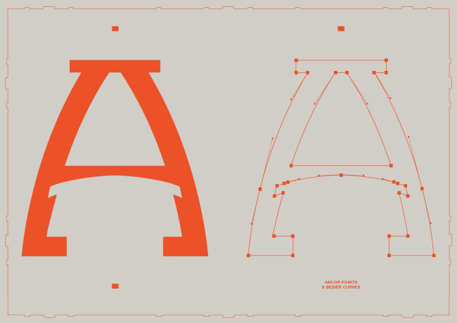
East Float typeface
Hannah Quine
Mies Mod
Ciara Paterson
Mies Mod
Ciara Paterson
Mies Mod
Ciara Paterson
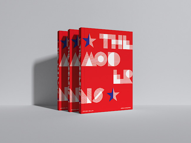
The Moderns
Ciara Paterson
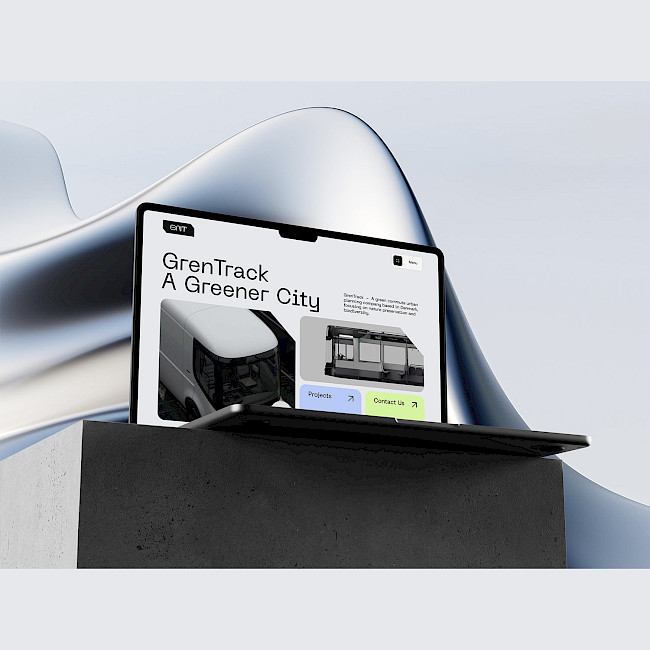
GrenTrack
Michael Lim Yu Cheng Lim

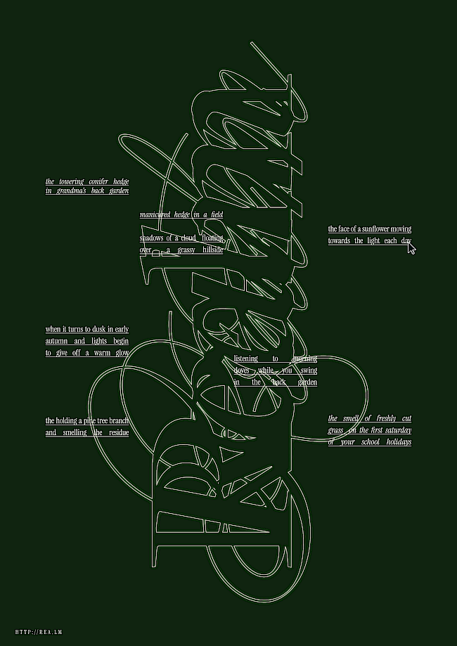
The Space Between
Marissa Van Ristell
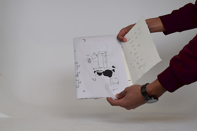
The Space Between
Marissa Van Ristell
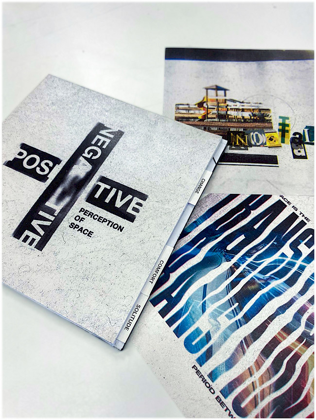
Negative and positive
Lucian Florea
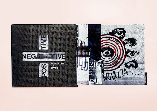
Negative and positive
Lucian Florea
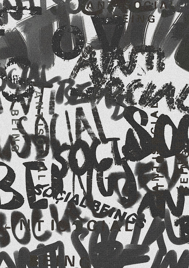
Mind The Gap
Justin Poh Keng Hoe
ISTD
Igor Kijko
ISTD
Igor Kijko
ISTD
Igor Kijko
Greta Thunberg Animation
Annie Baboumyan
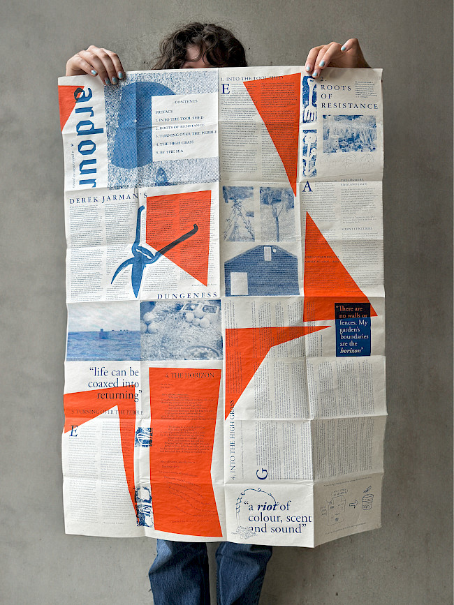
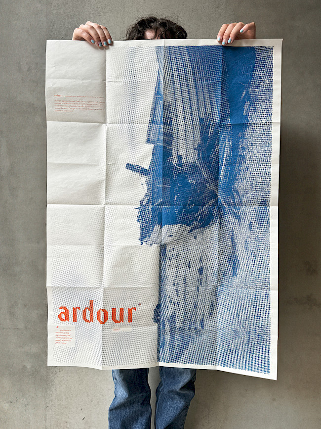
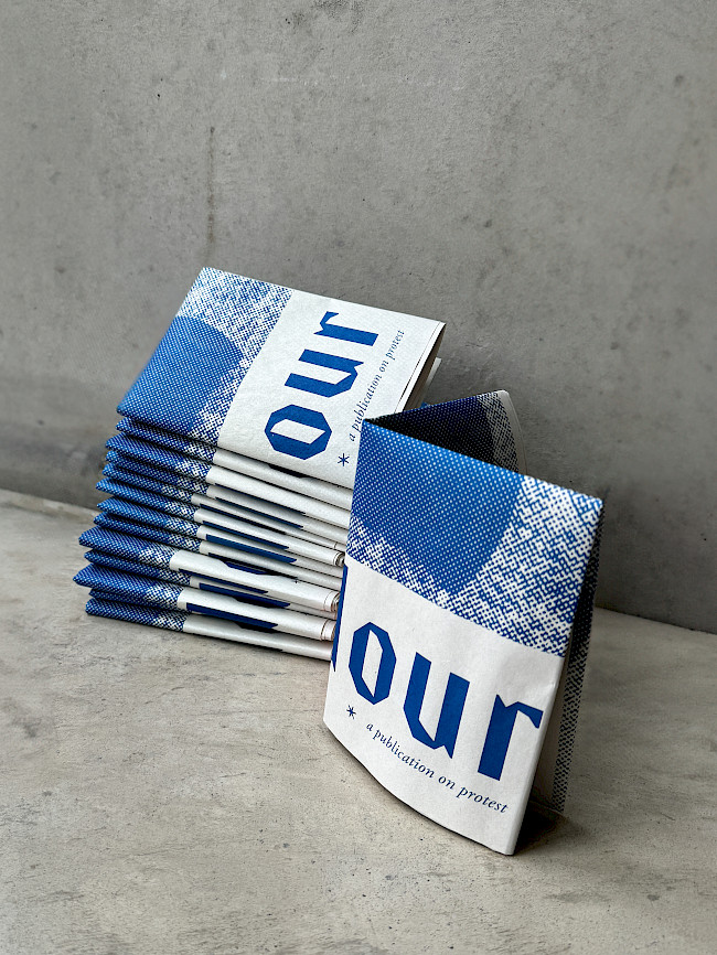
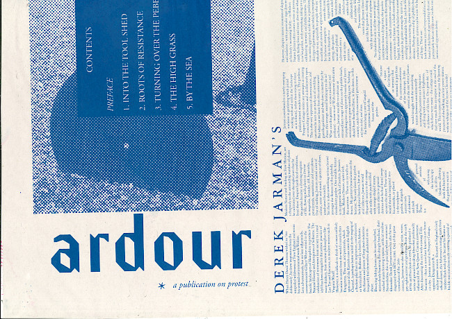
Ardour
Bibi Lola Lewin-Sanderson

Ardour
Bibi Lola Lewin-Sanderson
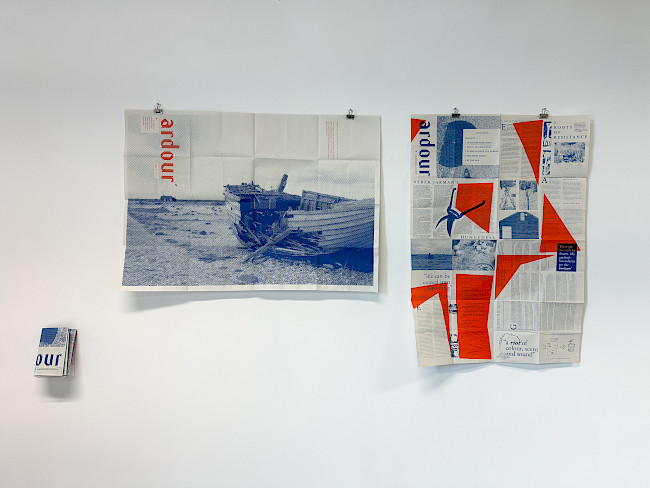
Ardour
Bibi Lola Lewin-Sanderson

Ardour
Bibi Lola Lewin-Sanderson
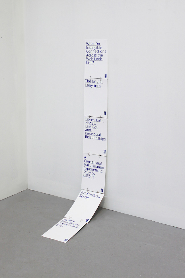
Hyperlink
Bibi Lola Lewin-Sanderson
Hyperlink
Bibi Lola Lewin-Sanderson
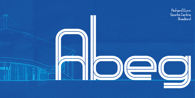
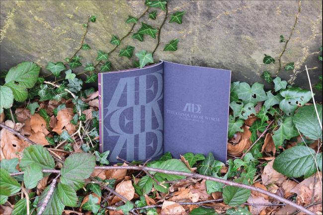
Richard Dunn typeface
Bradley Sansom
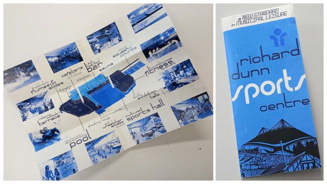
Richard Dunn typeface
Bradley Sansom
Cherry
Amber Degirmencioglu
Ardour
Roxy Luke

Ardour
Roxy Luke
Ardour
Roxy Luke

Ardour
Roxy Luke
Ardour
Roxy Luke
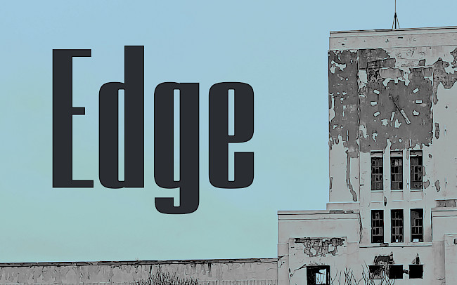
EDGE
Faye Byrne
EDGE
Faye Byrne
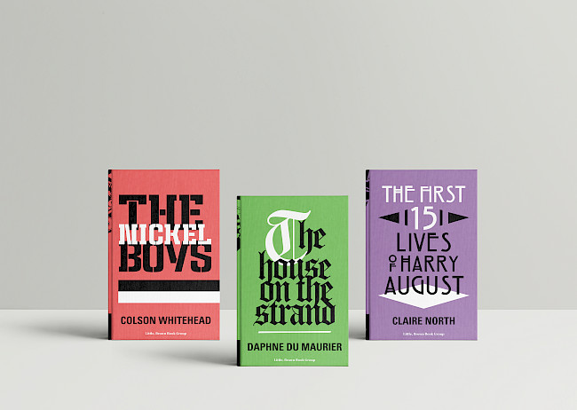
Book covers
Faye Byrne
Book 15
Abbie Knipe
Book 19
Abbie Knipe
Arup
Maddie Clayton
Arpita Jhajharia
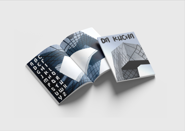
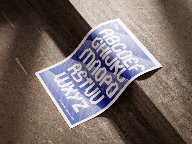
Da Kucha
BB Przewlocka
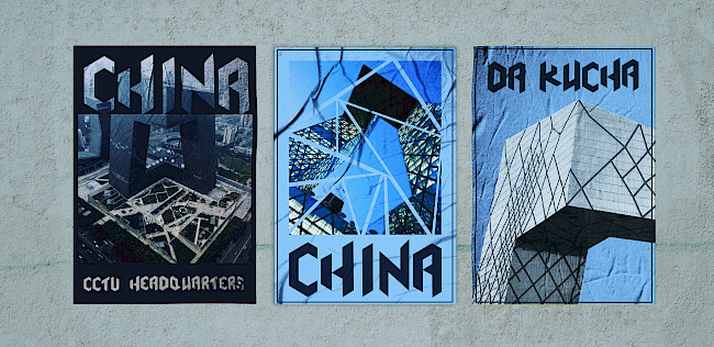
Da Kucha
BB Przewlocka
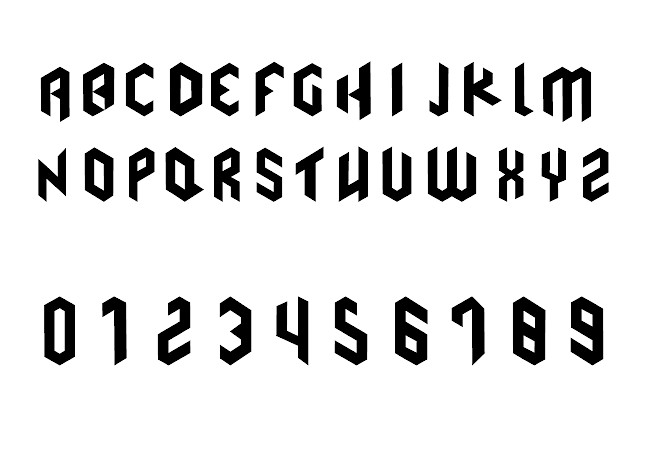
Da Kucha
BB Przewlocka
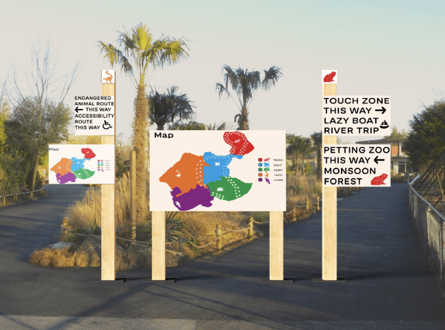
Chester Zoo wayfinding
Rachel Topping
T26 Museum
Rachel Topping
Turia typeface
Vanessa Neri

Turia typeface
Vanessa Neri
Trapped in Sewage
Adeem Asghar
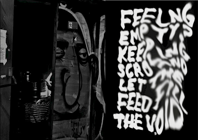
When I Rise
Jude Wakeley
When I Rise
Jude Wakeley