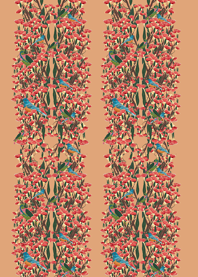
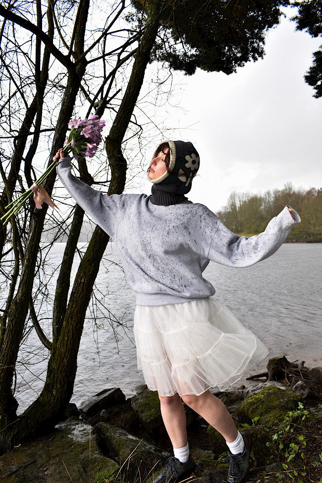
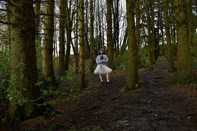
Space Separation and play
Aleysha Saddiq
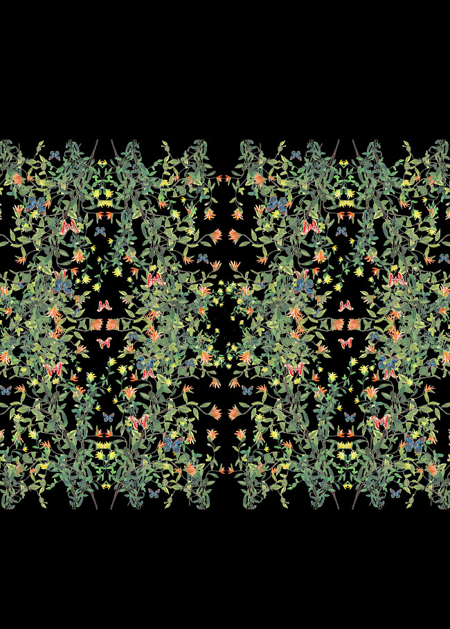
Space Separation and play
Aleysha Saddiq
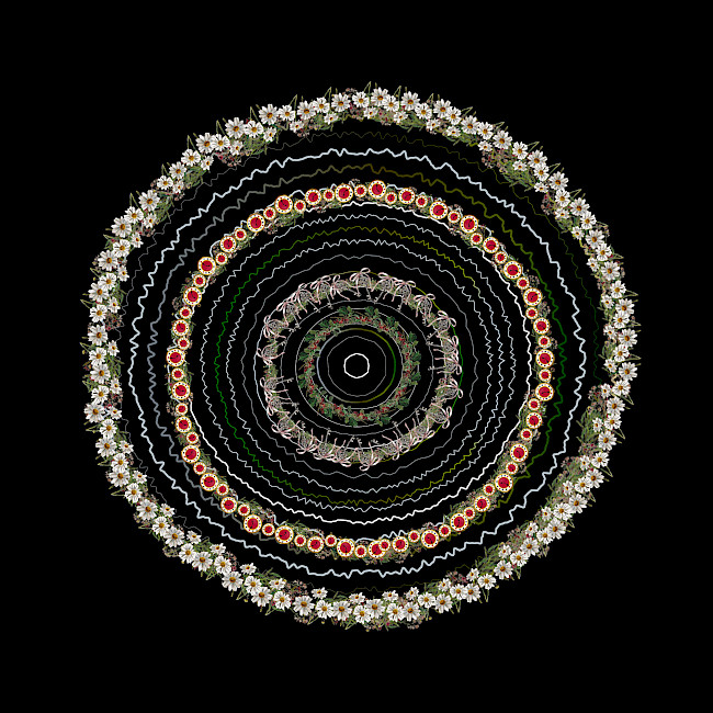
Space Separation and play
Aleysha Saddiq
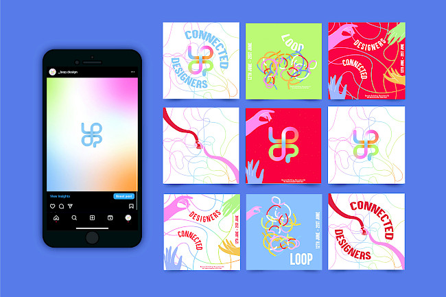
LOOP
Aleysha Saddiq
Reinventing a Classic
Aleysha Saddiq
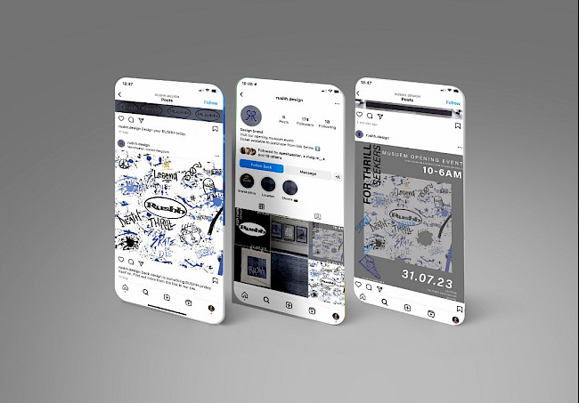
Rushh
Aleysha Saddiq
Kitchen Sink film festival
Jamie Gough
Kitchen Sink film festival
Jamie Gough
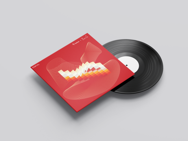
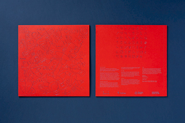
G.F Smith Portal
Jamie Gough
Run Riot
Jamie Gough
Run Riot
Jamie Gough
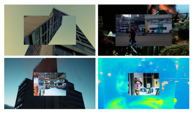
Nostalgia Museum
Jamie Gough
Nostalgia museum
Jamie Gough
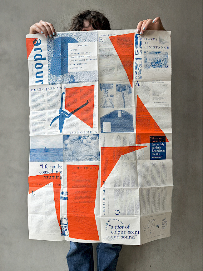
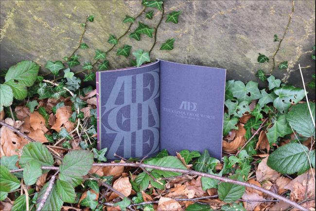
Ardour
Bibi Lola Lewin-Sanderson
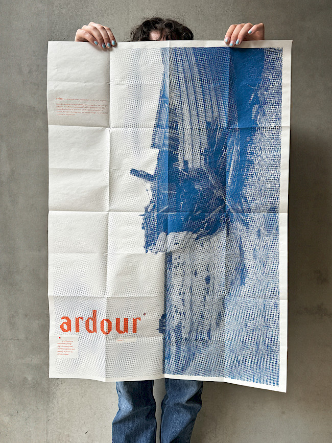
Ardour
Bibi Lola Lewin-Sanderson
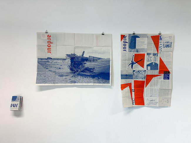
Ardour
Bibi Lola Lewin-Sanderson
Ardour
Bibi Lola Lewin-Sanderson
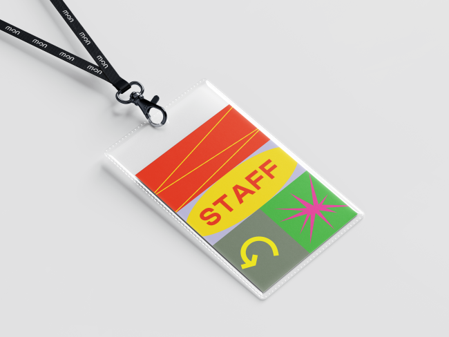
&Beyond
Bibi Lola Lewin-Sanderson
&Beyond
Bibi Lola Lewin-Sanderson
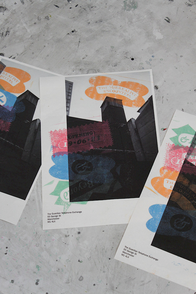
&Beyond
Bibi Lola Lewin-Sanderson
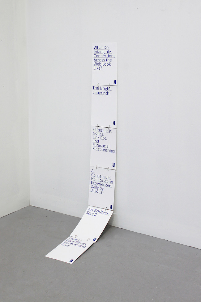
Hyperlink
Bibi Lola Lewin-Sanderson
Hyperlink
Bibi Lola Lewin-Sanderson
The Great Stir
Bibi Lola Lewin-Sanderson
The Great Stir
Bibi Lola Lewin-Sanderson
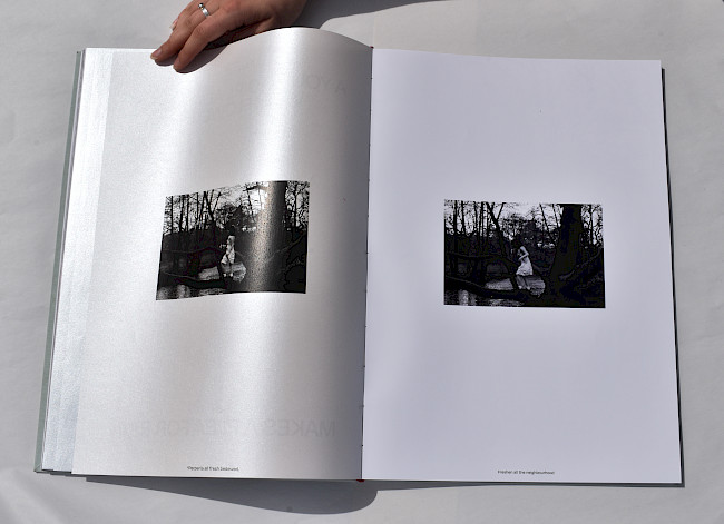
Book 15
Abbie Knipe
Book 19
Abbie Knipe
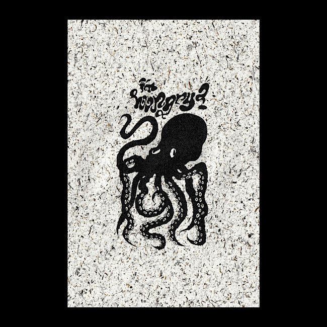
Octopus
Abbie Knipe
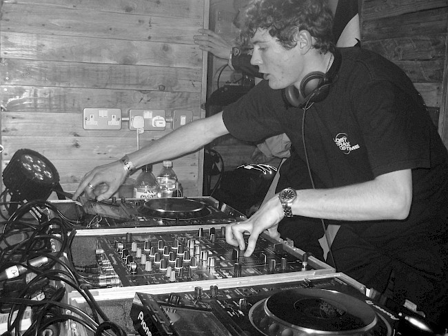
DJ
Abbie Knipe
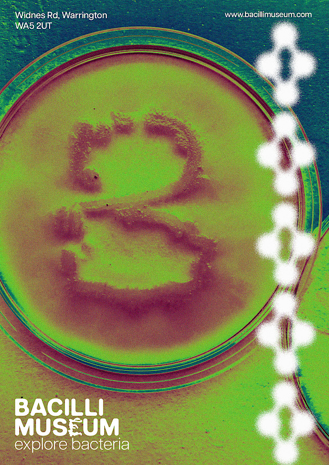
Bacilli Museum
Amelia Renny
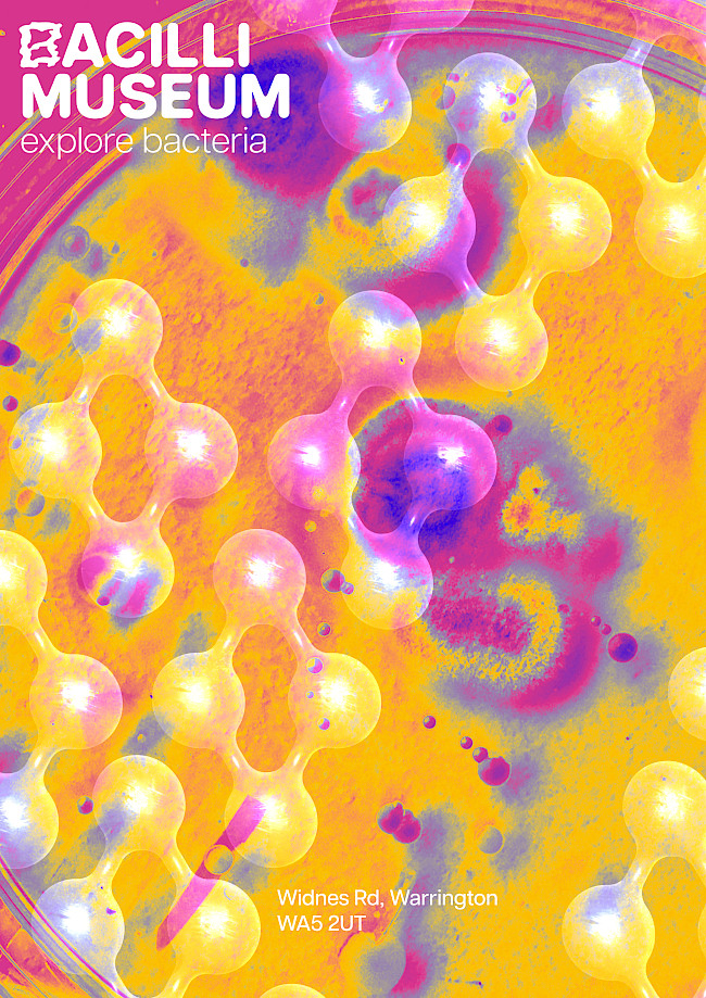
Bacilli Museum
Amelia Renny
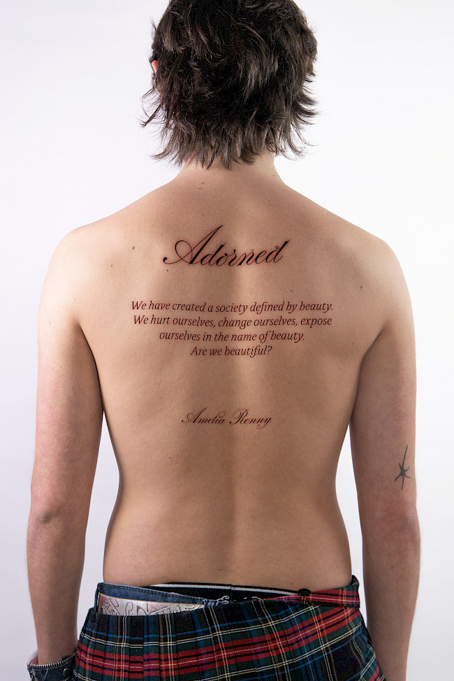
Adorned
Amelia Renny

Adorned
Amelia Renny
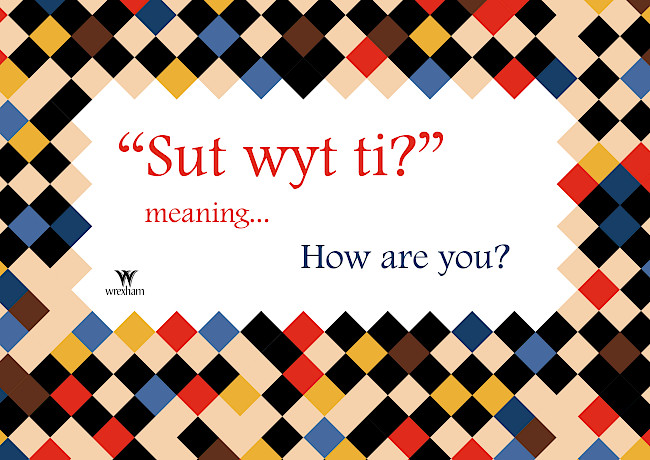
Celebrate Wrexham
Amelia Renny

Maritime typeface
Aaron Moss
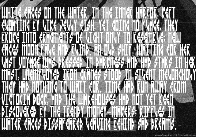
Maritime typeface
Aaron Moss
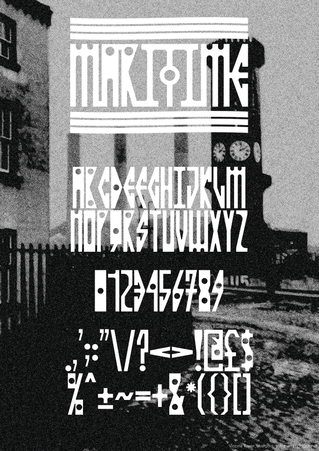
Maritime typeface
Aaron Moss
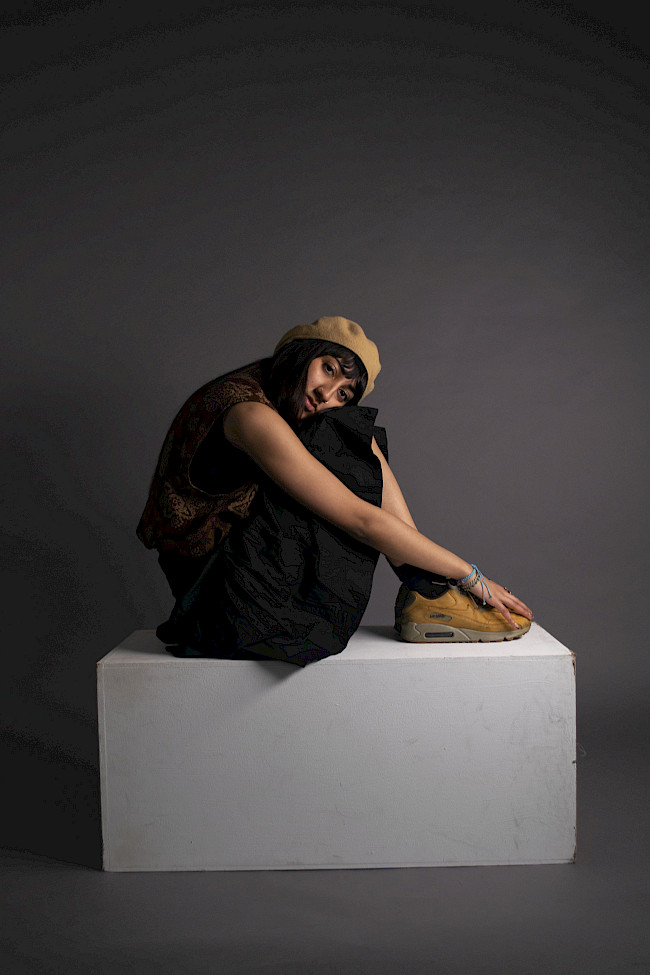
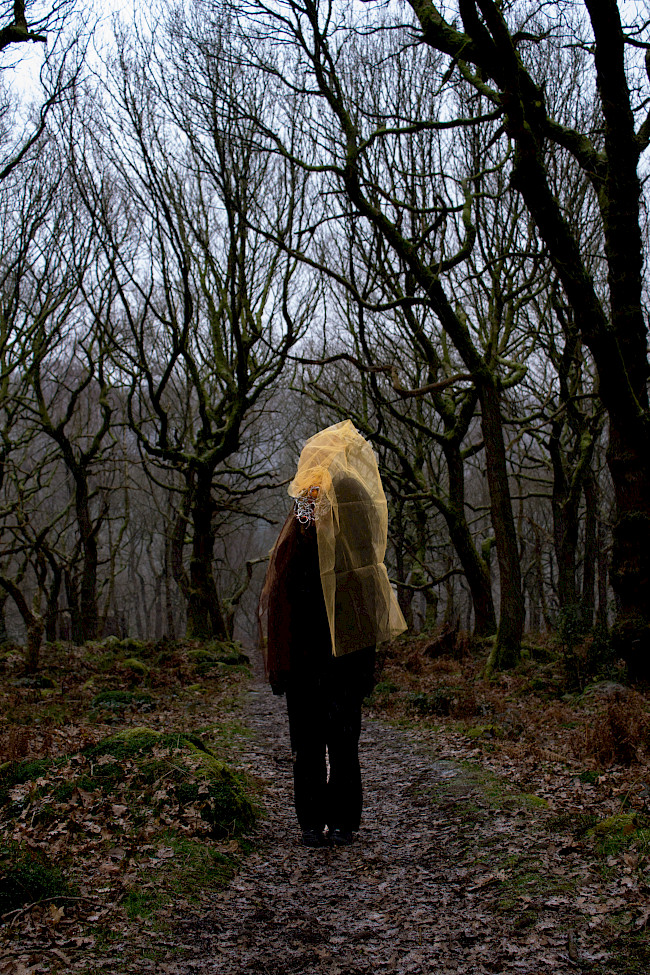
Life, death, and permanence
Aaron Moss
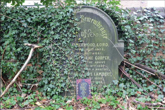
Life, death, and permanence
Aaron Moss

Life, death, and permanence
Aaron Moss
Hand-drawn illustrations
Aaron Moss
G.F Smith Portal
Aaron Moss
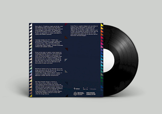
G.F Smith Portal
Aaron Moss
Rainmakers
Grace Parnell
Rainmakers
Grace Parnell
Rainmakers
Grace Parnell
Rainmakers
Grace Parnell

Rainmakers
Grace Parnell

Rainmakers
Grace Parnell
Rainmakers
Grace Parnell
Rainmakers
Grace Parnell
Fast Fashion
Grace Parnell
Fast Fashion
Grace Parnell

Over-consumption
Grace Parnell
Book it
Dan Hughes
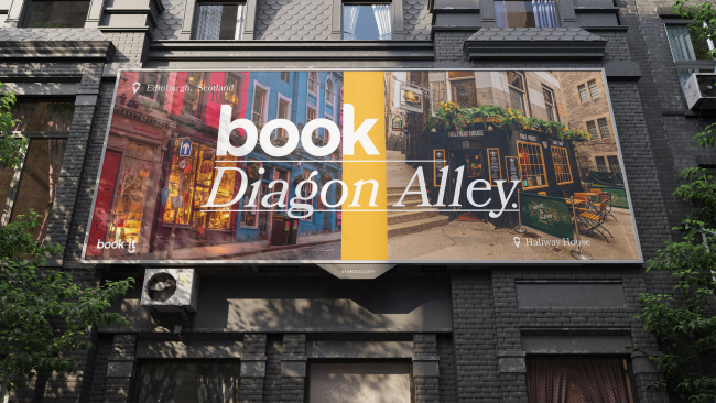
Book it
Dan Hughes

Book it
Dan Hughes
i Degree show branding
Dan Hughes
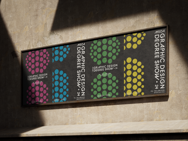
i Degree show branding
Dan Hughes
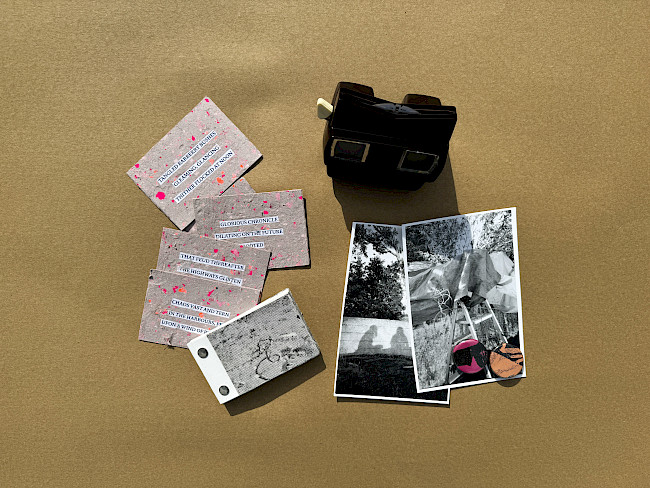
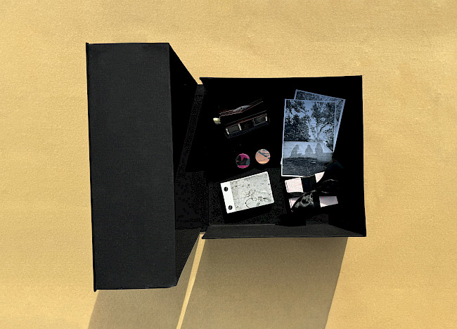
Box2Box
Dan Hughes
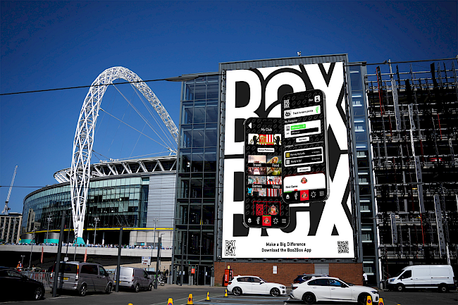
Box2Box
Dan Hughes

Box2Box
Dan Hughes
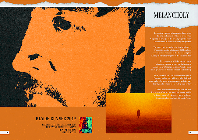
Film Festival Branding
Charlie Flanagan
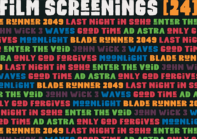
Film Festival Branding
Charlie Flanagan
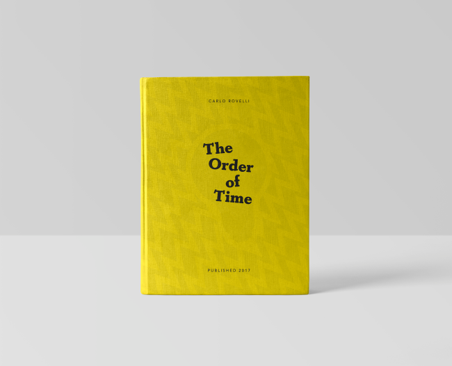
The Order of Time Book Cover
Charlie Flanagan
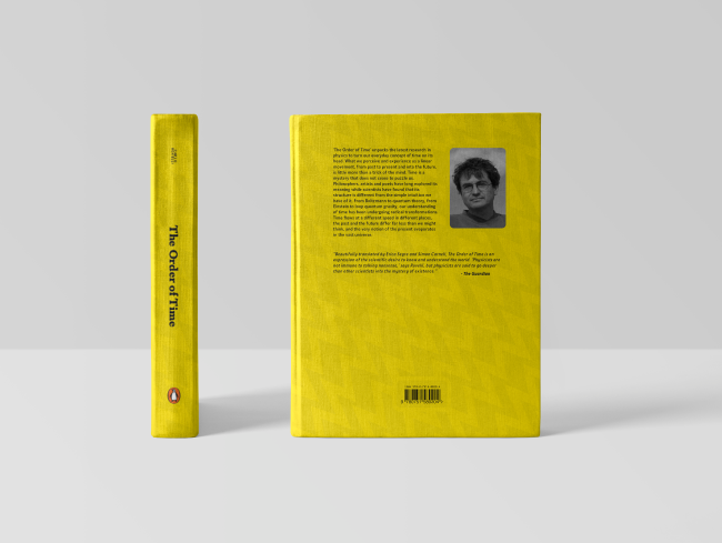
The Order of Time Book Cover
Charlie Flanagan
Manchester Medical Museum Branding
Charlie Flanagan
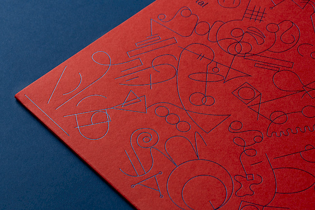
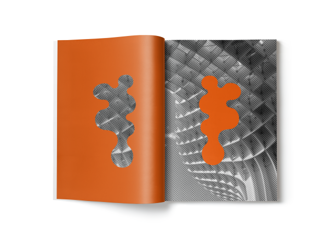
G.F Smith Portal
Connie Wooddisse
G.F Smith Portal
Connie Wooddisse
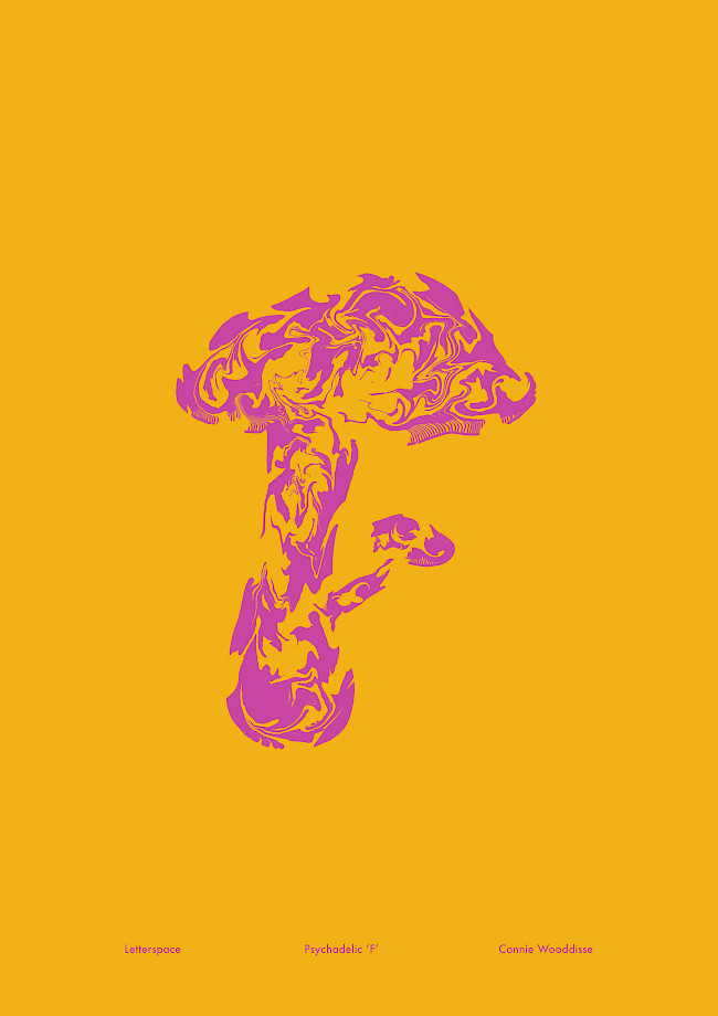
Letterspace
Connie Wooddisse
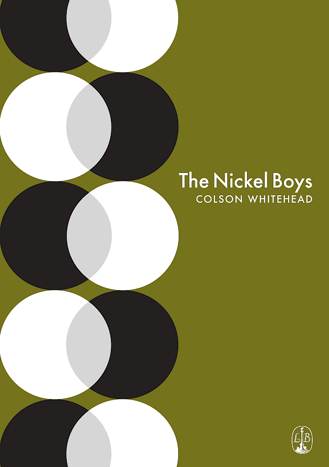
The Nickel Boys
Connie Wooddisse
Metropol
Connie Wooddisse
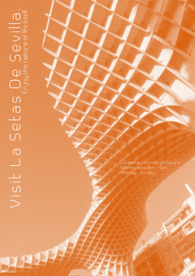
Metropol
Connie Wooddisse

Metropol
Connie Wooddisse