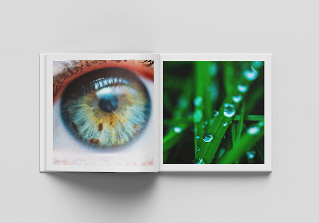
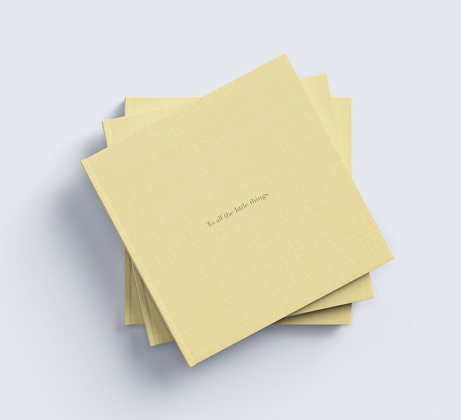
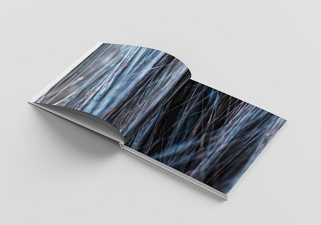
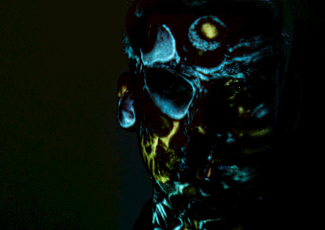
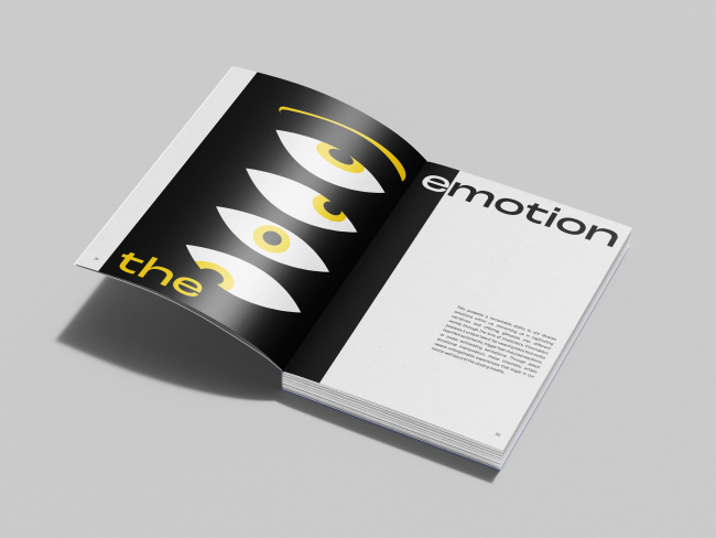
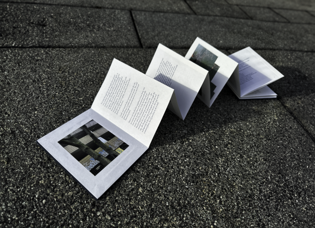
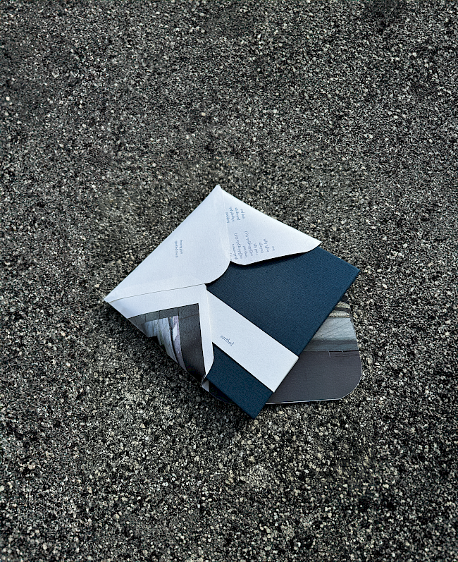
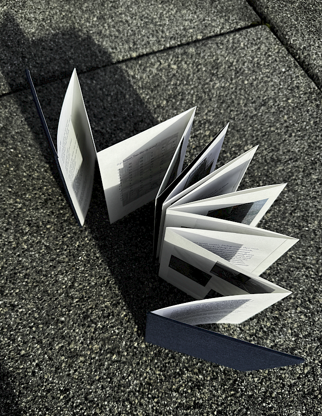
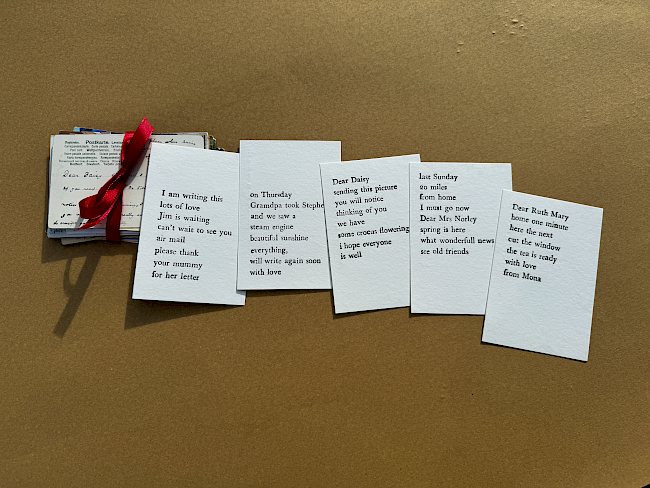
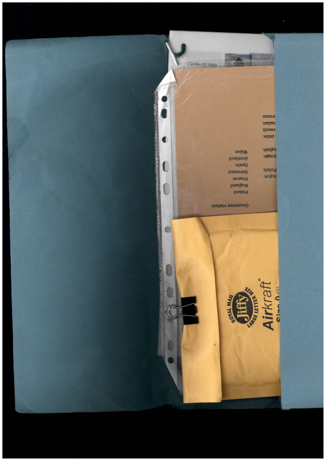
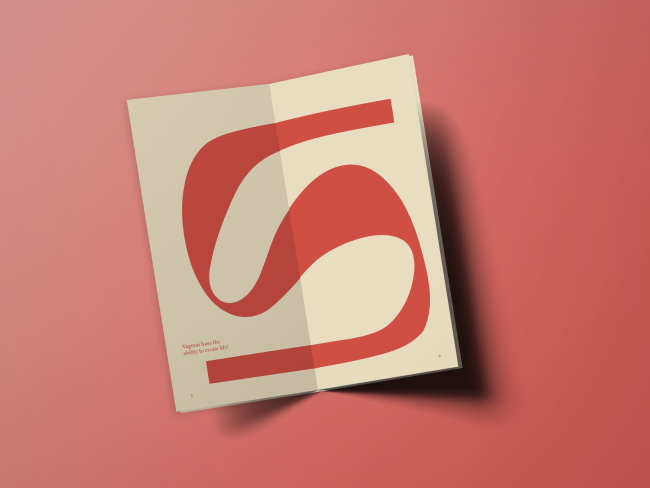
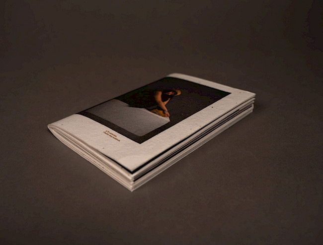
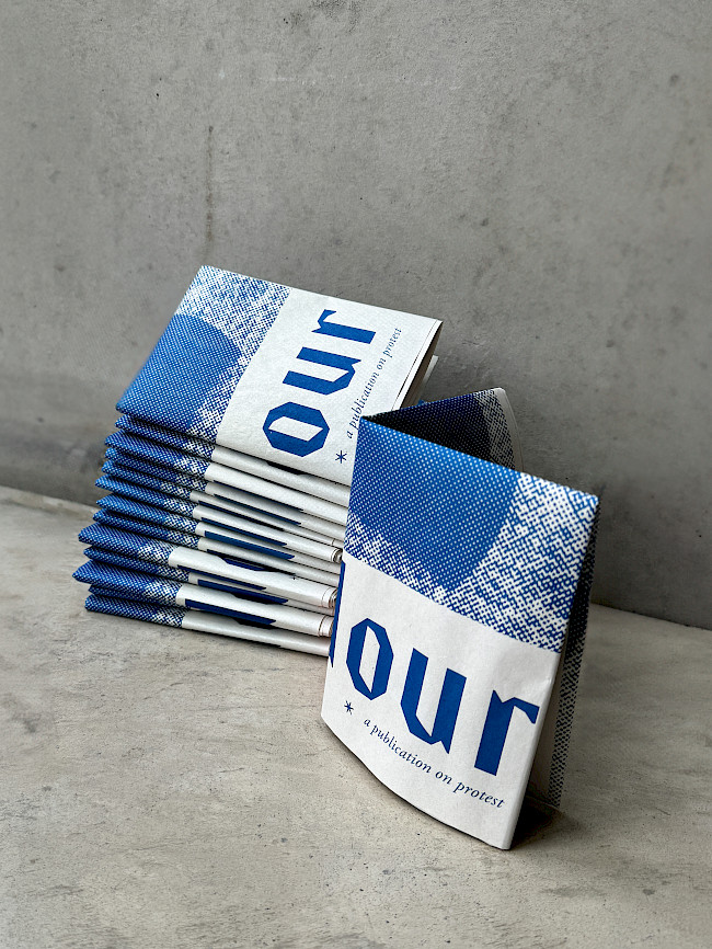
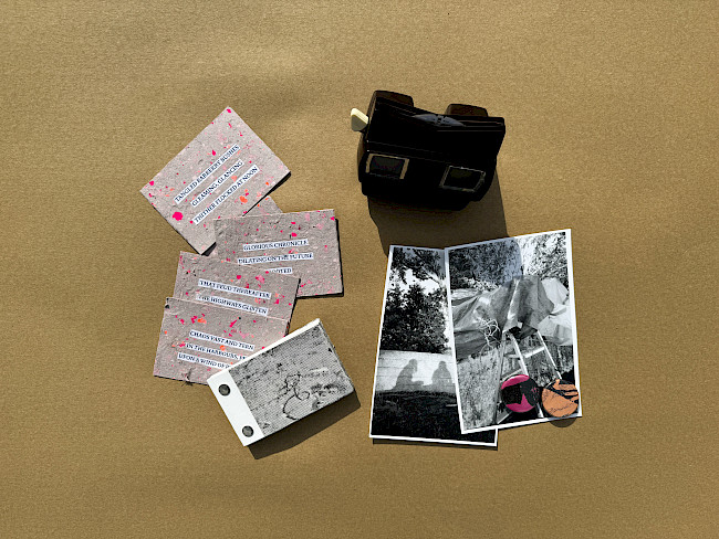
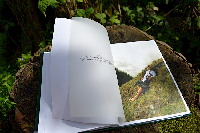
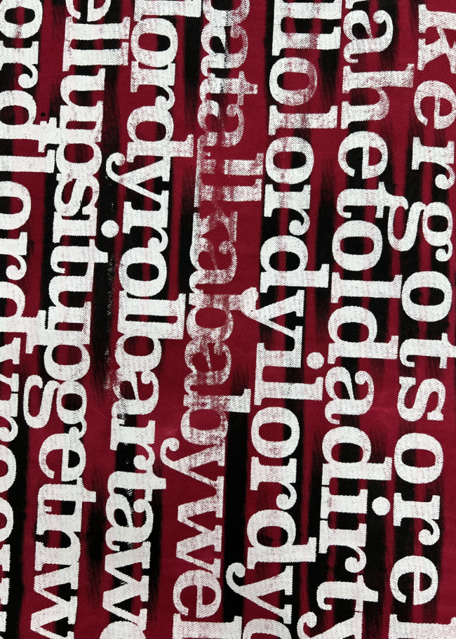
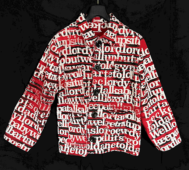
To all the little things
Lily Maddocks
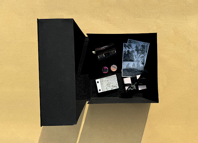
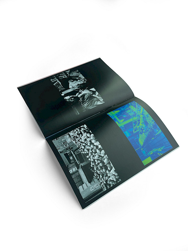
To all the little things
Lily Maddocks
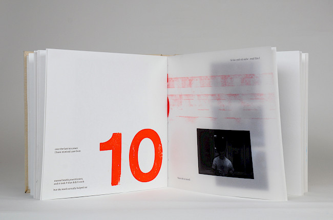
To all the little things
Lily Maddocks
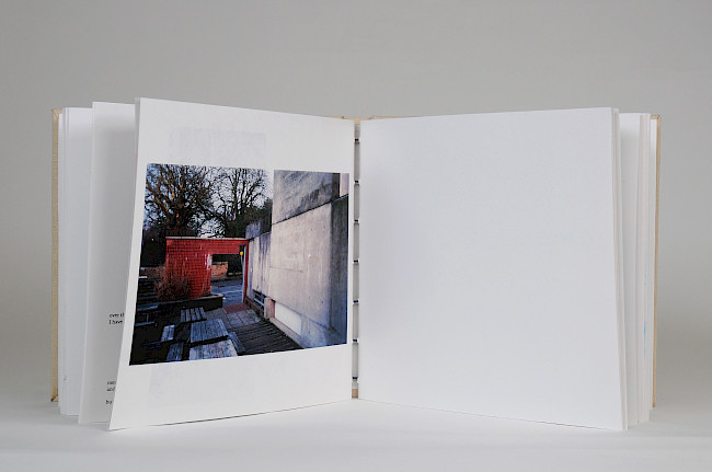
To all the little things
Lily Maddocks
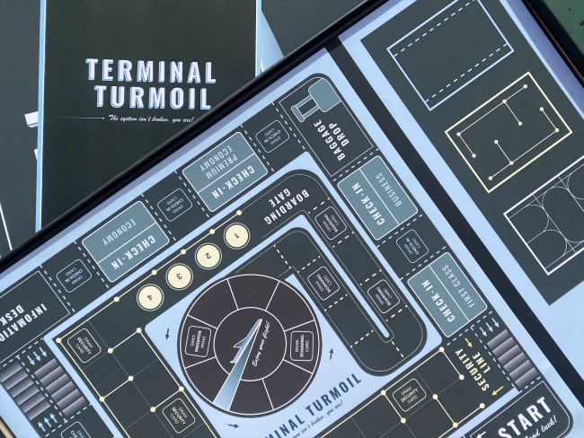
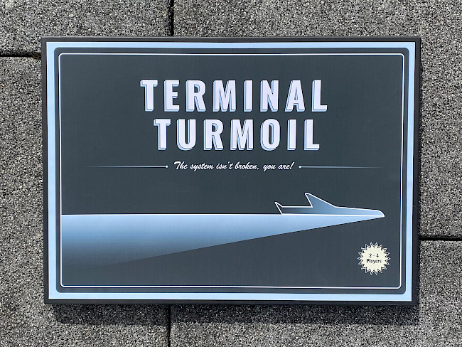
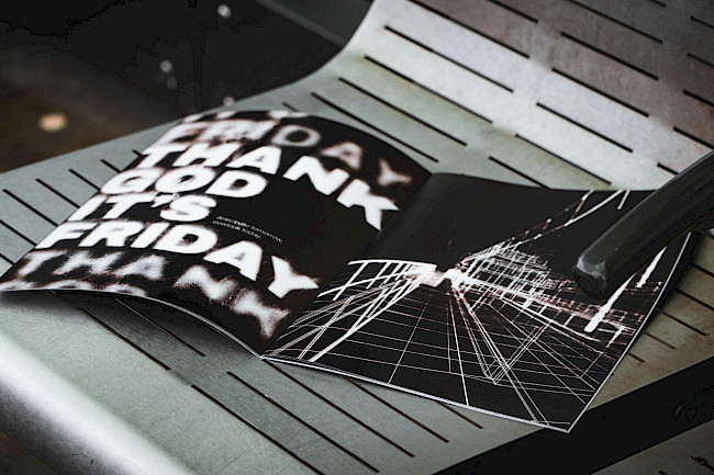
Terminal Turmoil game
Hannah Quine
Terminal Turmoil game
Hannah Quine
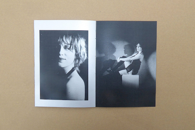
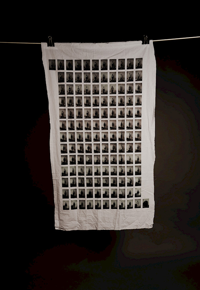
Quietly Boastful
Hannah Quine
Quietly Boastful
Hannah Quine
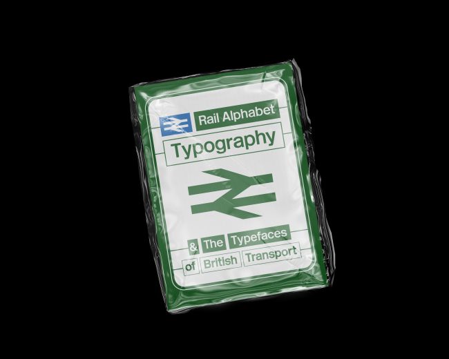
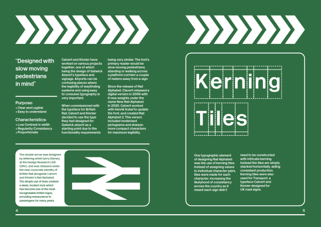
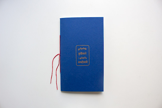
in the sphere of waiting
Chloe Wilmont
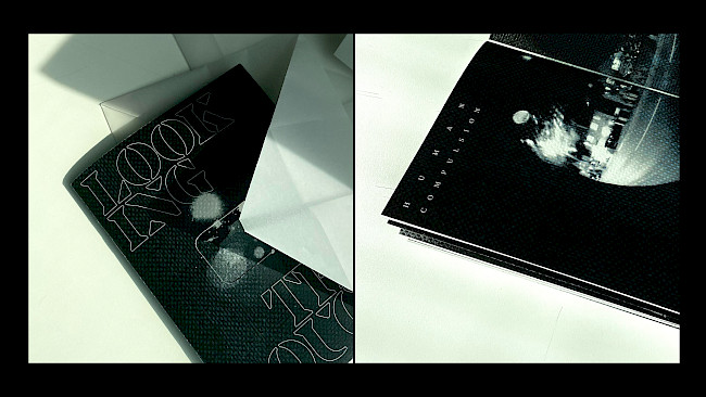
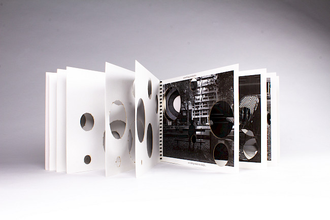
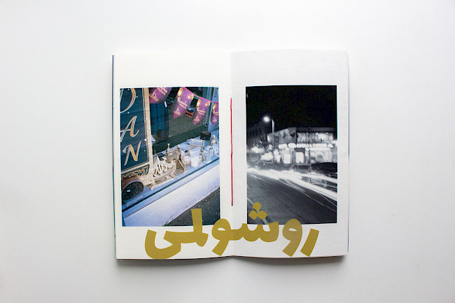
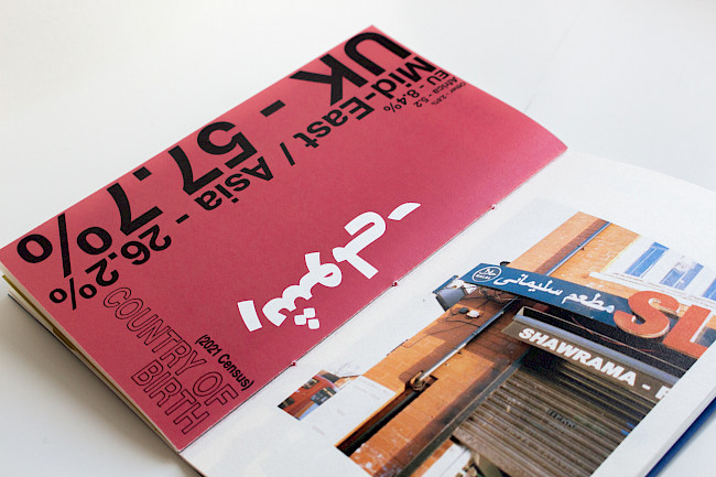
Looking Through
Chloe Wilmont
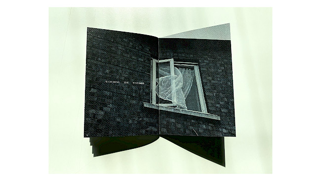
Looking Through
Chloe Wilmont
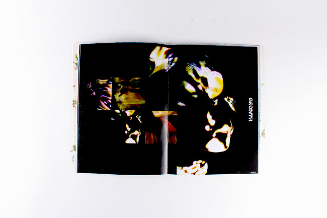
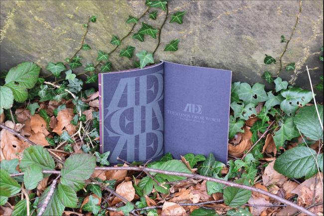
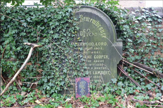
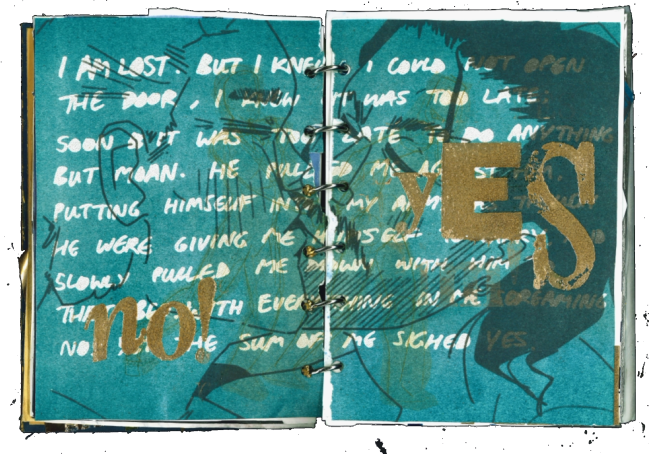
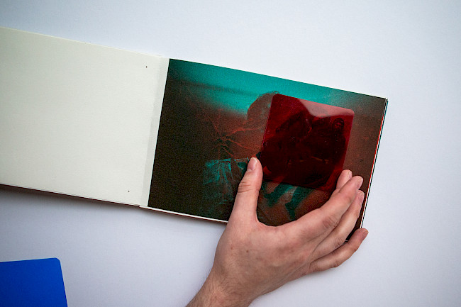
Metamorphosis
Chloe Wilmont
Metamorphosis
Chloe Wilmont
Metamorphosis
Chloe Wilmont
Metamorphosis
Chloe Wilmont
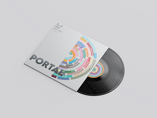
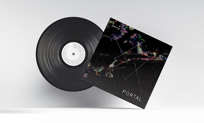
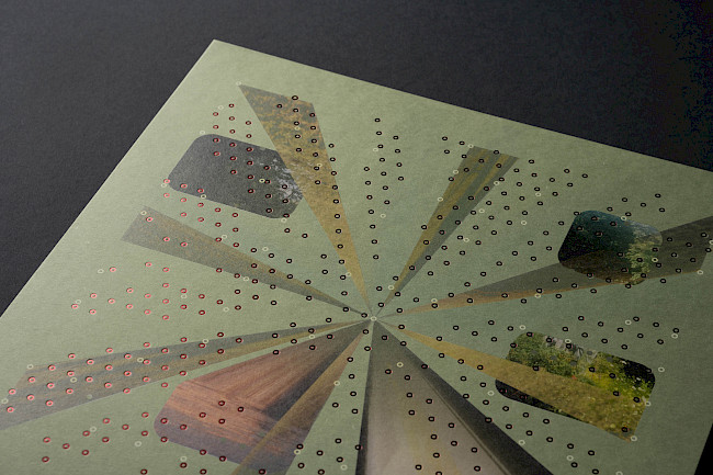
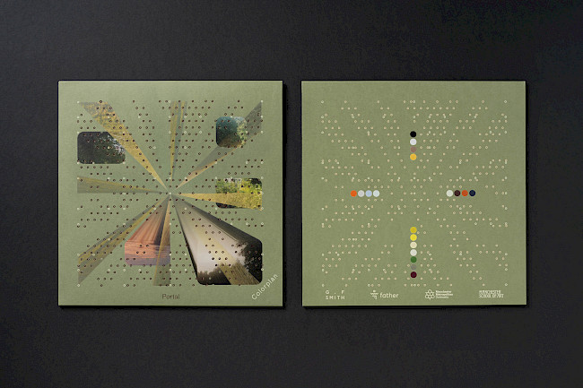
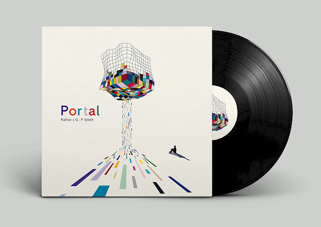
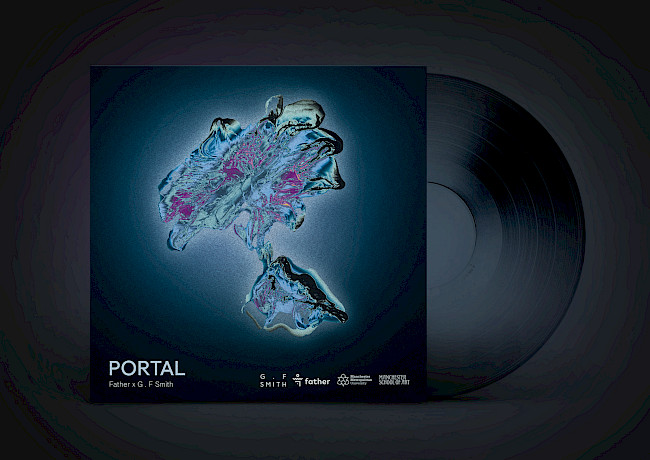
G.F Smith Portal
Chloe Wilmont
Little Brown books
Chloe Wilmont
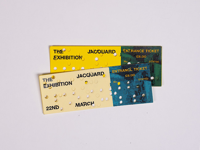
Jacquard Exhibition
Harrison Leitch
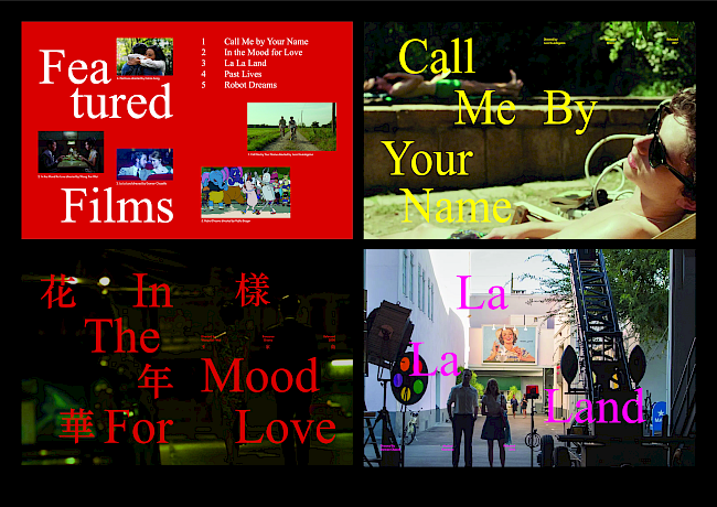
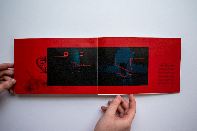
1.19:1 Film Festival
Harrison Leitch
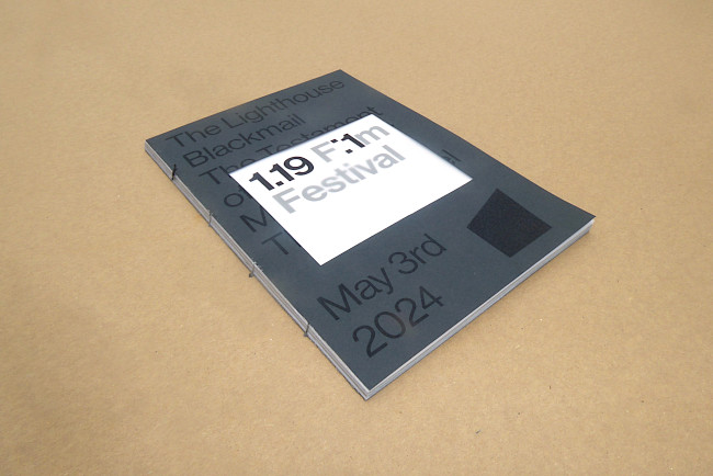
1.19:1 Film Festival
Harrison Leitch
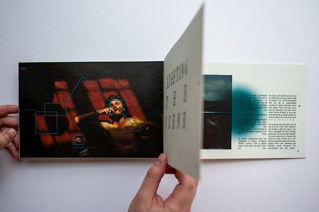
Reinterpreting a Classic
Annie Baboumyan
Reinterpreting a Classic
Annie Baboumyan
Reinterpreting a Classic
Annie Baboumyan
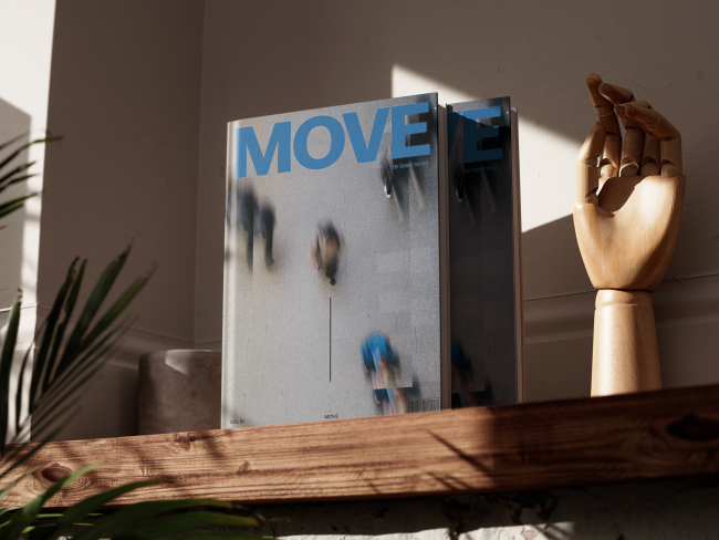
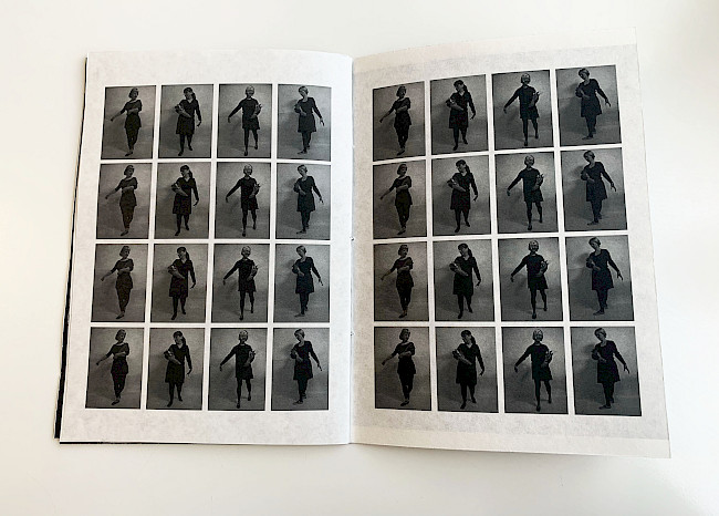
MOVE
Emily Dicks
MOVE
Emily Dicks
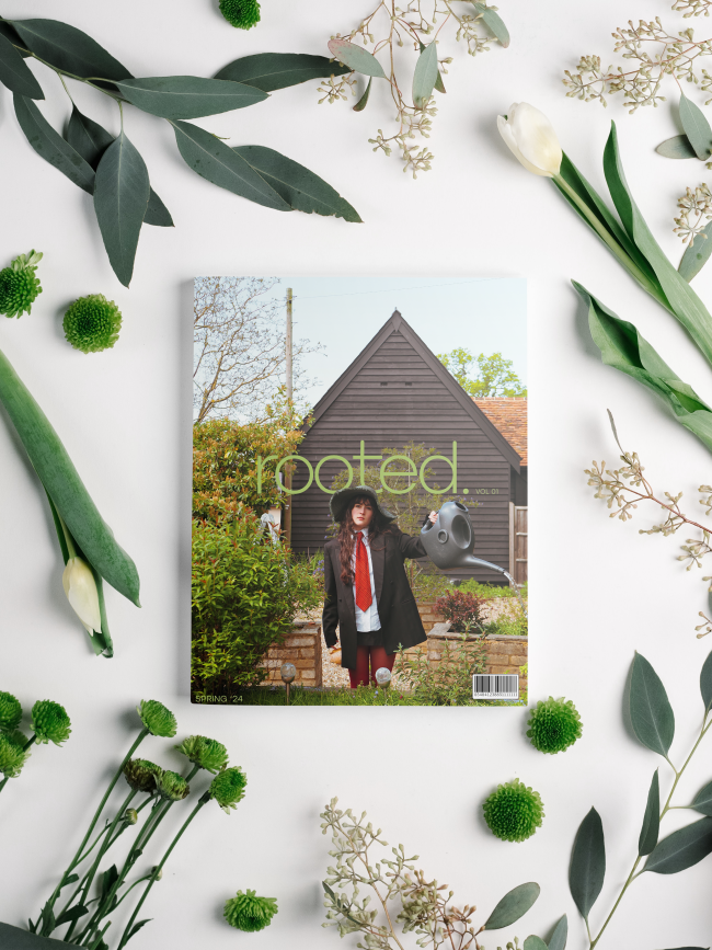
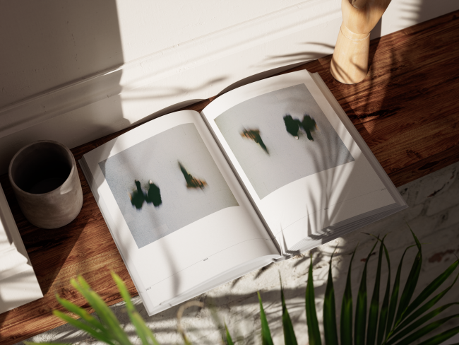
Rooted magazine
Emily Dicks
Book 19
Abbie Knipe
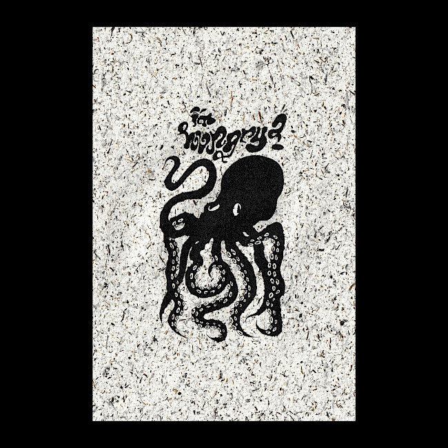
Octopus
Abbie Knipe
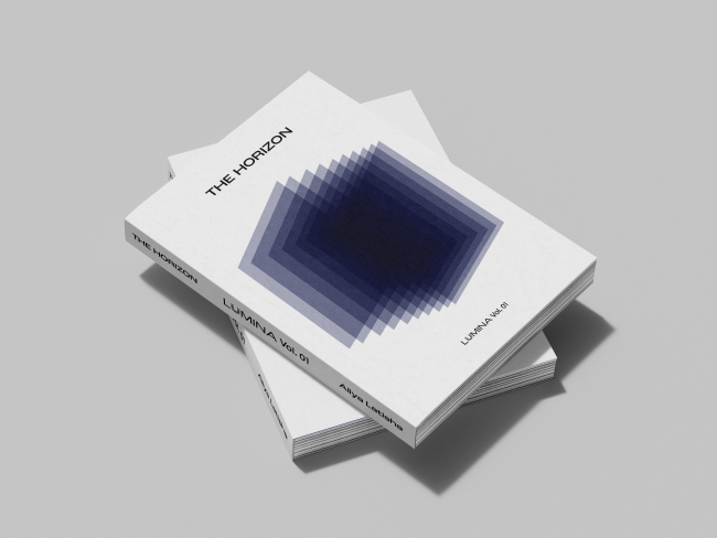
The Horizon
Tisha Adiyanto
The Horizon
Tisha Adiyanto
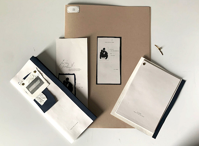
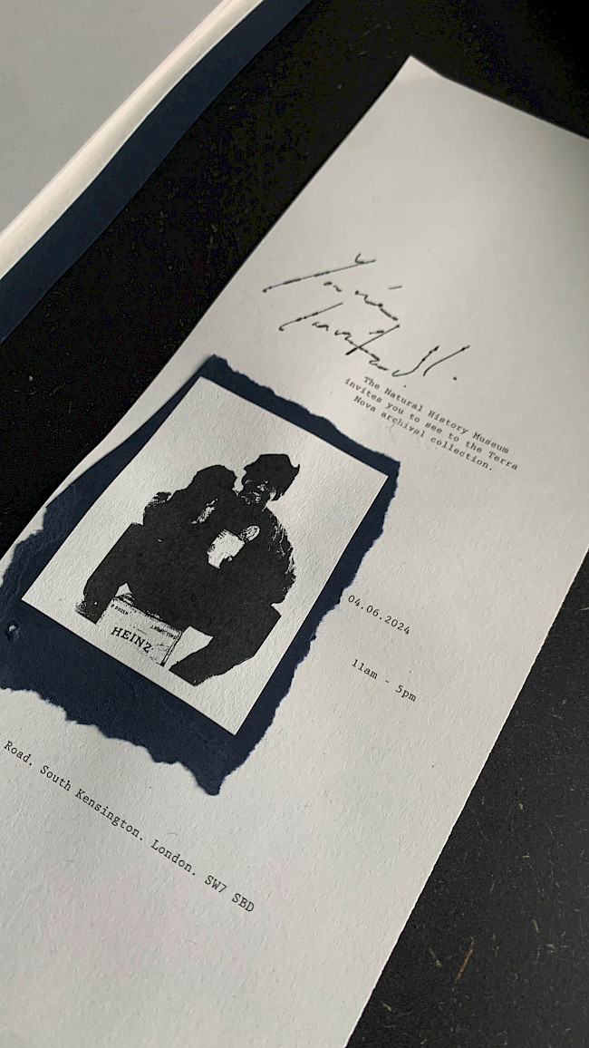
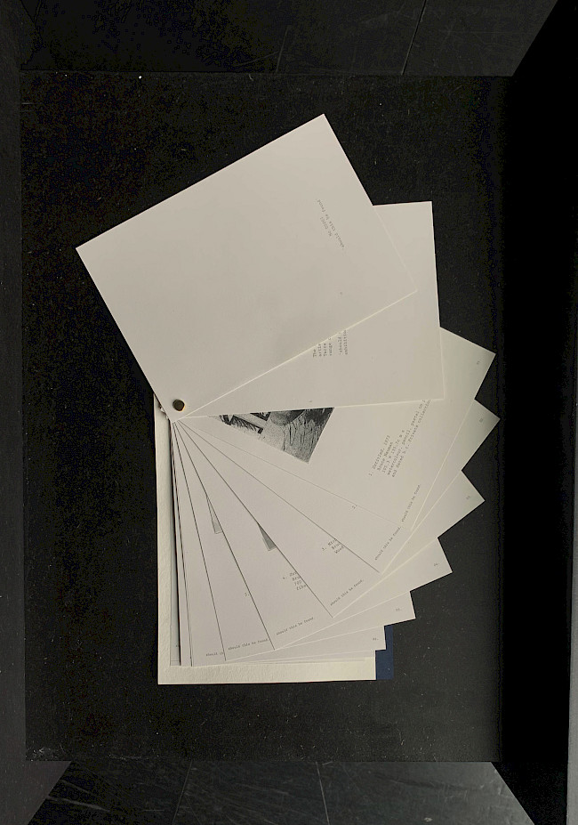
Should this be found
Katie Gibson
Should this be found
Katie Gibson
Should this be found
Katie Gibson
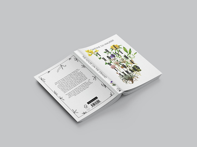
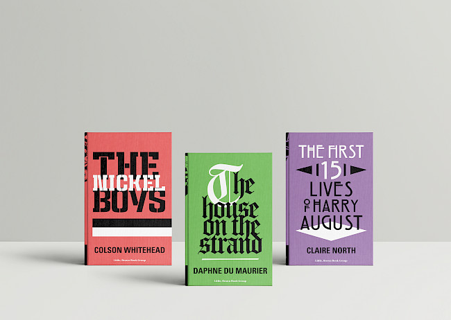
The House On The Strand
Vyk Hargreaves
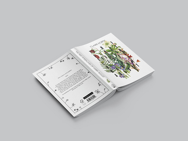
The First Fifteen Lives of Harry August
Vyk Hargreaves
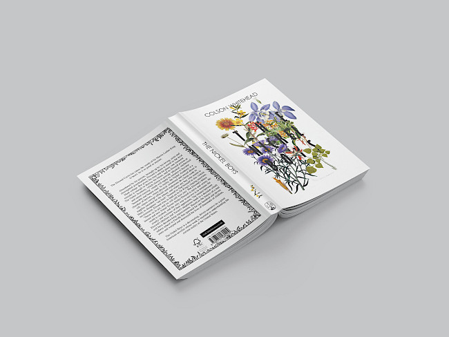
The Nickel Boys
Vyk Hargreaves
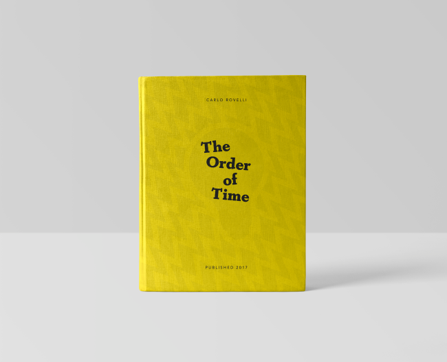
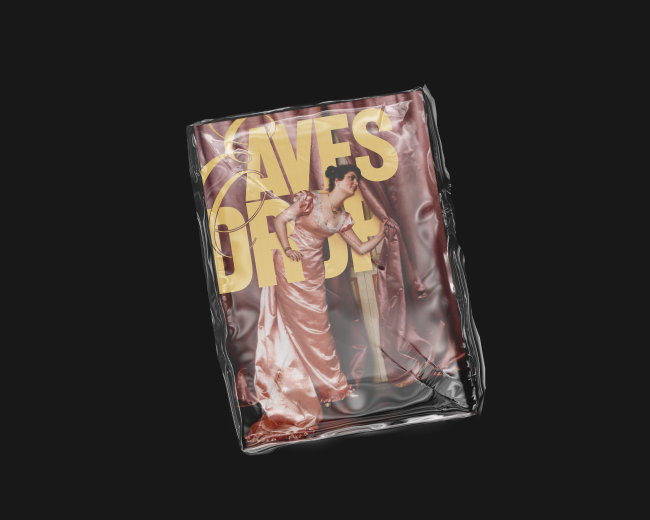
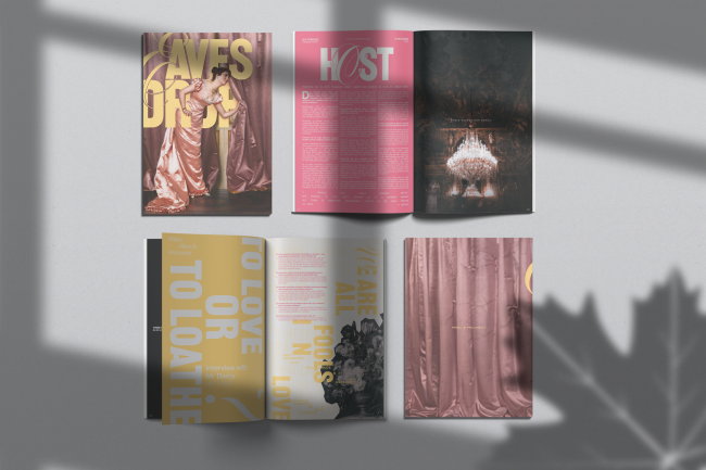
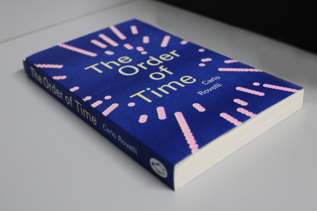
The Order of Time Book Cover
Charlie Flanagan
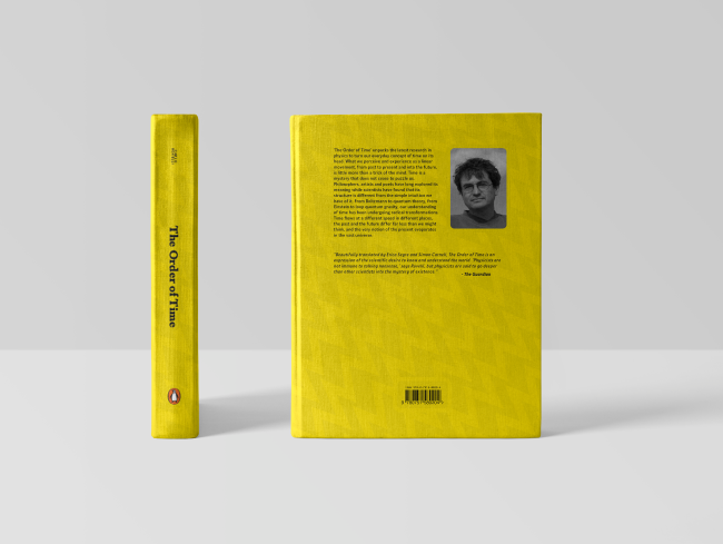
The Order of Time Book Cover
Charlie Flanagan
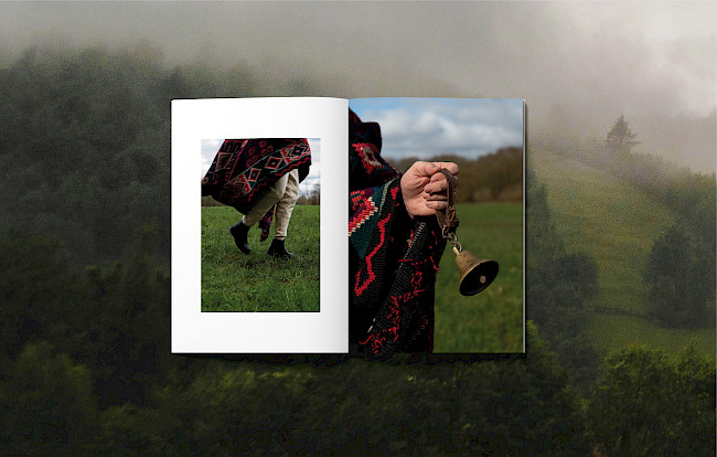
The Goat
Teodora Bracau
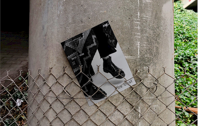
The Goat
Teodora Bracau
Residue Magazine
Lu Michaela
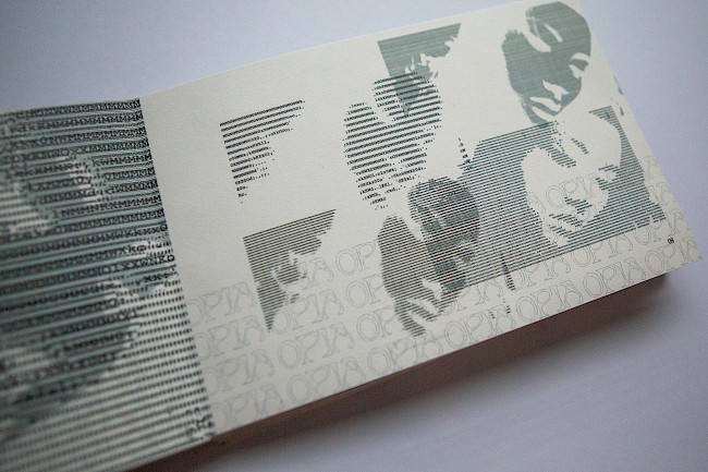
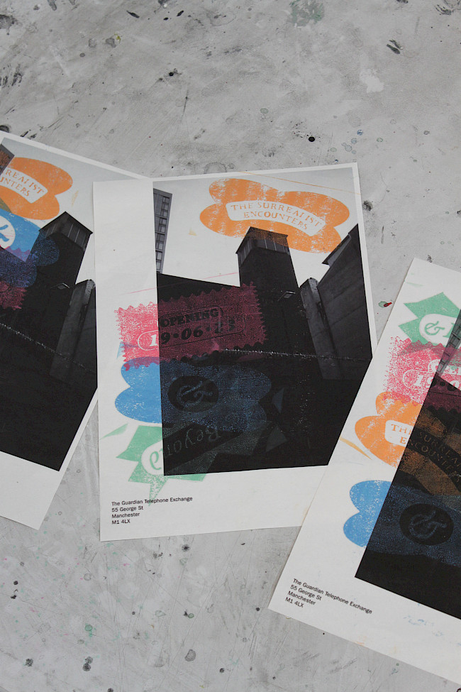
Opia Film Festival
Lu Michaela
Unearthed
Hannah Whitworth
Unearthed with Dustcover
Hannah Whitworth
Unearthed
Hannah Whitworth
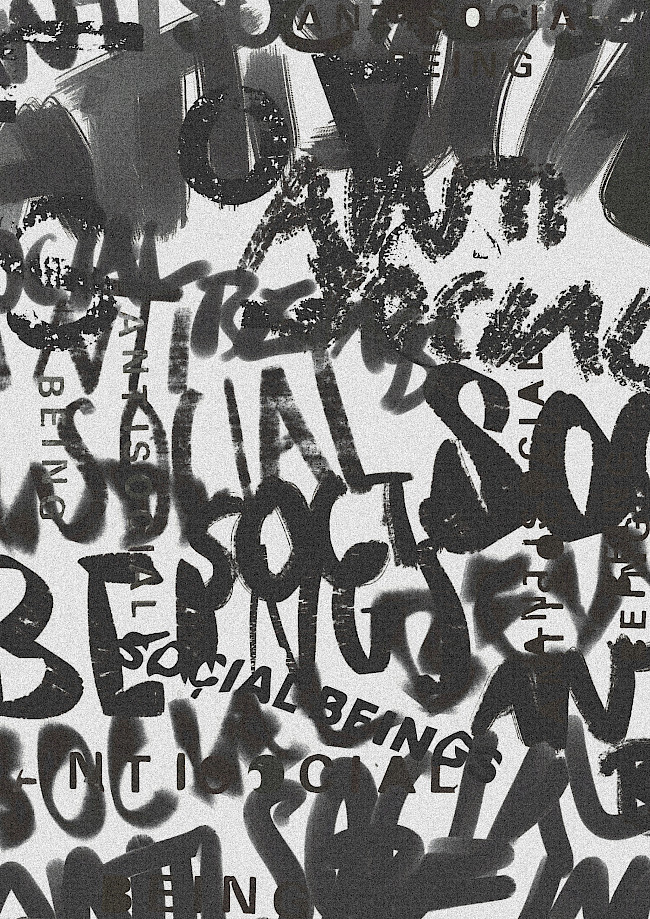
This space may be used for communication
Hannah Whitworth
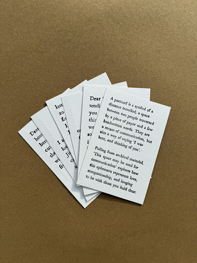
This space may be used for communication
Hannah Whitworth
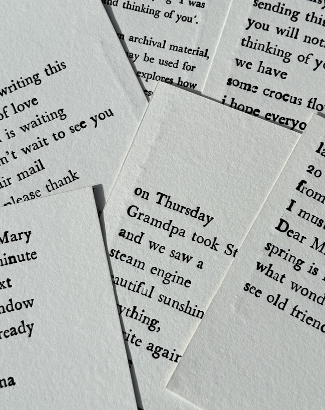
this space may be used for communication
Hannah Whitworth
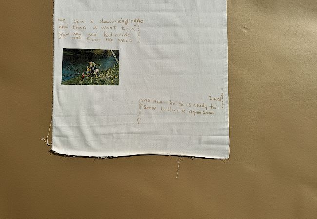
This space may be used for communication
Hannah Whitworth
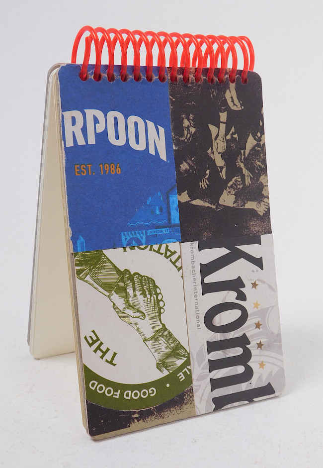
THE RPOONKromb
Hannah Whitworth

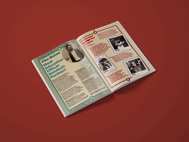
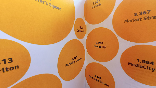
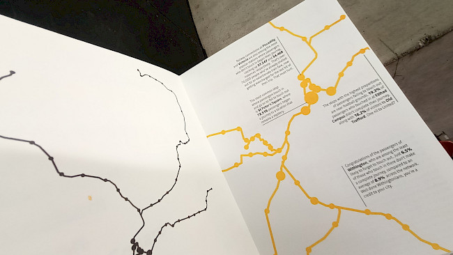
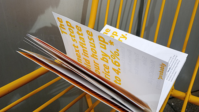
Mind The Gap
Justin Poh Keng Hoe
Mind The Gap
Justin Poh Keng Hoe
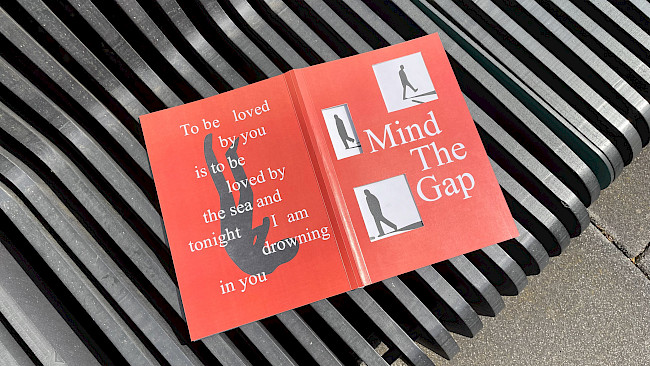
Mind The Gap
Justin Poh Keng Hoe
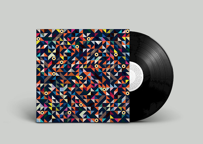
G.F Smith Portal
Justin Poh Keng Hoe
G.F Smith Portal
BB Przewlocka
G.F Smith Portal
BB Przewlocka
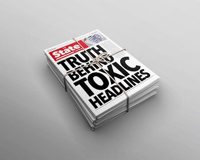
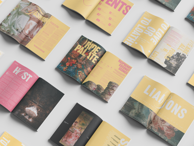
The State We're In
Faye Byrne
Book covers
Faye Byrne
Crowded House
Holly Yarwood
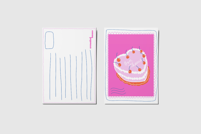
Crowded House
Holly Yarwood
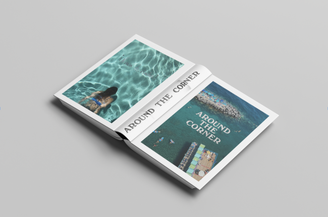
Around the corner
Holly Yarwood
Around the corner
Holly Yarwood
Around the corner
Holly Yarwood

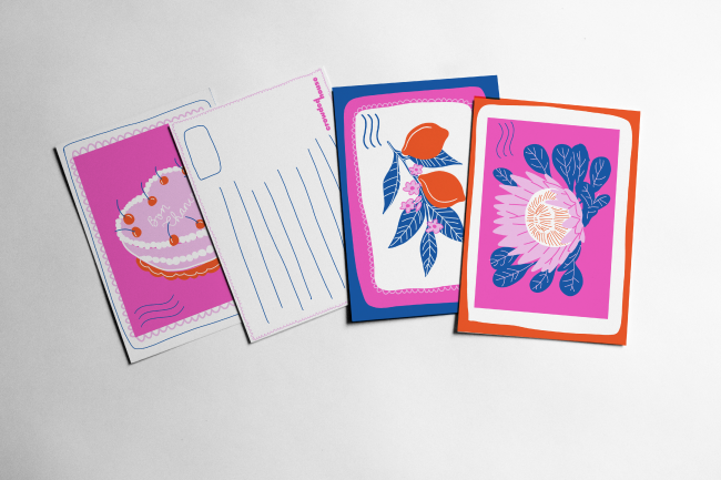
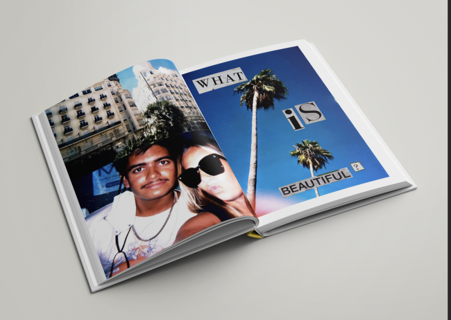
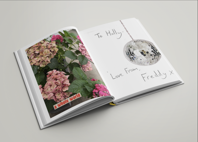
Personal Publication
Noemi Laszkowska
Personal Publication
Noemi Laszkowska
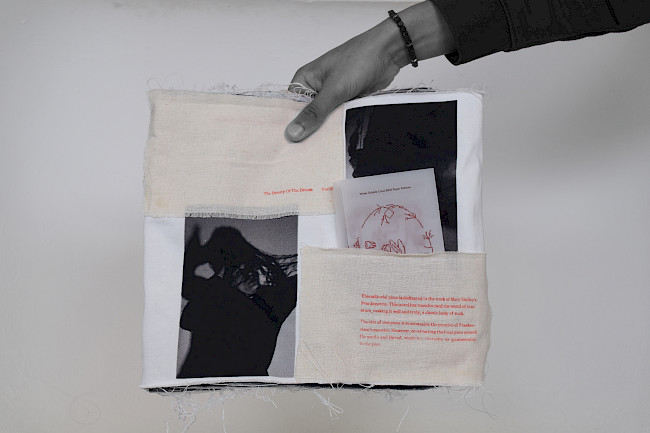
The Beauty Of The Dream... Vanished
Marissa Van Ristell
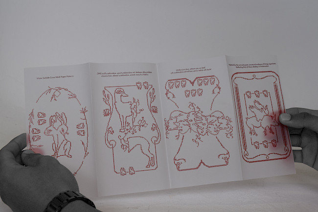
The Beauty Of The Dream... Vanished
Marissa Van Ristell
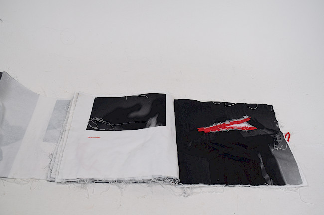
The Beauty Of The Dream... Vanished
Marissa Van Ristell
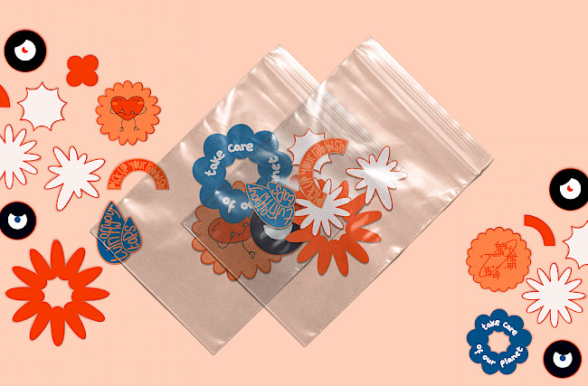
The Unseen Zine
Marissa Van Ristell
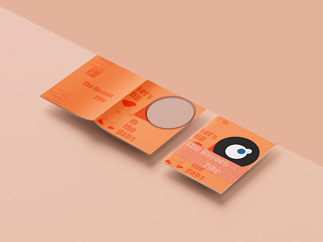
The Unseen Zine
Marissa Van Ristell
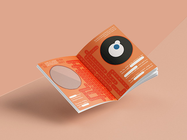
The Unseen Zine
Marissa Van Ristell

The Space Between
Marissa Van Ristell
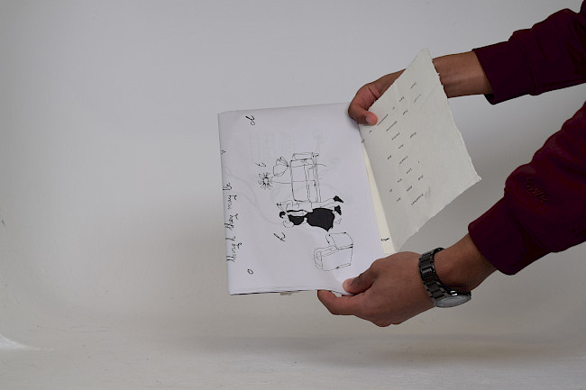
The Space Between
Marissa Van Ristell
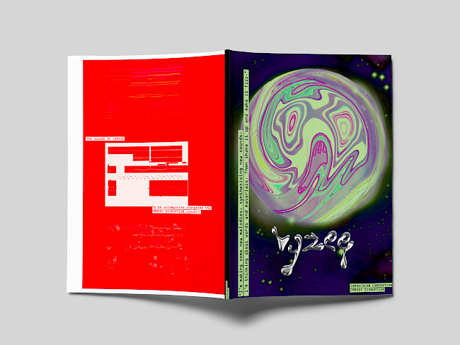
VYZEE: Embody Disruption
Marissa Van Ristell
VYZEE: Embody Disruption
Marissa Van Ristell
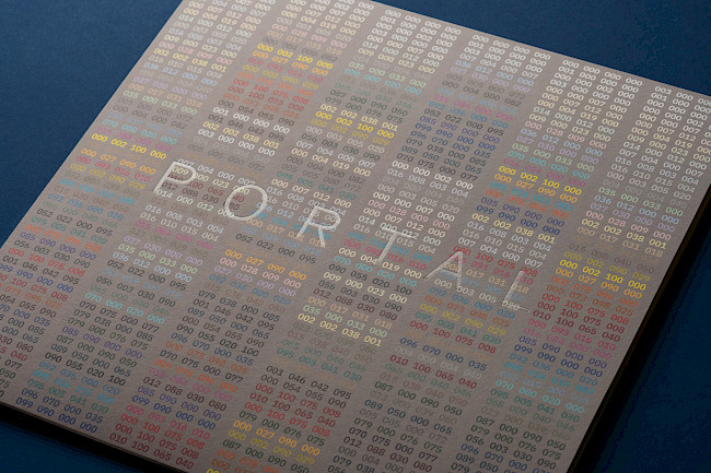
G.F Smith Portal
Bradley Sansom
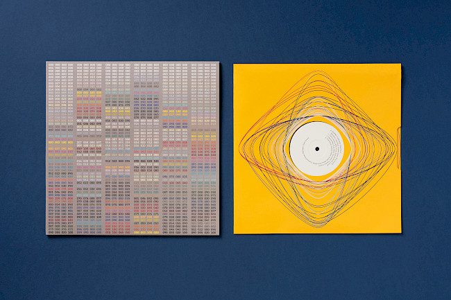
G.F Smith Portal
Bradley Sansom
G.F Smith Portal
Bradley Sansom
G.F Smith Portal
Bradley Sansom
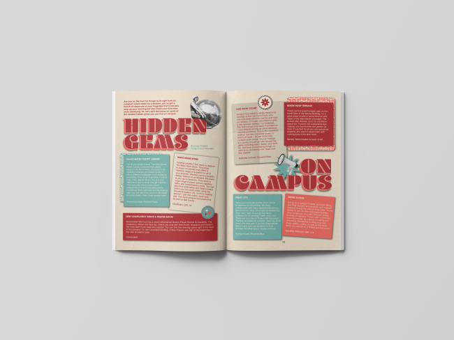
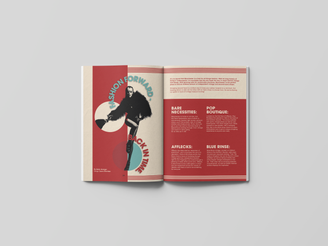
aAh! FRESHERS Issue
Bradley Sansom
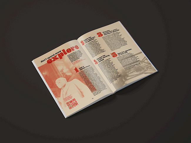
aAh! FRESHERS Issue
Bradley Sansom
aAh! FRESHERS Issue
Bradley Sansom
aAh! FRESHERS Issue
Bradley Sansom
Bradley Sansom
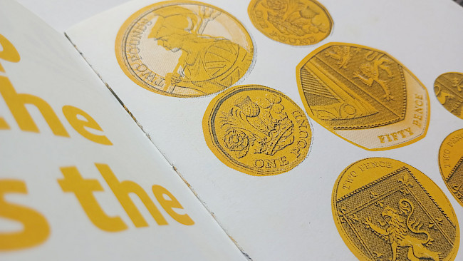
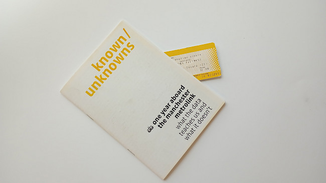
known/unknowns
Bradley Sansom
known/unknowns
Bradley Sansom
known/unknowns
Bradley Sansom
known/unknowns
Bradley Sansom
Squared
Amber Degirmencioglu
Cherry
Amber Degirmencioglu
G.F Smith Portal
Amber Degirmencioglu
G.F Smith Portal
Amber Degirmencioglu
G.F Smith Portal
Amber Degirmencioglu
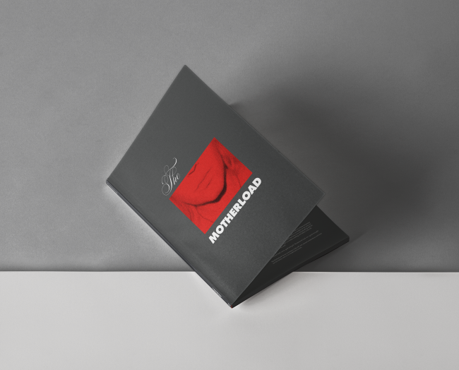
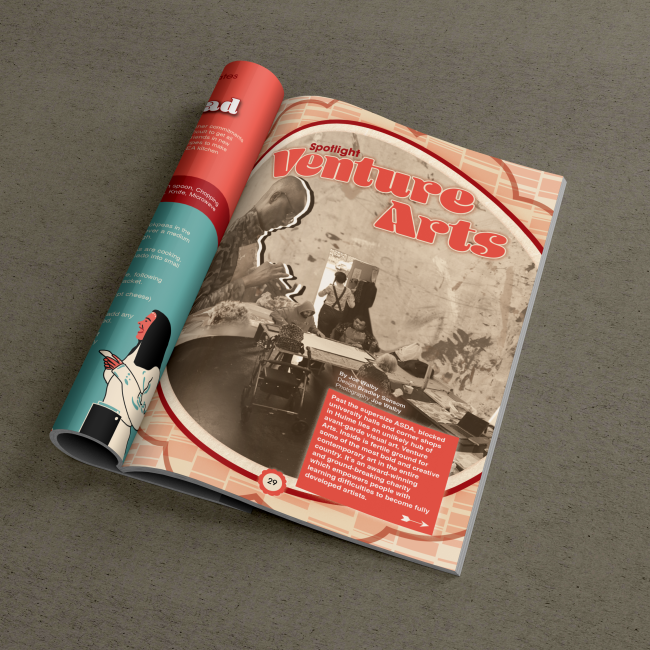
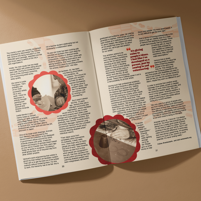
The Motherload
Laura Sheridan
The Motherload
Laura Sheridan
aAh! FRESHERS Issue
Laura Sheridan
aAh! FRESHERS Issue
Laura Sheridan
G.F Smith Portal
Laura Sheridan
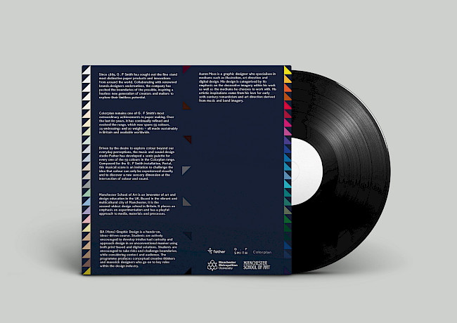
Life, death, and permanence
Aaron Moss
Life, death, and permanence
Aaron Moss
G.F Smith Portal
Aaron Moss
G.F Smith Portal
Aaron Moss
Eve Pemrick
Eve Pemrick
Eve Pemrick
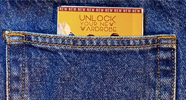
Unlock your new wardrobe
Arpita Jhajharia
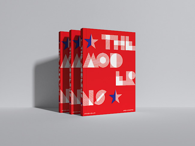
The Moderns
Ciara Paterson
G.F Smith Portal
Ciara Paterson
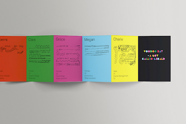
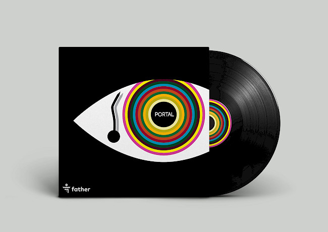
Voodoo Ray
Ciara Paterson
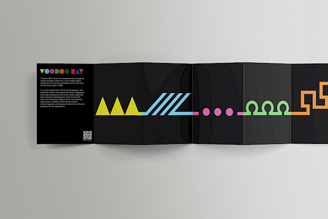
Voodoo Ray
Ciara Paterson
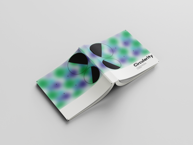
Circularity
Vanessa Neri
Circularity
Vanessa Neri
Circularity
Vanessa Neri
Link book
Vanessa Neri
Link book
Vanessa Neri
G.F Smith Portal
Vanessa Neri
G.F Smith Portal
Vanessa Neri
Curry Mile zine
Louis Joseph
Curry Mile zine
Louis Joseph
Curry Mile zine
Louis Joseph
Brochure
Maurice Carter
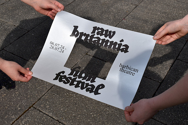
Raw Britannia
Annie Pugsley
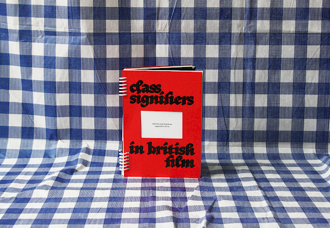
Class Signifiers in British Film
Annie Pugsley
Melting Point
Annie Pugsley
Rainmakers
Grace Parnell
Fast Fashion
Grace Parnell
Fast Fashion
Grace Parnell
G.F Smith Portal
Jack Dean
Giovannis Room
Jack Dean
Opia
LJ Mascall
Opia
LJ Mascall
Opia
LJ Mascall
Opia
LJ Mascall
Opia
LJ Mascall
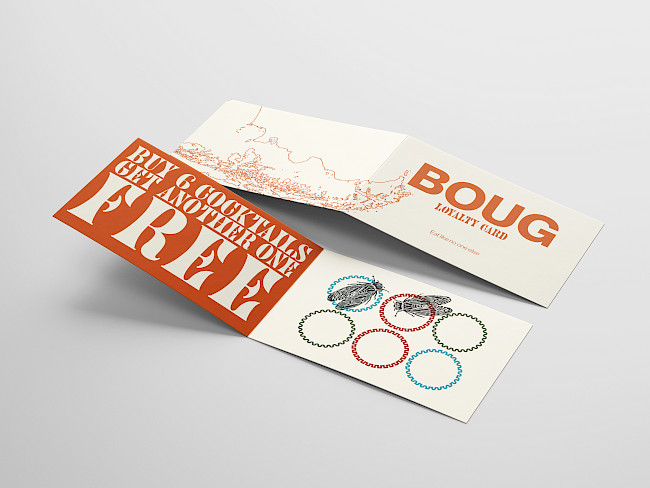
Boug
Kian Repsys
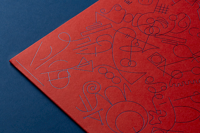
G.F Smith Portal
Connie Wooddisse
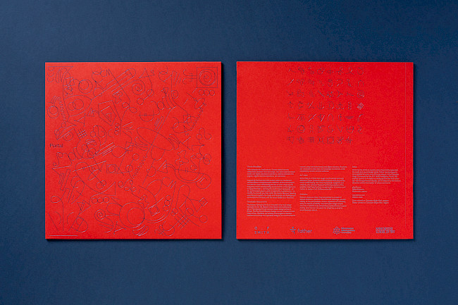
G.F Smith Portal
Connie Wooddisse
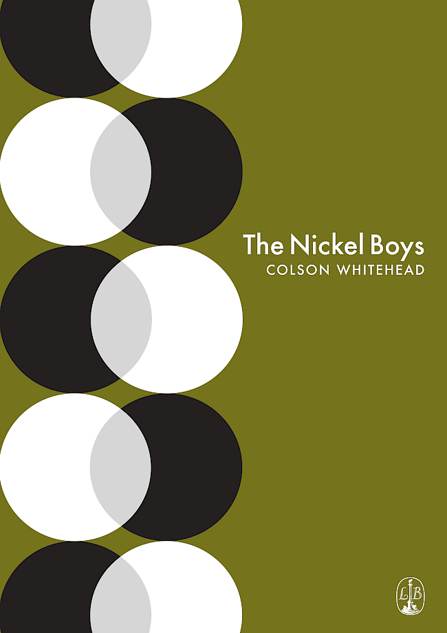
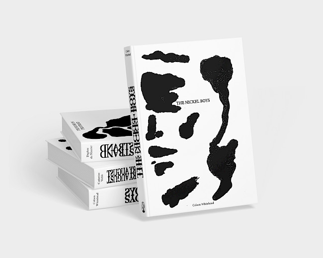
The Nickel Boys
Connie Wooddisse
Metropol
Connie Wooddisse
Metropol
Connie Wooddisse
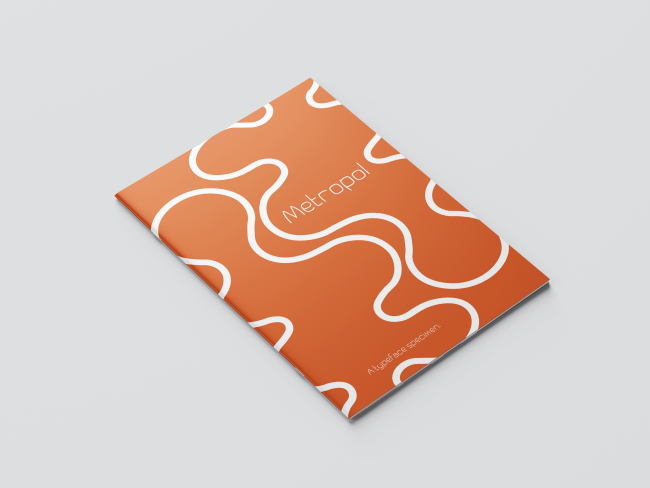
Metropol
Connie Wooddisse
G.F Smith Portal
Sophia Cimelli
G.F Smith Portal
Sophia Cimelli
Silver Swans
Maddie Clayton
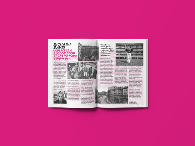
aAh! Richard Davis spread
Maddie Clayton
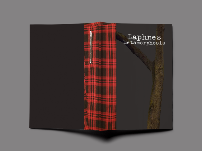
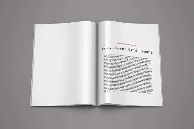
Daphne's Metamorphosis
Tyla Harwood
Daphne's Metamorphosis
Tyla Harwood
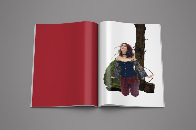
Daphne's Metamorphosis
Tyla Harwood
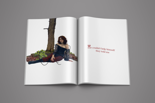
Daphne's Metamorphosis
Tyla Harwood
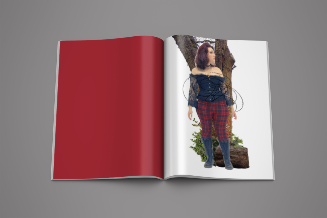
Daphne's Metamorphosis
Tyla Harwood
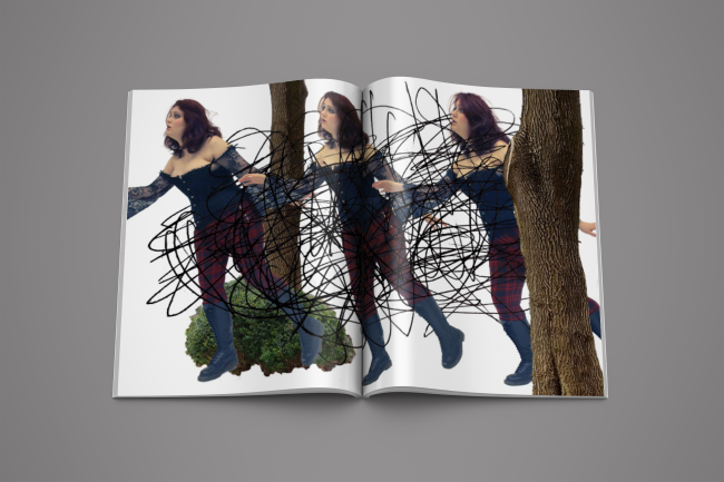
Daphne's Metamorphosis
Tyla Harwood
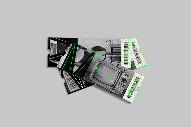
Cloud Factory
Anita Belous
Mindset
Anita Belous
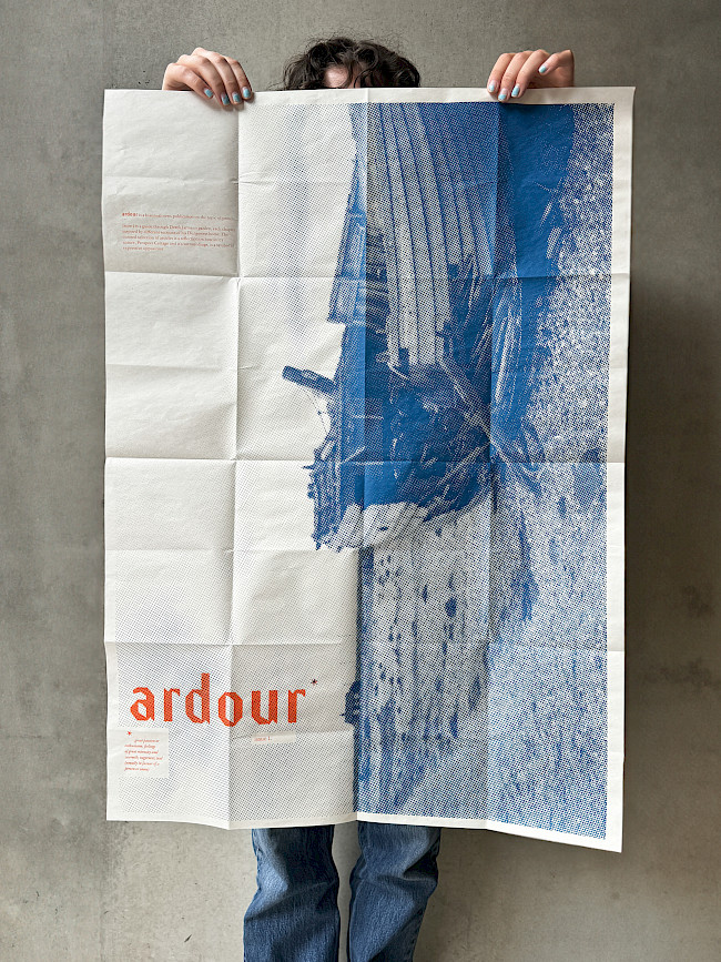
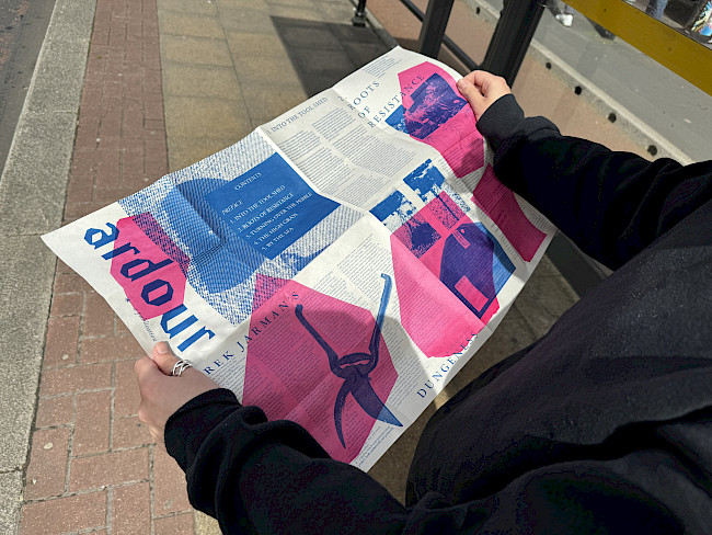
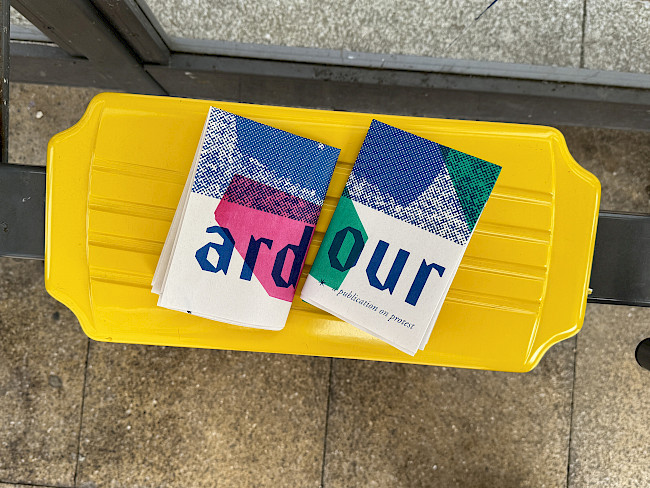
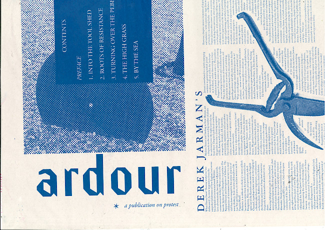
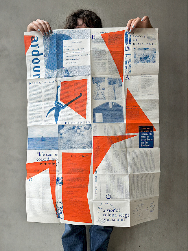
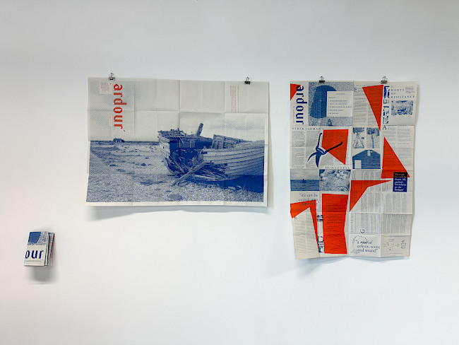
Ardour
Roxy Luke

Ardour
Roxy Luke
Ardour
Roxy Luke

Ardour
Roxy Luke
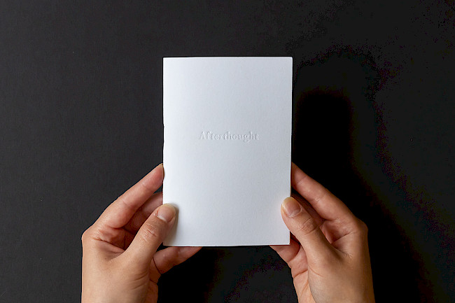
Afterthought
Roxy Luke
Afterthought
Roxy Luke
Afterthought
Roxy Luke
Afterthought
Roxy Luke
Ardour
Roxy Luke
Ardour
Roxy Luke
Ardour
Roxy Luke
Seaweave
Roxy Luke
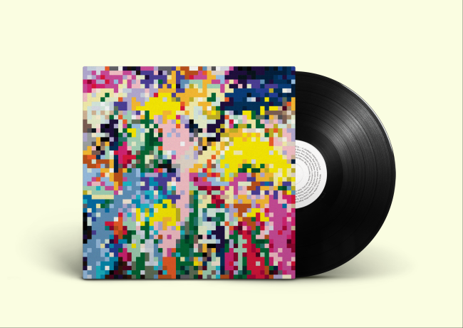
G.F Smith Portal sleeve
Adomas Lukas Petrauskas
G.F Smith portal sleeve
Adomas Lukas Petrauskas
Orenda witch museum
Erin Parkes

G.F Smith Portal
Jamie Gough
Ardour
Bibi Lola Lewin-Sanderson

Ardour
Bibi Lola Lewin-Sanderson
Ardour
Bibi Lola Lewin-Sanderson

Ardour
Bibi Lola Lewin-Sanderson
&Beyond
Bibi Lola Lewin-Sanderson
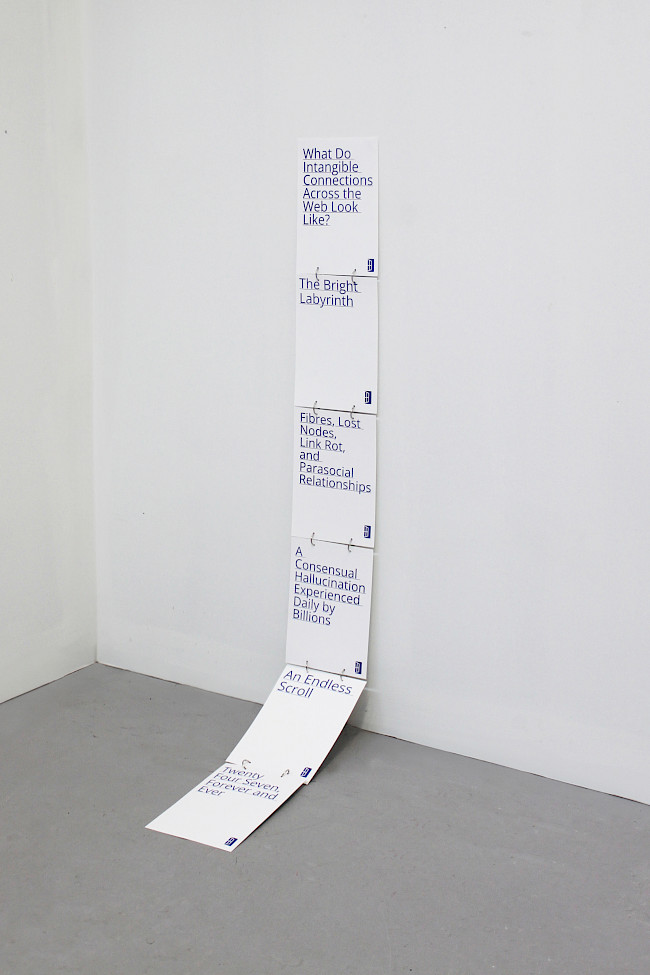
Hyperlink
Bibi Lola Lewin-Sanderson
The Great Stir
Bibi Lola Lewin-Sanderson
The Great Stir
Bibi Lola Lewin-Sanderson
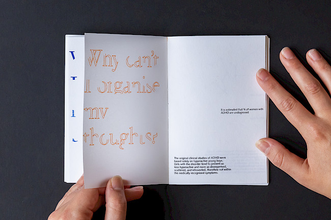
Metamorphosis through diagnosis
Evie Sonnentanz
Metamorphosis through diagnosis
Evie Sonnentanz
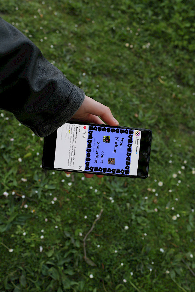
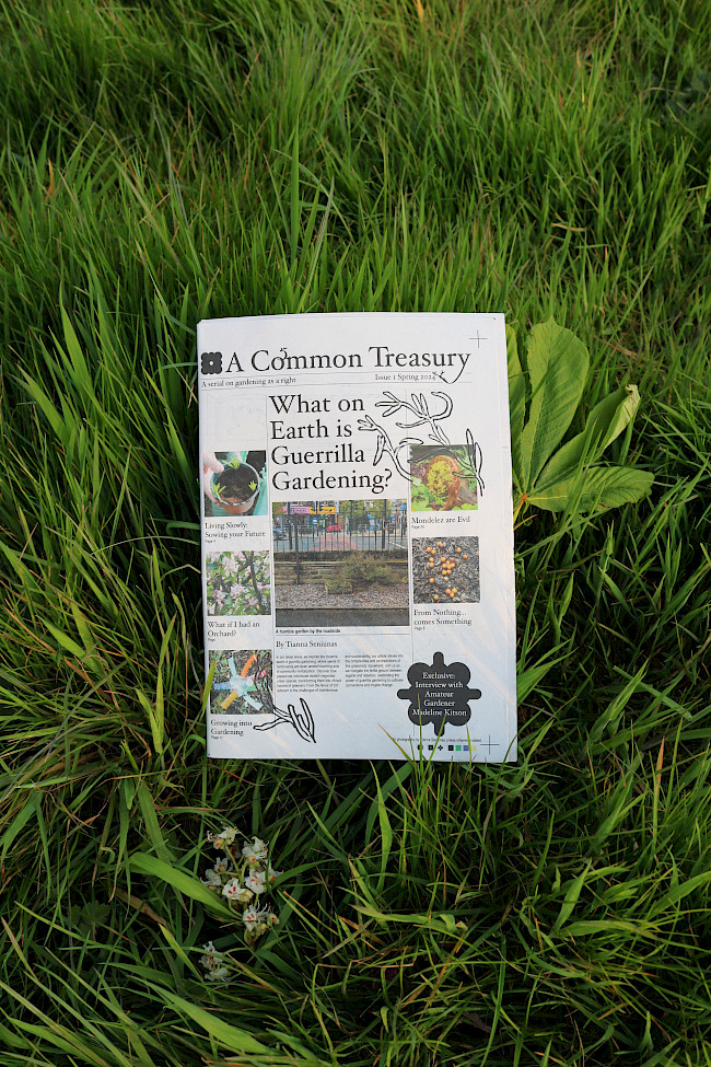
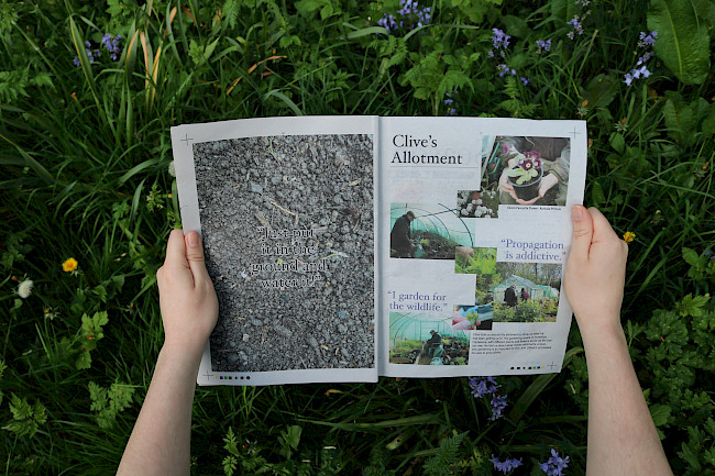
A Common Treasury
Tianna Seniunas
A Common Treasury
Tianna Seniunas
A Common Treasury
Tianna Seniunas
Time and Space
Tianna Seniunas
Time and Space
Tianna Seniunas
Time and Space
Tianna Seniunas
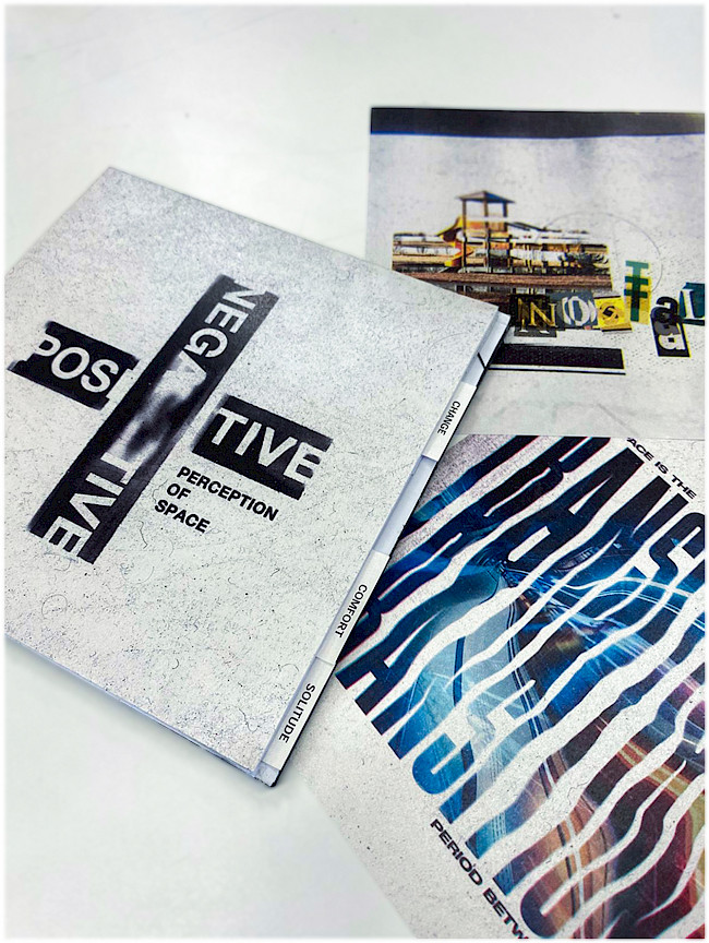
Negative and positive
Lucian Florea
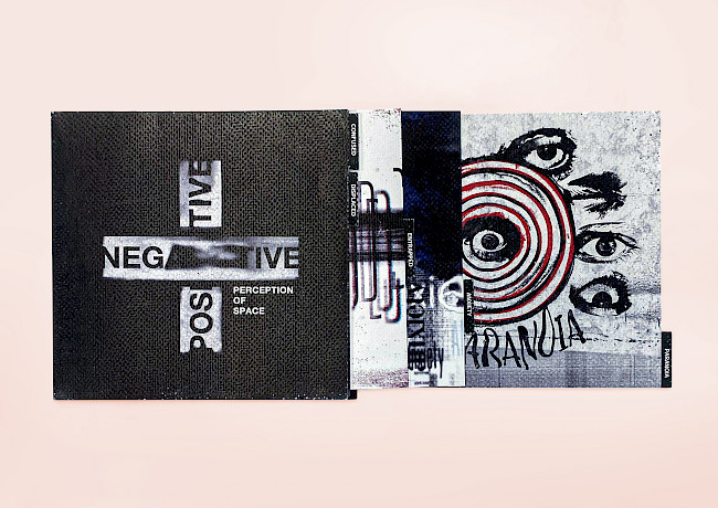
Negative and positive
Lucian Florea
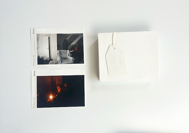
Becoming You
Isobel Richardson
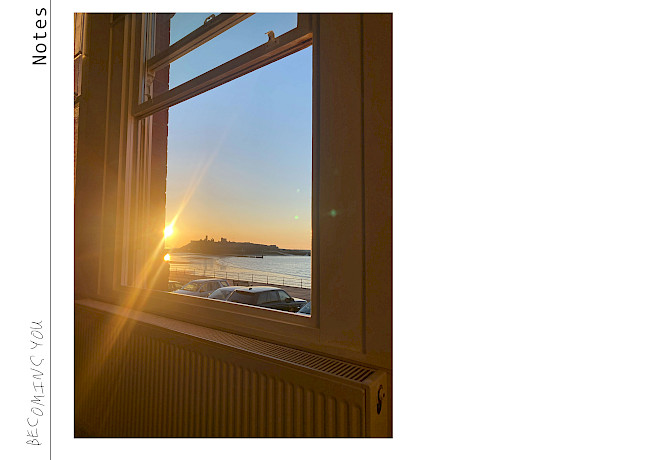
Becoming You
Isobel Richardson
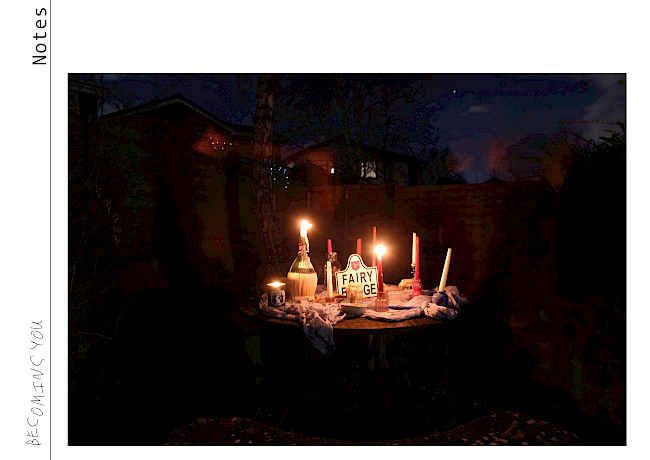
Becoming You
Isobel Richardson
ZOR film festival
Trishna Kaur
ZOR film festival
Trishna Kaur
Penguin series
Trishna Kaur
Penguin series
Trishna Kaur

Vex or Verity
Trishna Kaur
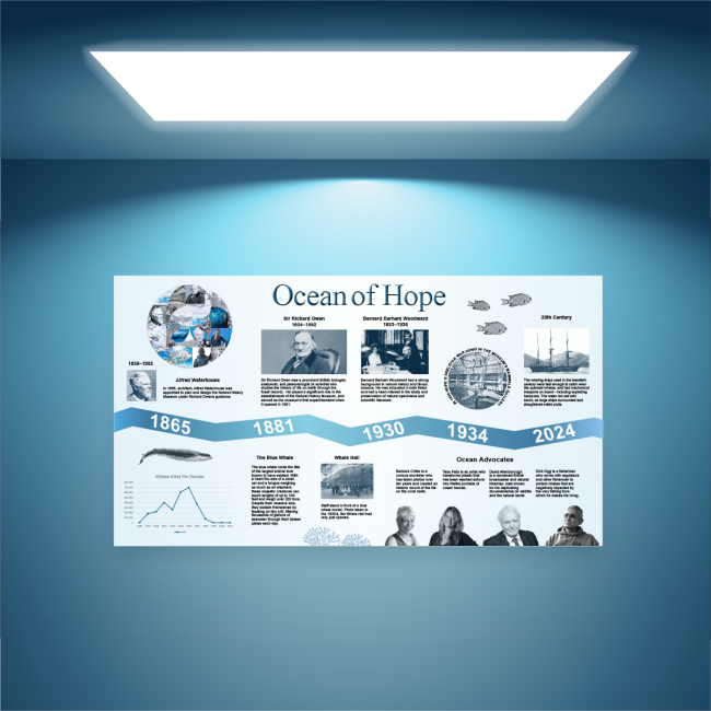
Ocean of Hope
Michelle Beaver
G.F Smith Portal
Michelle Beaver
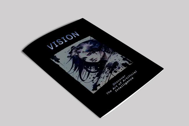
Vision magazine
Michelle Beaver
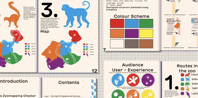
Chester Zoo Wayfinding booklet
Rachel Topping
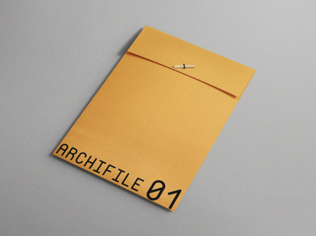
Archifile
Rachel Topping
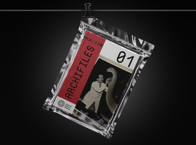
Archifile
Rachel Topping
MOVE Museum
Rachel Topping
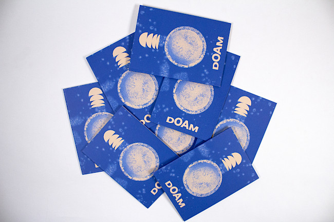
Doam
Igor Kijko
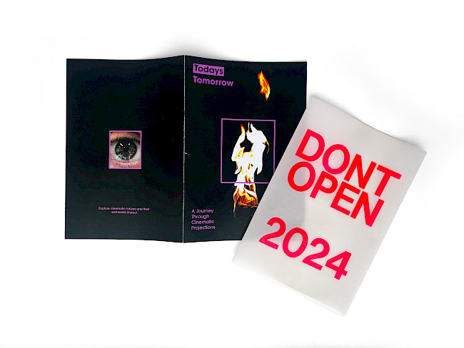
Todays Tomorrow Film Festival
Igor Kijko
Todays Tomorrow Film Festival
Igor Kijko
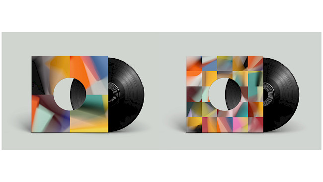
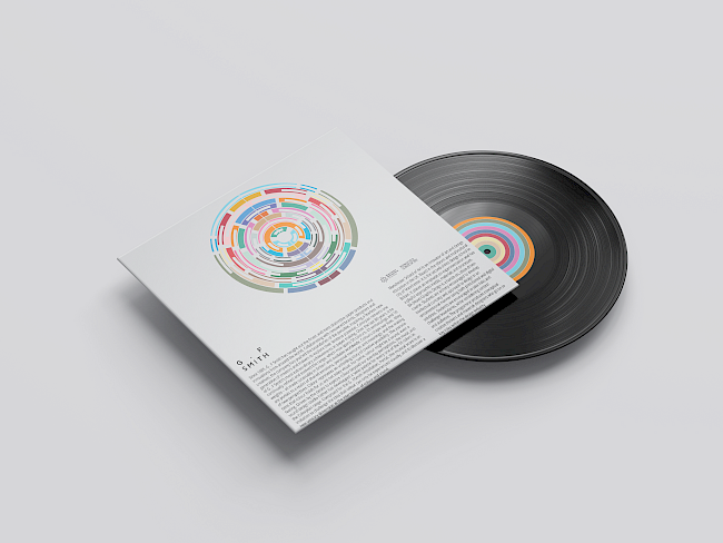
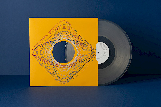
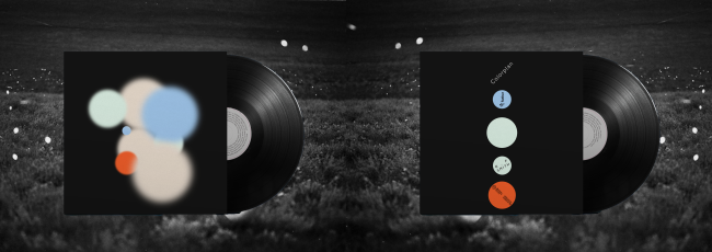
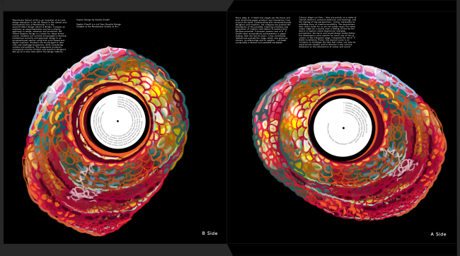
G. F Smith Portal Vinyl Cover
Igor Kijko
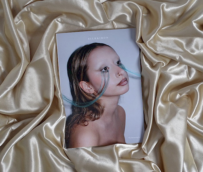
Silk and Iron
Eia Hopkinson
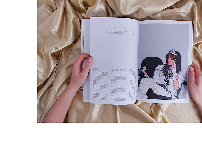
Silk and Iron
Eia Hopkinson
Perennial
Eia Hopkinson
In the absence of now
Luca Briggs
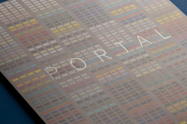
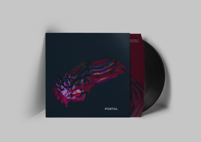
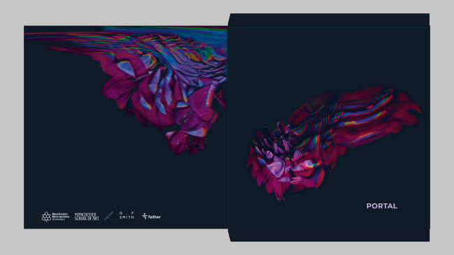
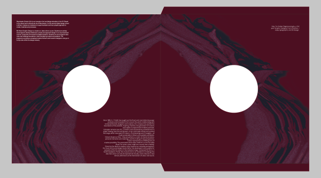
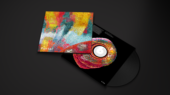
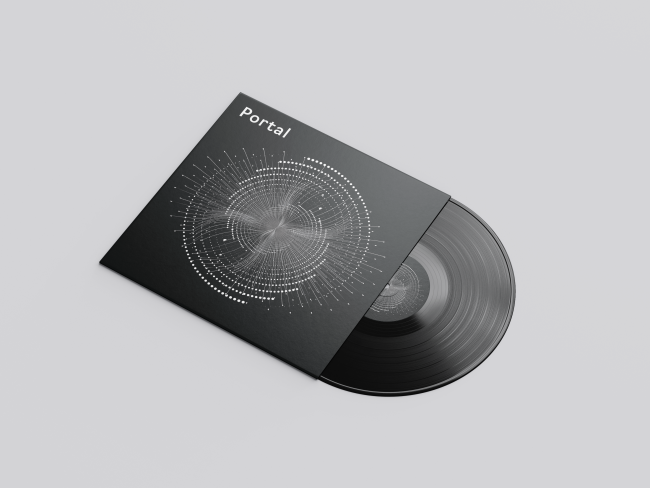
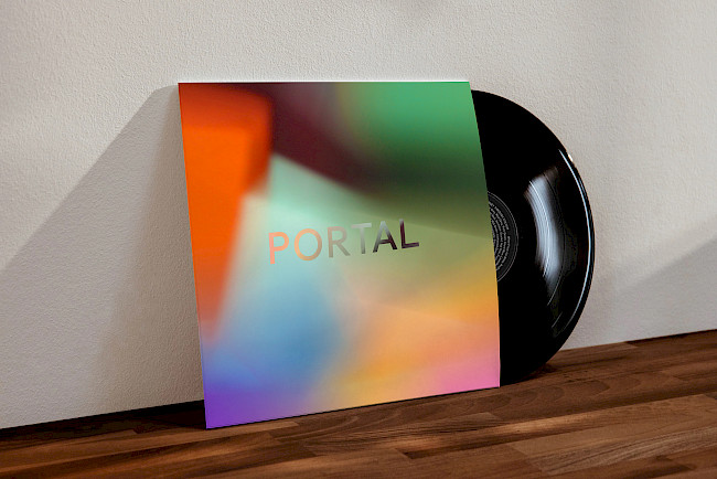
Portal
Luca Briggs
Portal
Luca Briggs
When I Rise
Jude Wakeley
When I Rise
Jude Wakeley