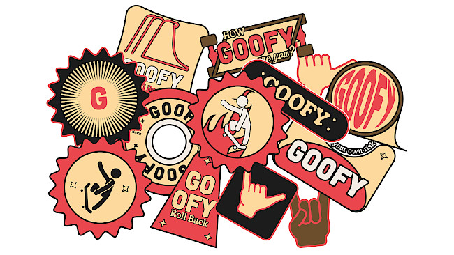
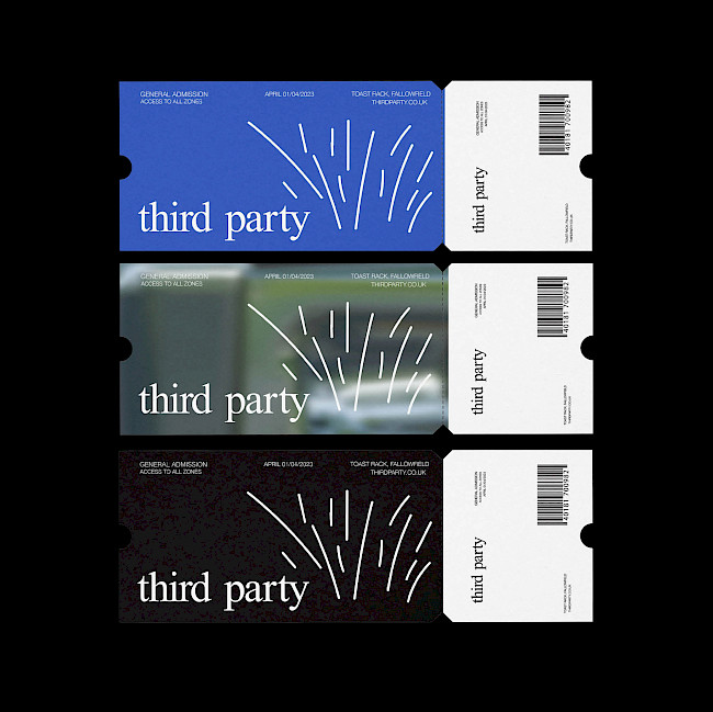
Goofy
Kian Repsys
Goofy
Kian Repsys
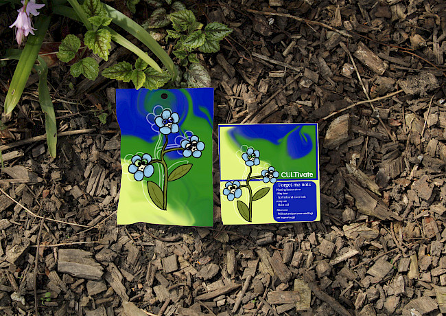
CULTivate
Isobel Richardson
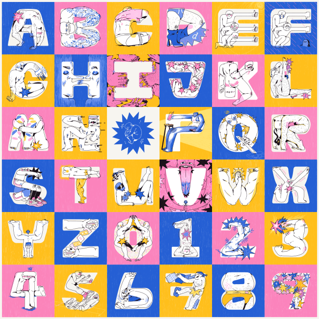
36 days of type
Jack Dean
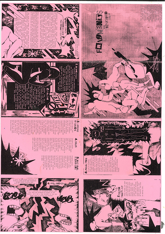
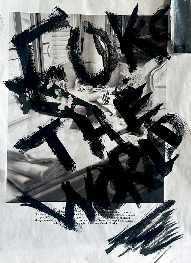
Fragments
Jack Dean
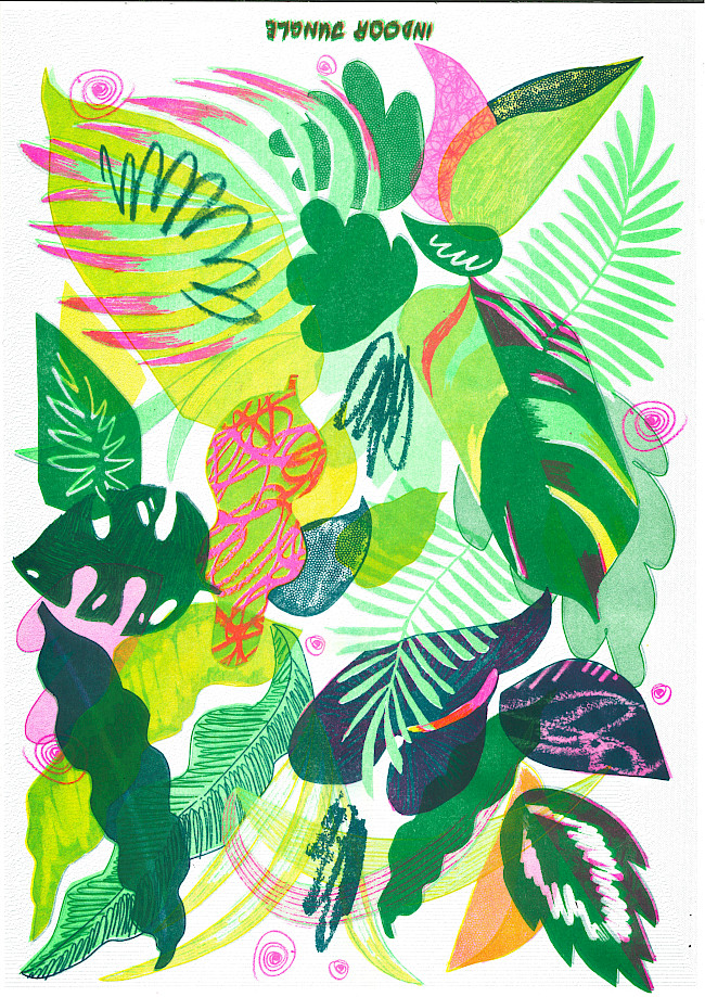
Plant pals
Jack Dean
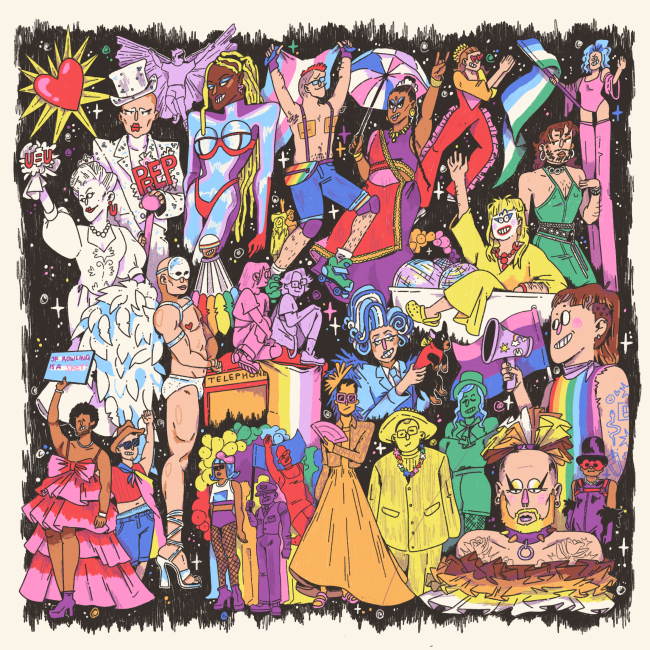
Pride illustration
Jack Dean
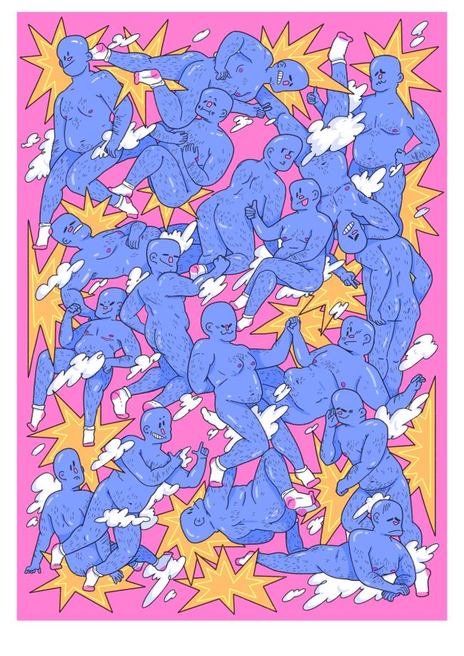
Show Off
Jack Dean
See Yourself
Jack Dean
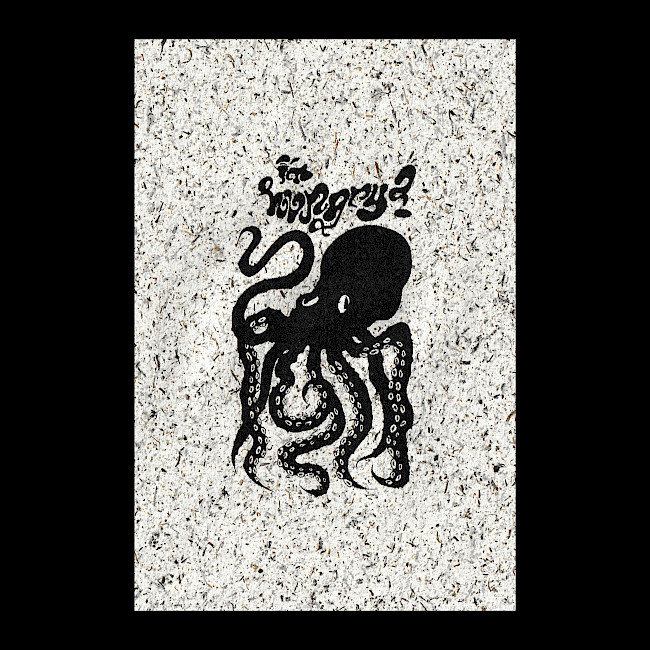
Octopus
Abbie Knipe
Space Separation and play
Aleysha Saddiq
Space Separation and play
Aleysha Saddiq
Reinventing a Classic
Aleysha Saddiq
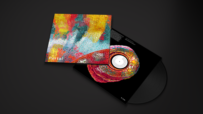
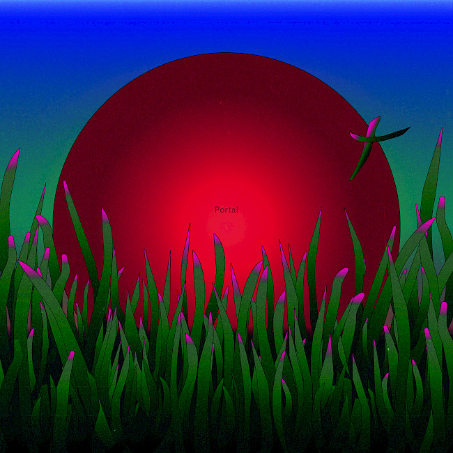
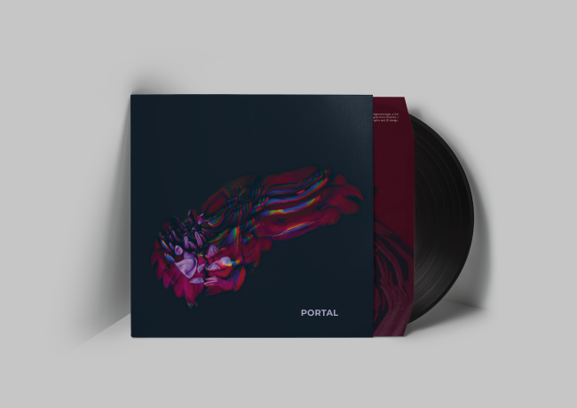
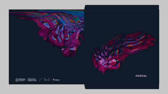
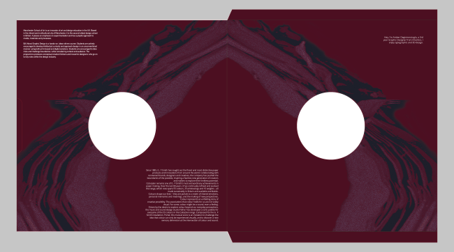
G.F Smith Portal
Sophia Cimelli
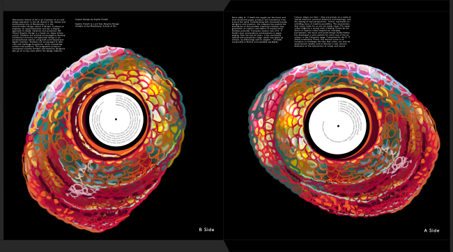
G.F Smith Portal
Sophia Cimelli
Senor Frogs
Sophia Cimelli
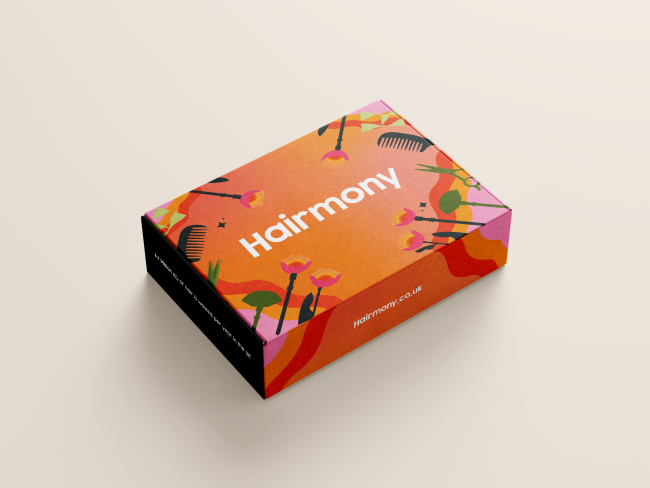
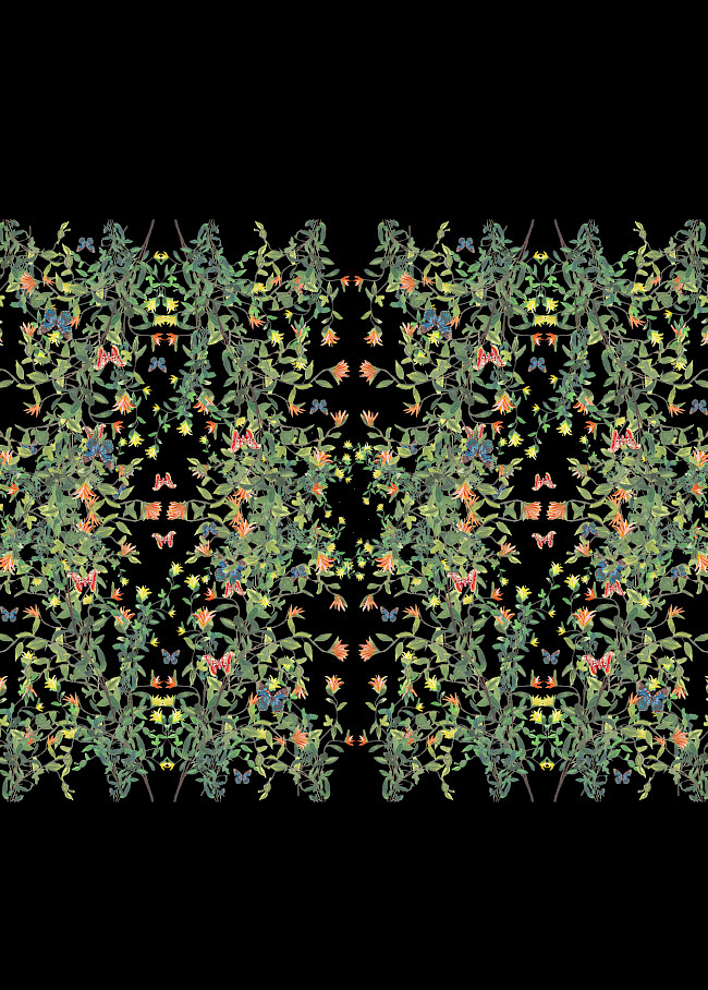
Hairmony
Lauren Banks
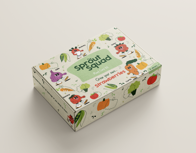
Sprout Squad
Lauren Banks
Please Don't Wake Me
Ruby Porter
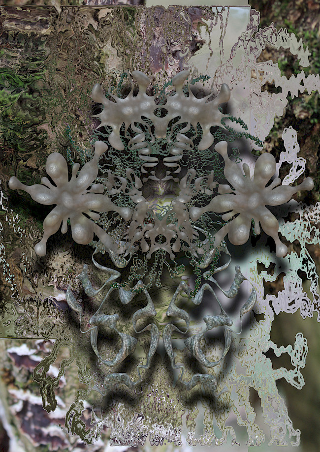
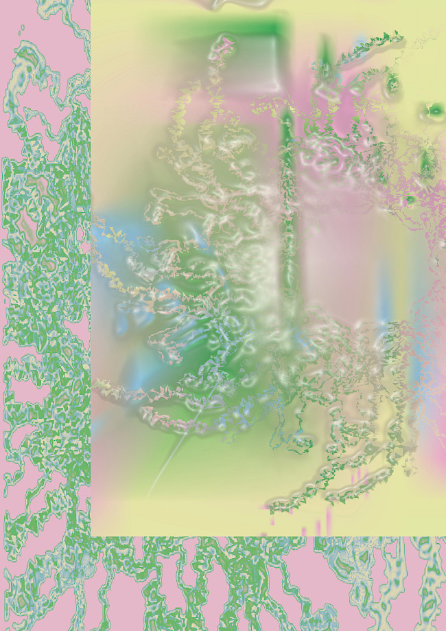
The unnatural world
Ruby Porter
Ruby Porter
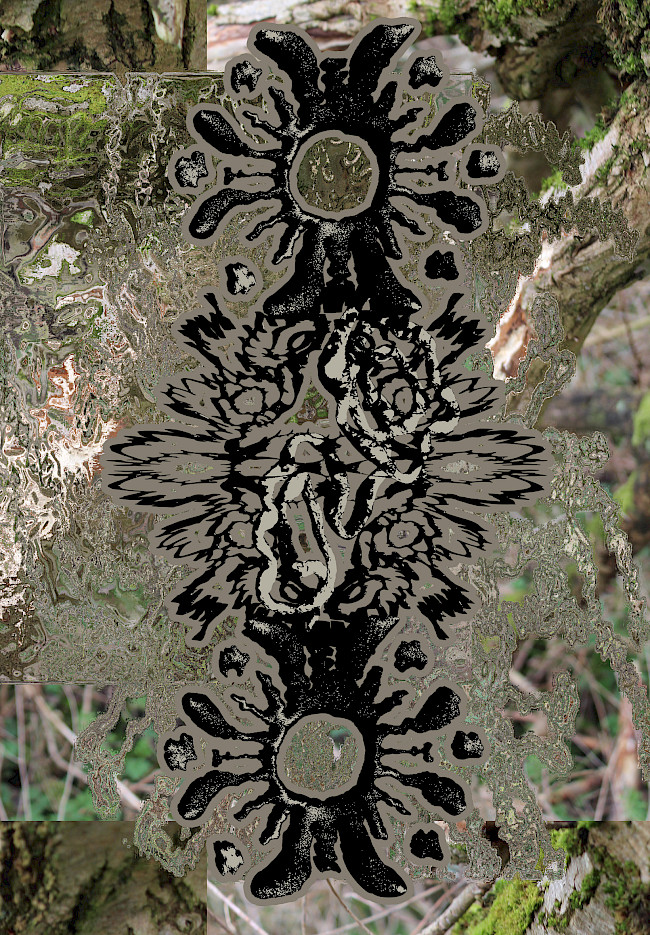
When you rub your eyes too hard
Ruby Porter
G.F Smith Portal
Lu Michaela
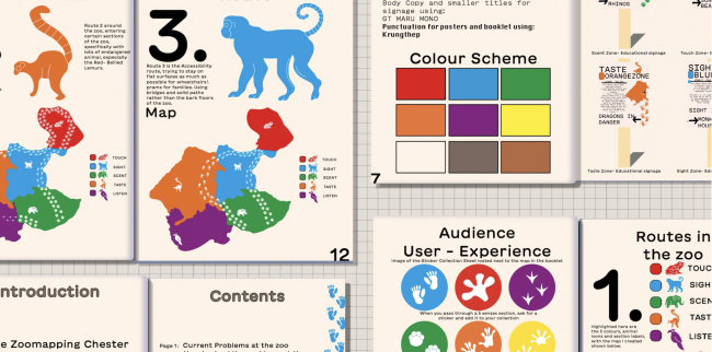
Chester Zoo Wayfinding booklet
Rachel Topping
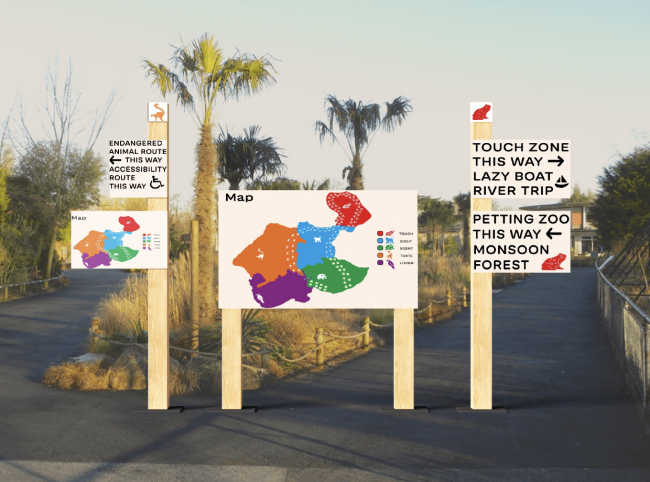
Chester Zoo wayfinding
Rachel Topping
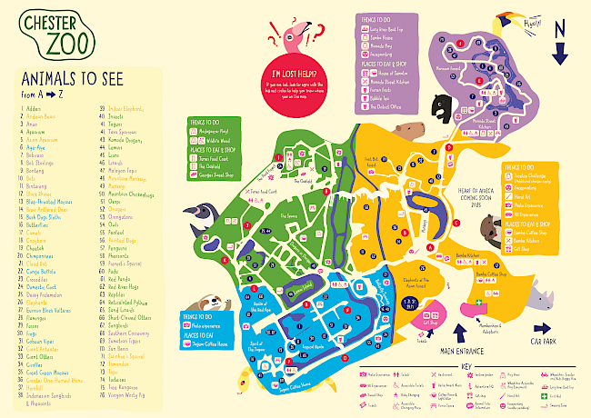
Chester Zoo
Justin Poh Keng Hoe
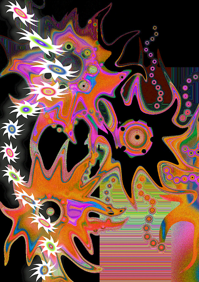
Trapped in Sewage
Adeem Asghar
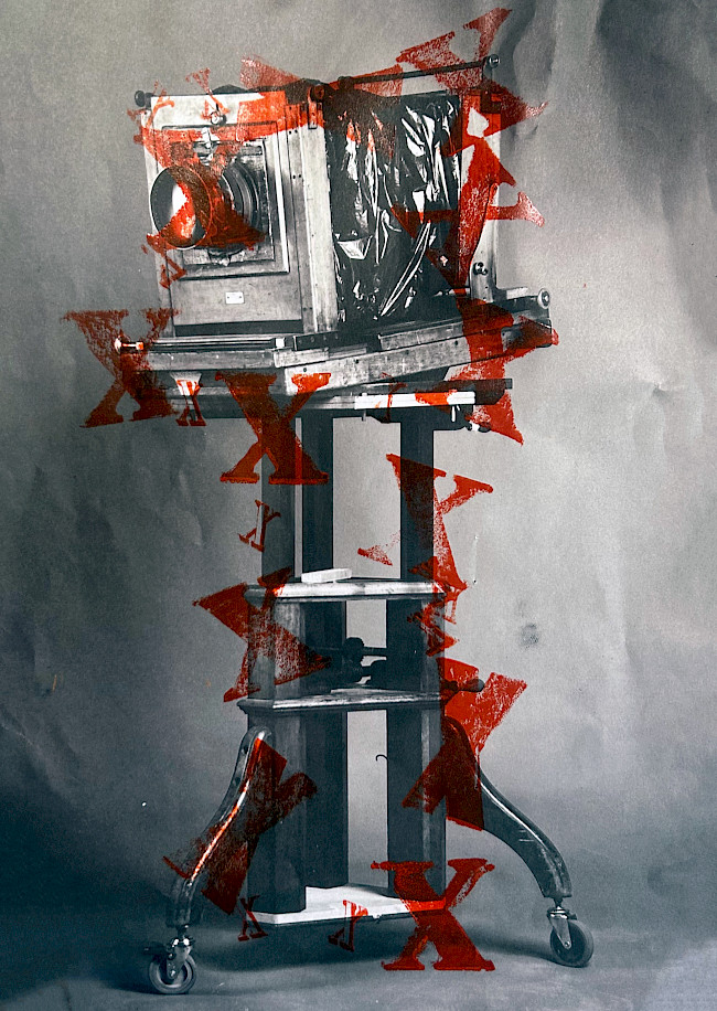
Trapped in sewage
Adeem Asghar
Planet Aura
Adeem Asghar
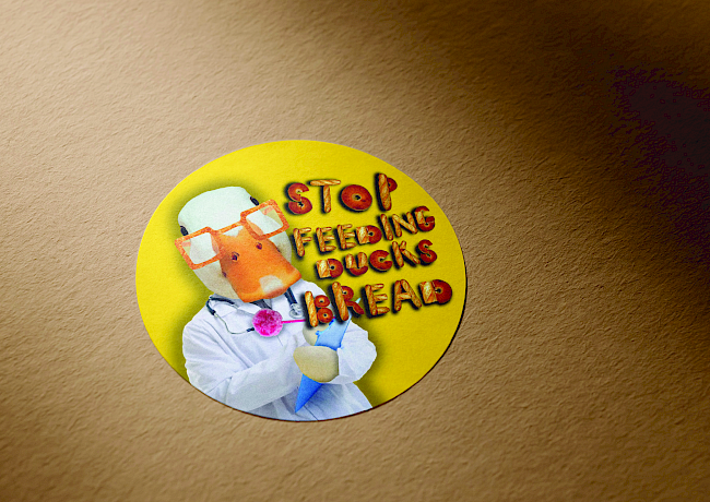
Don't feed the ducks
Hannah Brady
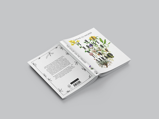
The House On The Strand
Vyk Hargreaves
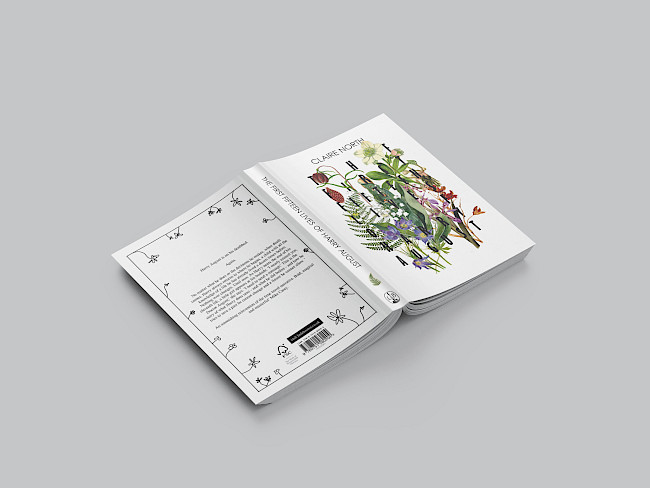
The First Fifteen Lives of Harry August
Vyk Hargreaves
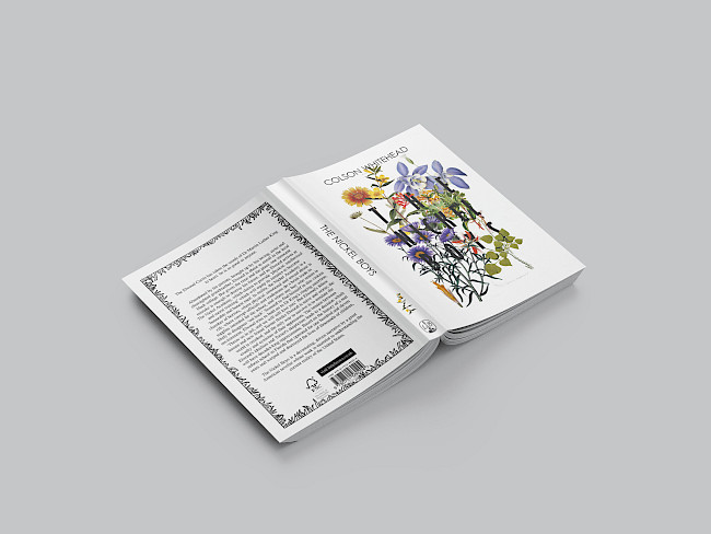
The Nickel Boys
Vyk Hargreaves
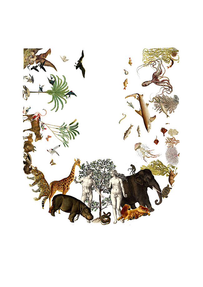
U for Utopia
Vyk Hargreaves
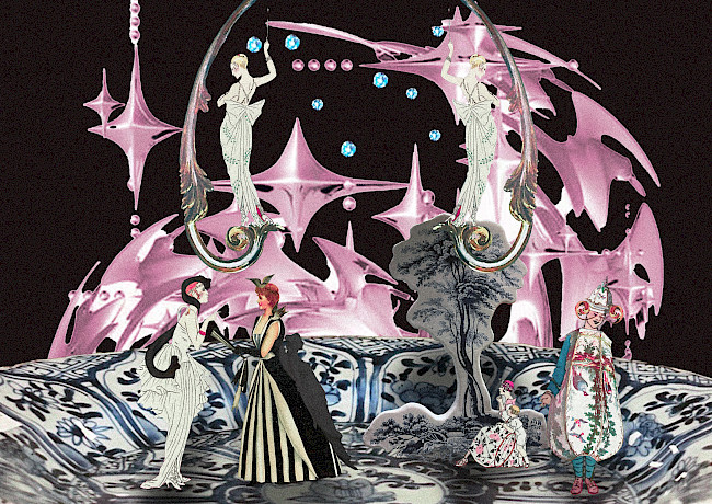
Deception
Arpita Jhajharia
Eve Pemrick
Eve Pemrick
Eve Pemrick
Eve Pemrick
Eve Pemrick
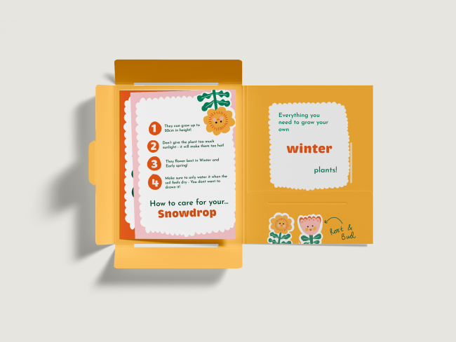
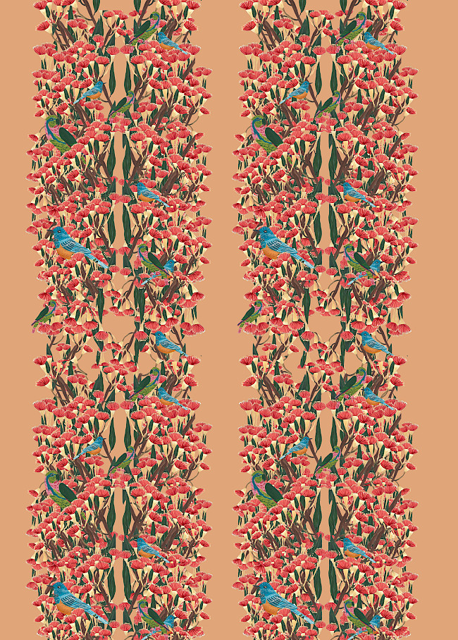
Root & Bud
Holly Yarwood
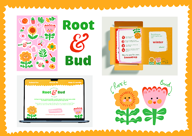
Root & Bud
Holly Yarwood
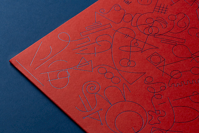
G.F Smith Portal
Connie Wooddisse
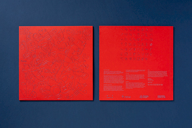
G.F Smith Portal
Connie Wooddisse
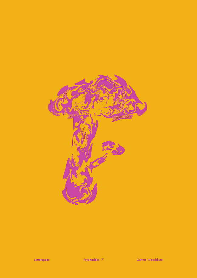
Letterspace
Connie Wooddisse
Life, death, and permanence
Aaron Moss
Hand-drawn illustrations
Aaron Moss
BuzzBlends
Annie Baboumyan
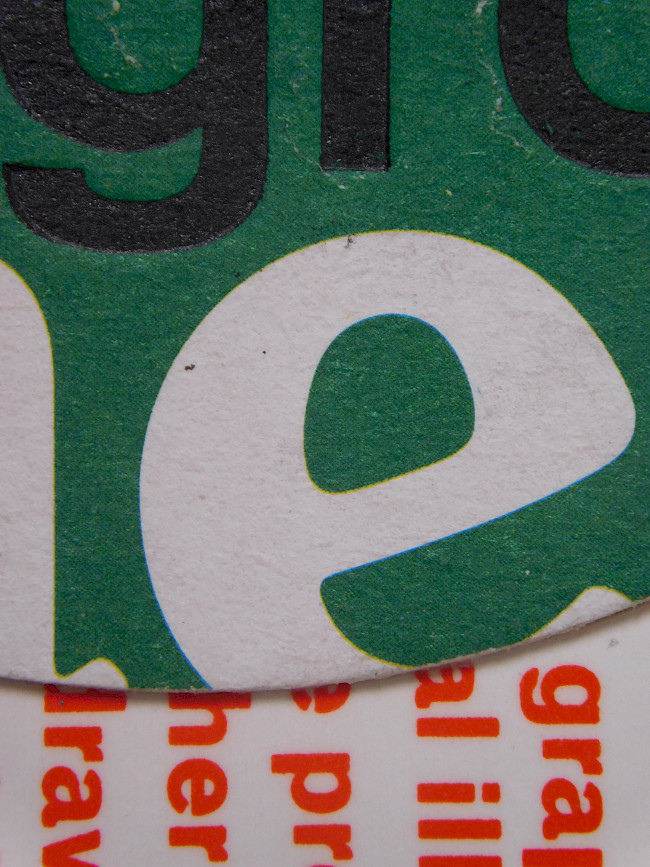
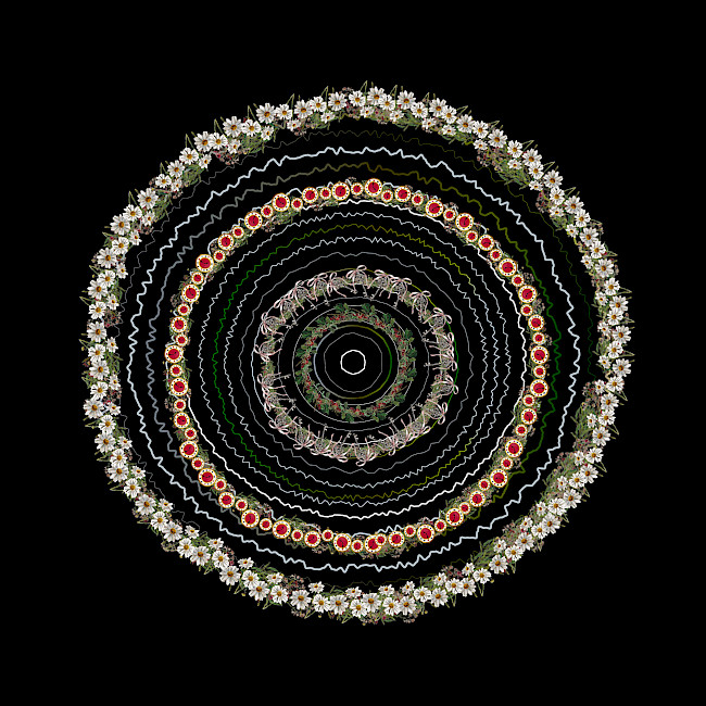
Big e
Hannah Whitworth
G.F Smith Portal
Amber Degirmencioglu
G.F Smith Portal
Amber Degirmencioglu
G.F Smith Portal
Amber Degirmencioglu