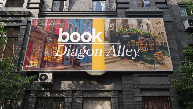
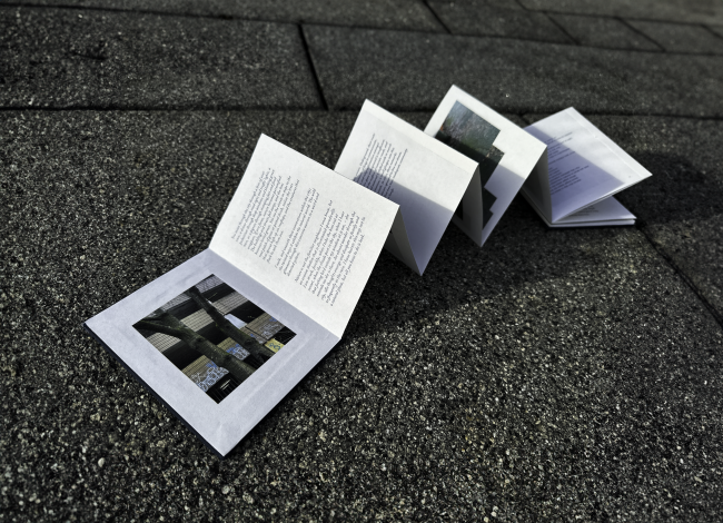
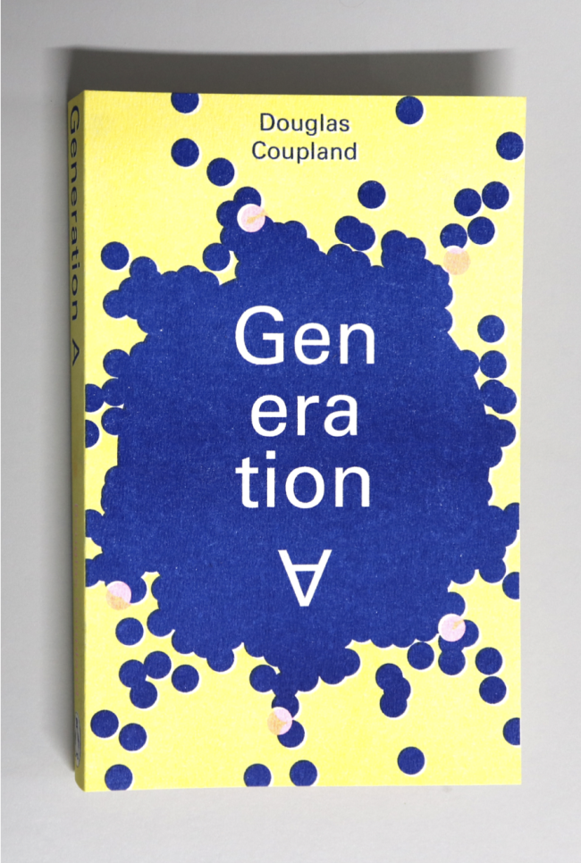
Book it
Dan Hughes
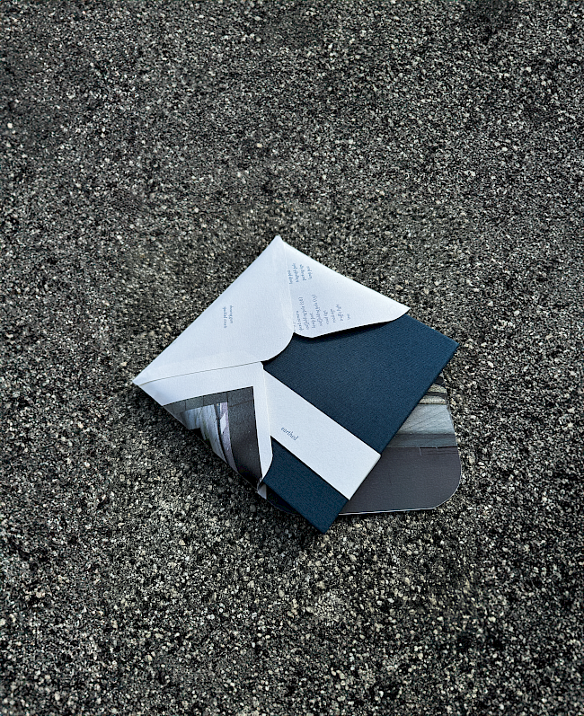
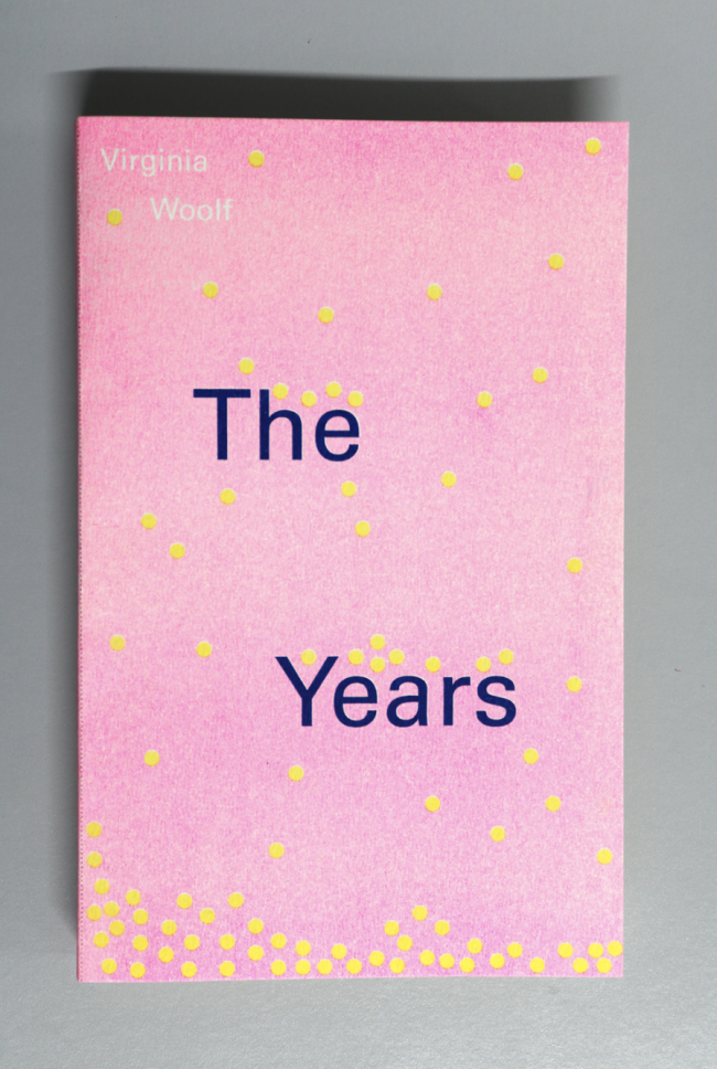
Book it
Dan Hughes
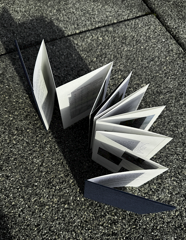
Book it
Dan Hughes

Book it
Dan Hughes
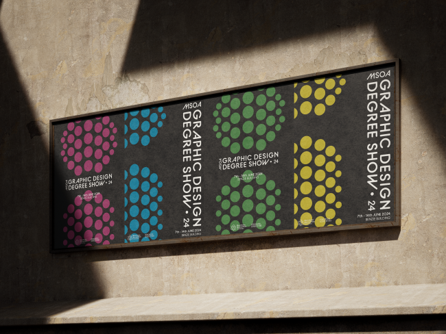
i Degree show branding
Dan Hughes
i Degree show branding
Dan Hughes
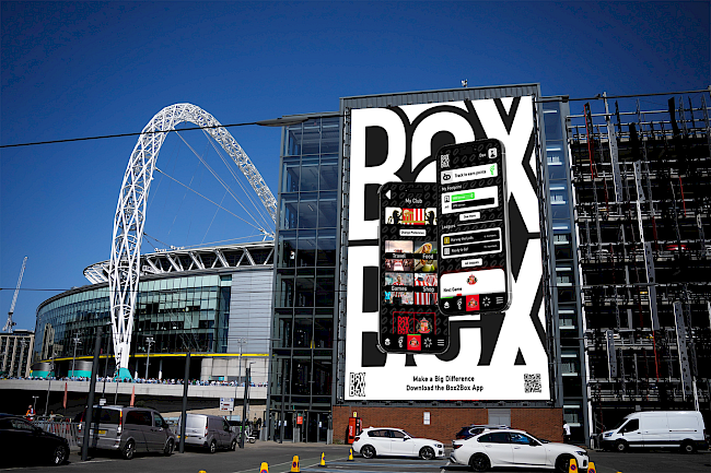
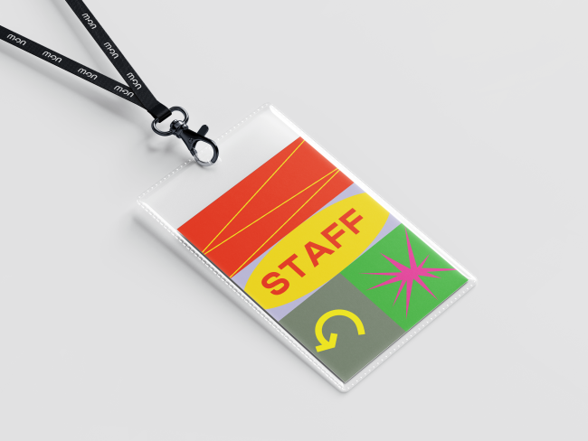
Box2Box
Dan Hughes
Box2Box
Dan Hughes

Box2Box
Dan Hughes
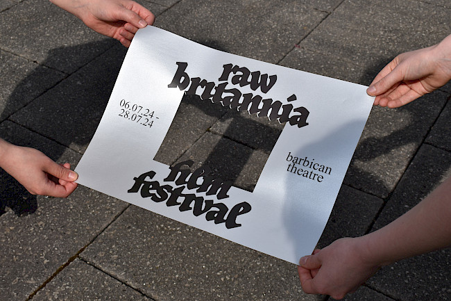
Raw Britannia
Annie Pugsley
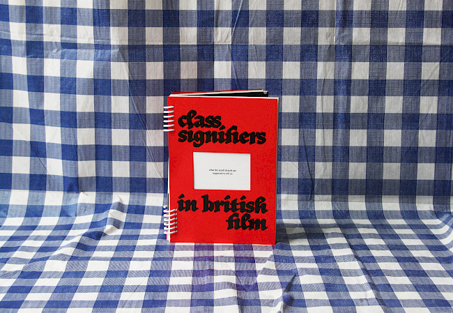
Class Signifiers in British Film
Annie Pugsley
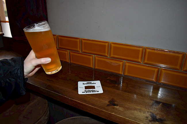
Raw Britannia
Annie Pugsley
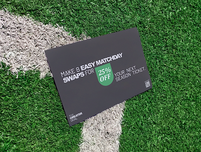
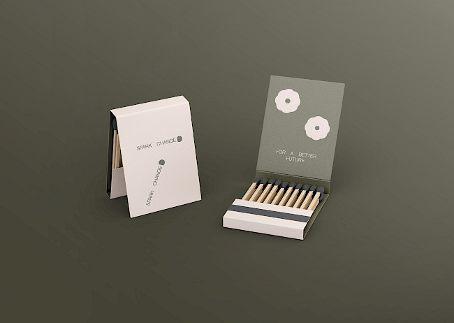
Greater Goal
Annie Pugsley
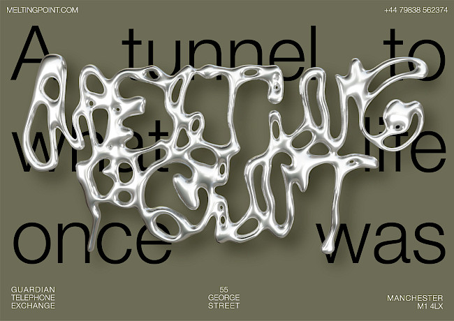
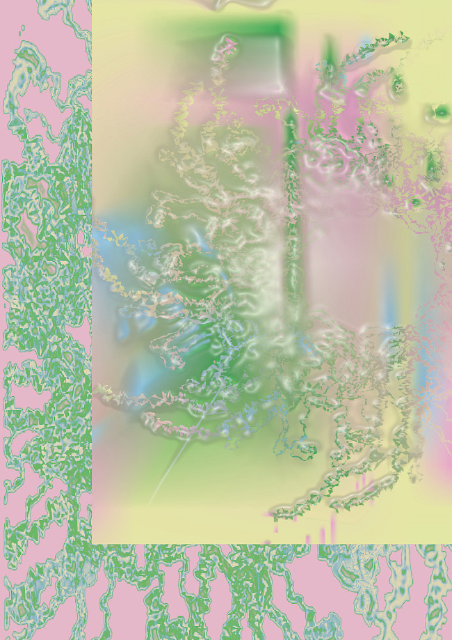
Melting Point
Annie Pugsley
Melting Point
Annie Pugsley

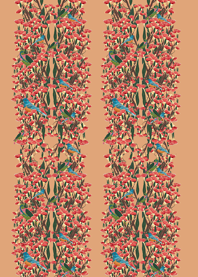
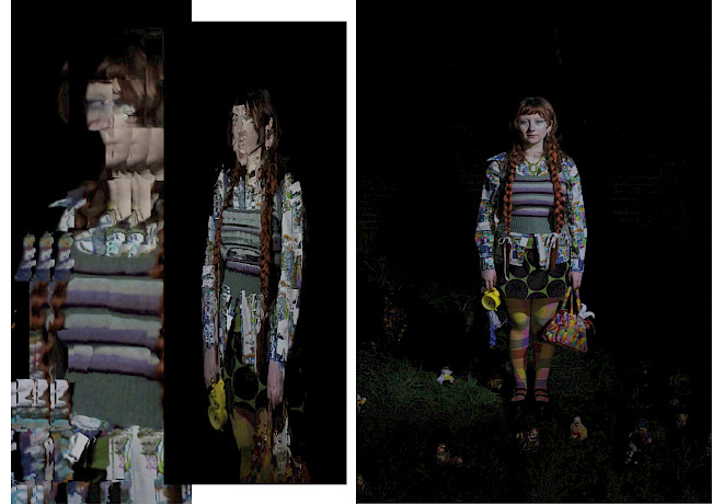
Threaded Together
Annie Pugsley
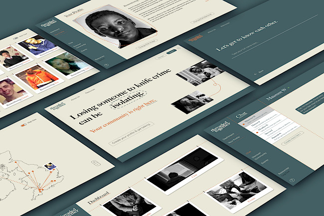
Threaded Together
Annie Pugsley
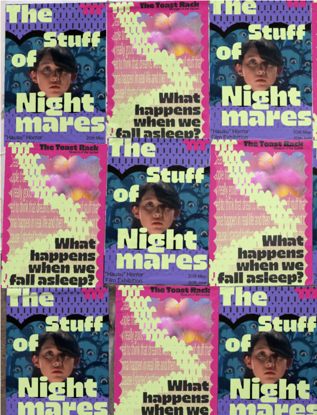
Kitchen Sink film festival
Jamie Gough
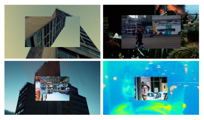
Kitchen Sink film festival
Jamie Gough
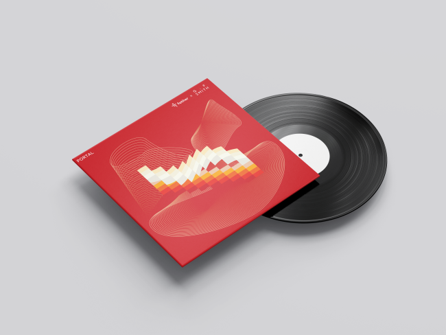
G.F Smith Portal
Jamie Gough
Run Riot
Jamie Gough
Run Riot
Jamie Gough
Nostalgia Museum
Jamie Gough
Nostalgia museum
Jamie Gough
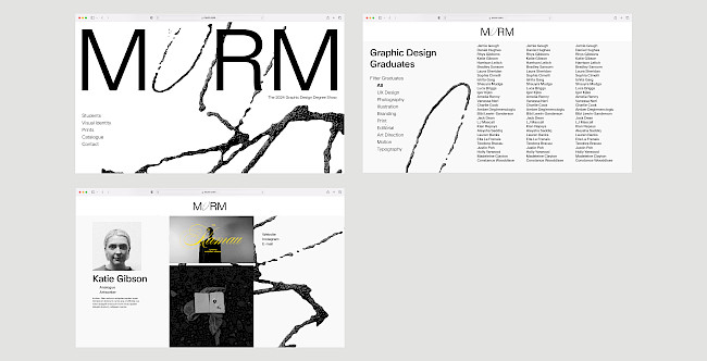
MURM website
Harrison Leitch
Jacquard Exhibition
Harrison Leitch
Jacquard Exhibition
Harrison Leitch
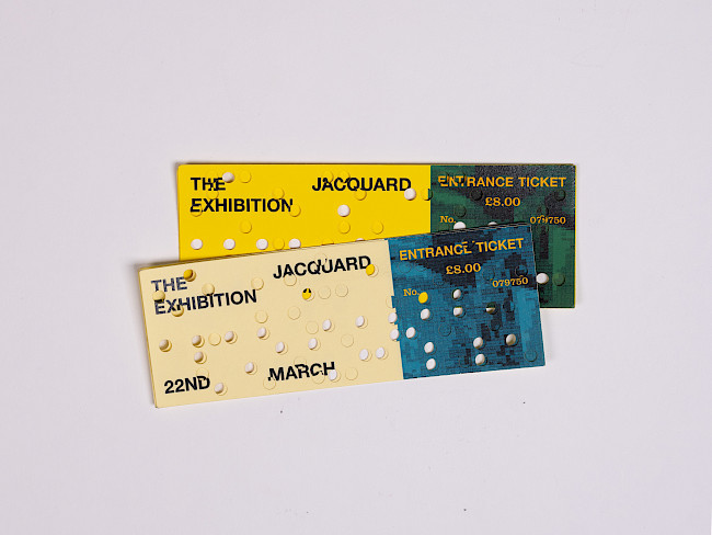
Jacquard Exhibition
Harrison Leitch
1.19:1 Film Festival
Harrison Leitch
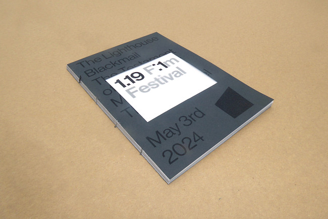
1.19:1 Film Festival
Harrison Leitch
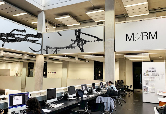
MURM
Harrison Leitch
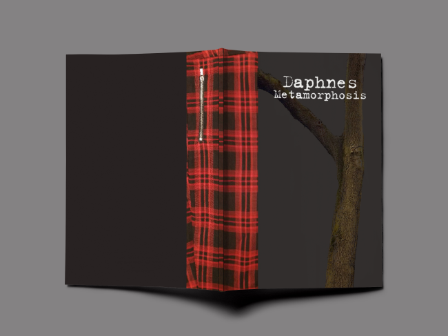
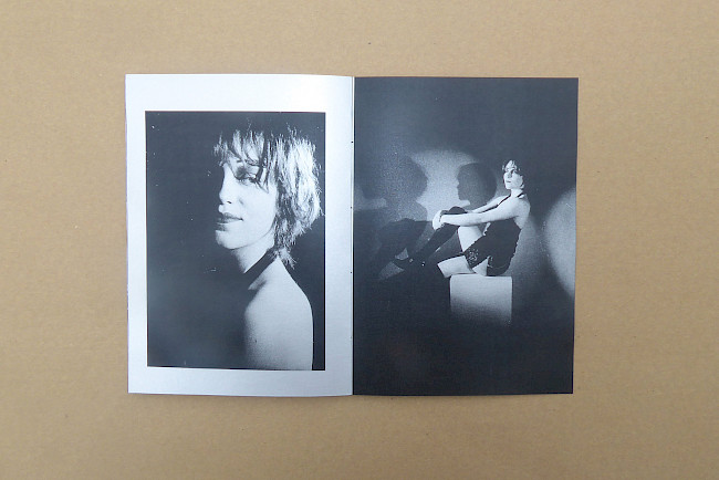
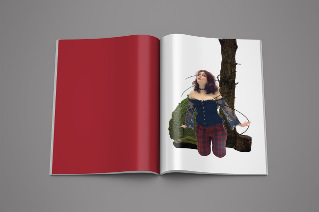
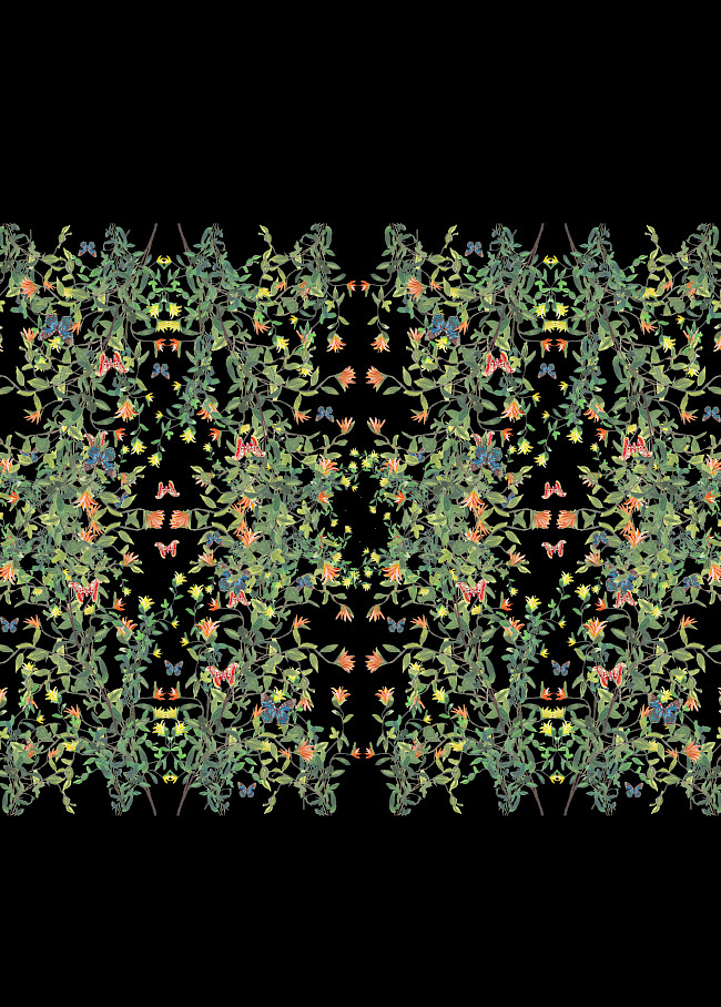
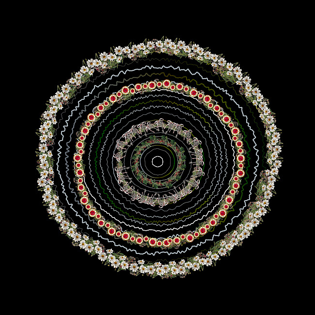
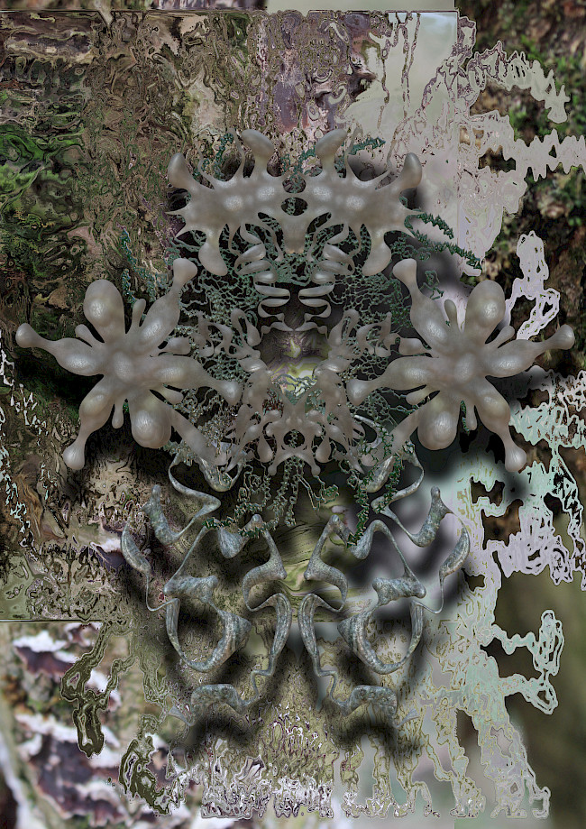
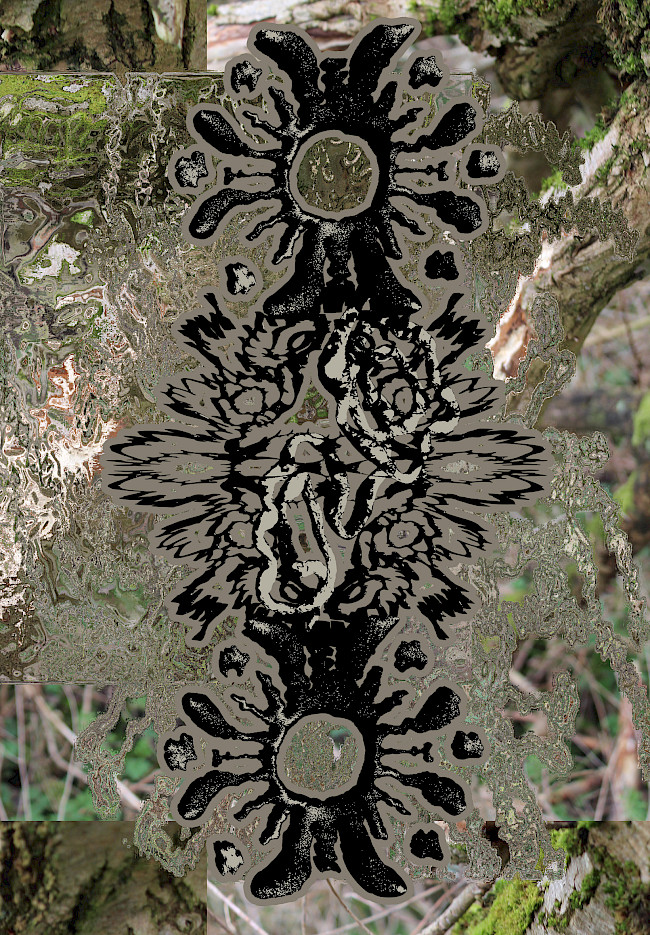
Daphne's Metamorphosis
Tyla Harwood
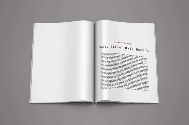
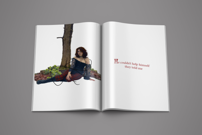
Daphne's Metamorphosis
Tyla Harwood
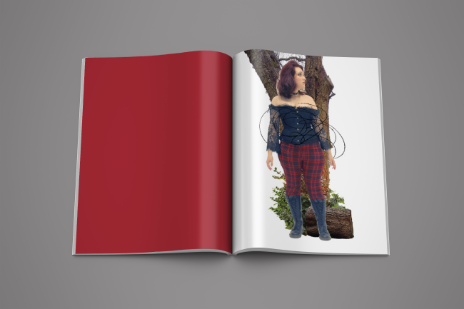
Daphne's Metamorphosis
Tyla Harwood
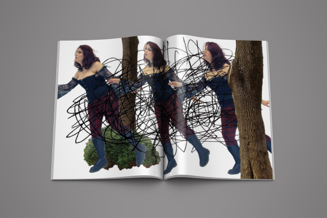
Daphne's Metamorphosis
Tyla Harwood
Daphne's Metamorphosis
Tyla Harwood
Daphne's Metamorphosis
Tyla Harwood
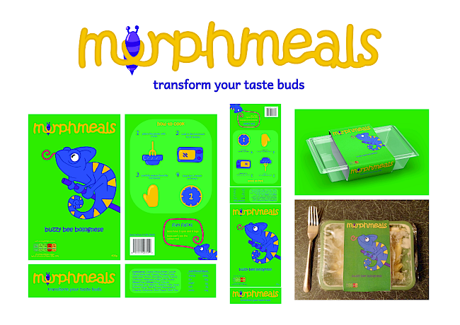
Morphmeals
Tyla Harwood
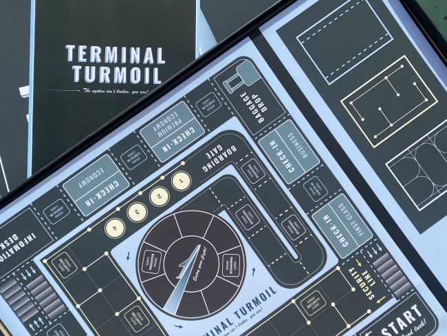
Terminal Turmoil game
Hannah Quine
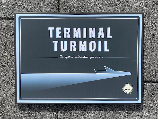
Terminal Turmoil game
Hannah Quine
Quietly Boastful
Hannah Quine
Quietly Boastful
Hannah Quine
Quietly Boastful
Hannah Quine
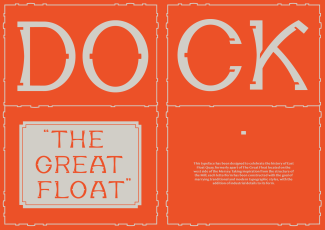
East Float typeface
Hannah Quine
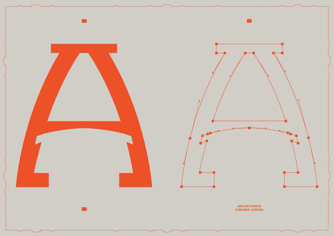
East Float typeface
Hannah Quine
Unearthed
Hannah Whitworth
Unearthed with Dustcover
Hannah Whitworth
Unearthed
Hannah Whitworth
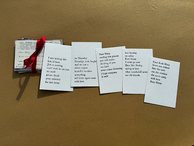
This space may be used for communication
Hannah Whitworth
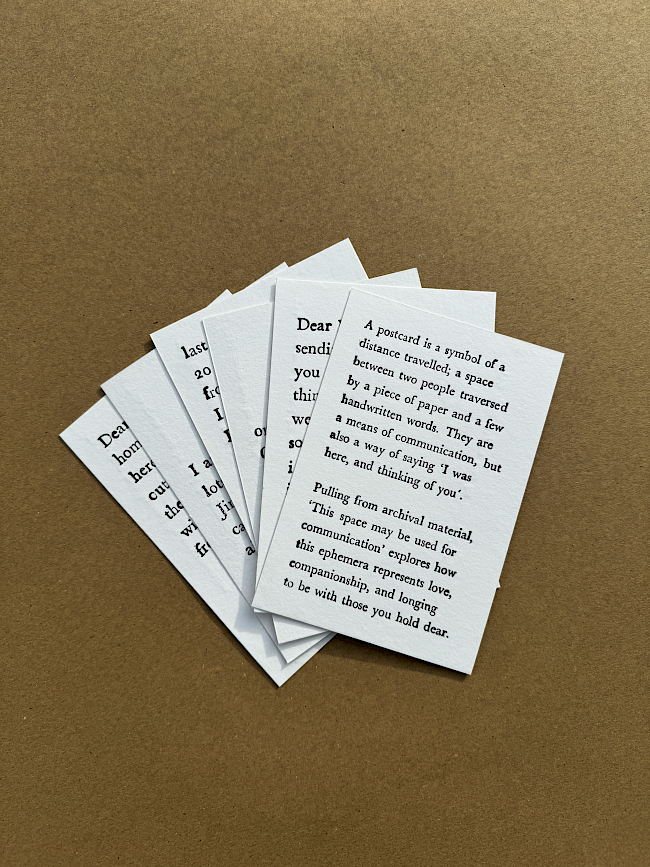
This space may be used for communication
Hannah Whitworth
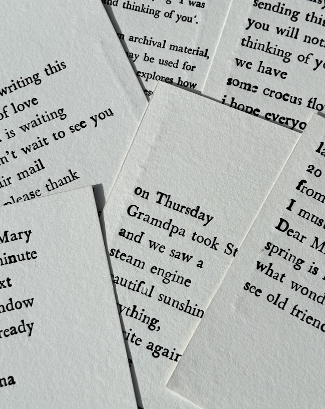
this space may be used for communication
Hannah Whitworth
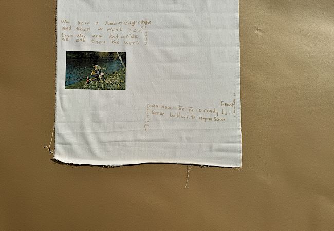
This space may be used for communication
Hannah Whitworth
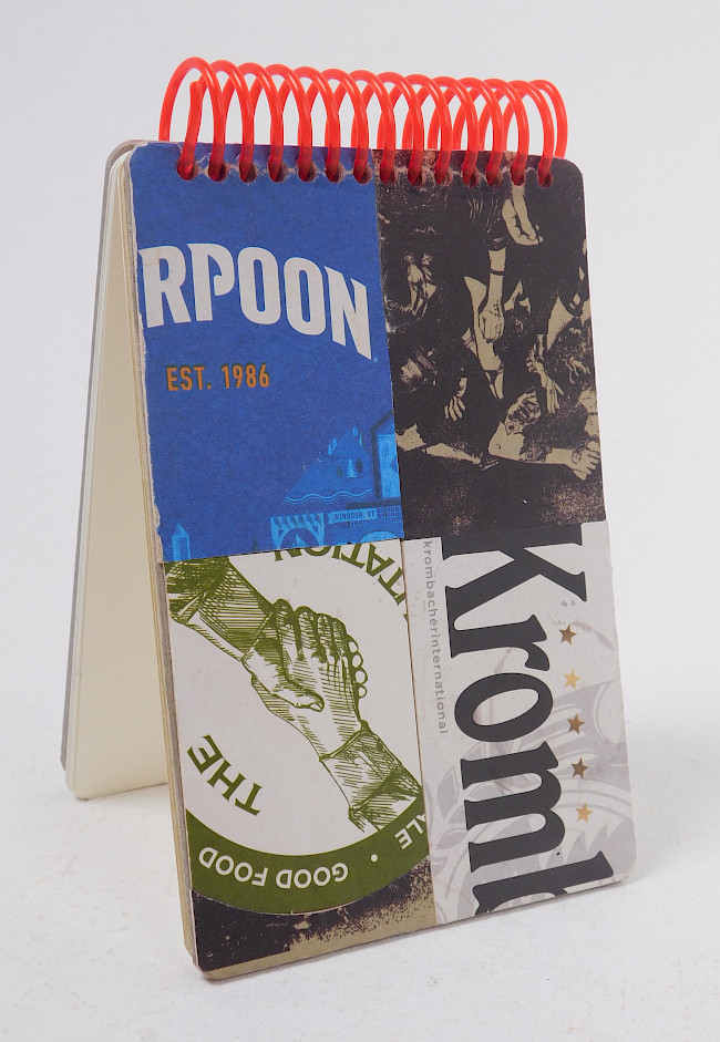
THE RPOONKromb
Hannah Whitworth
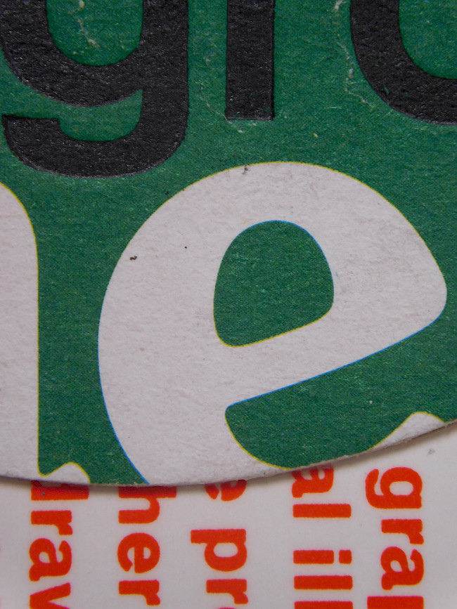
Big e
Hannah Whitworth
Corrupted_and_inaccessible
Tianna Seniunas
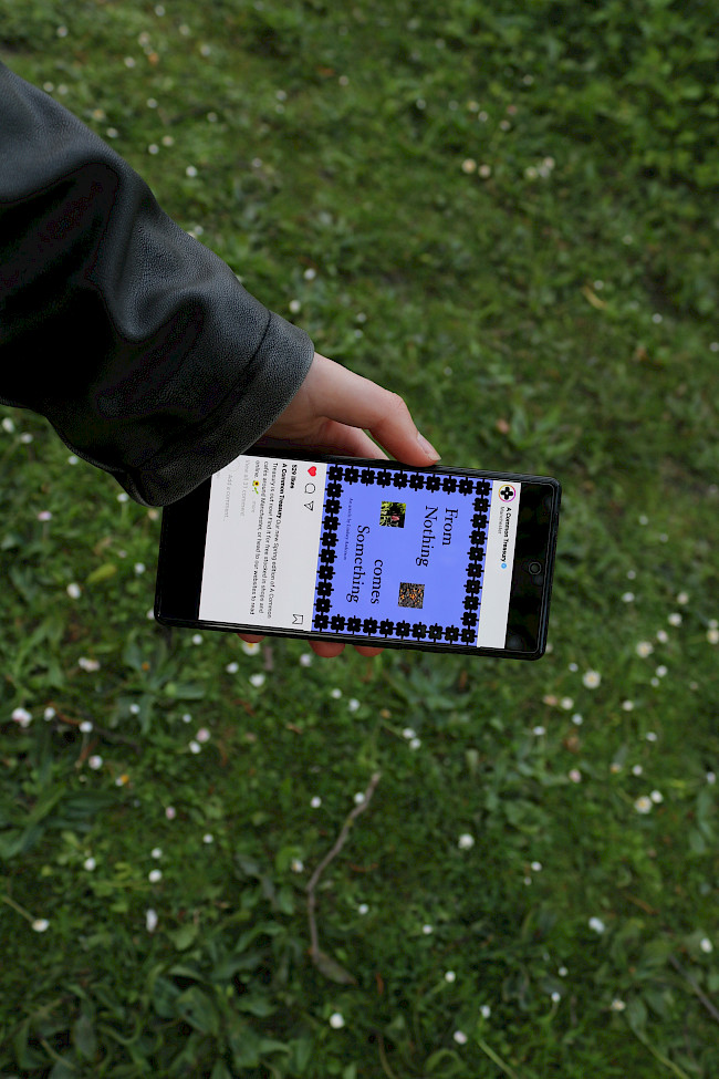
A Common Treasury
Tianna Seniunas
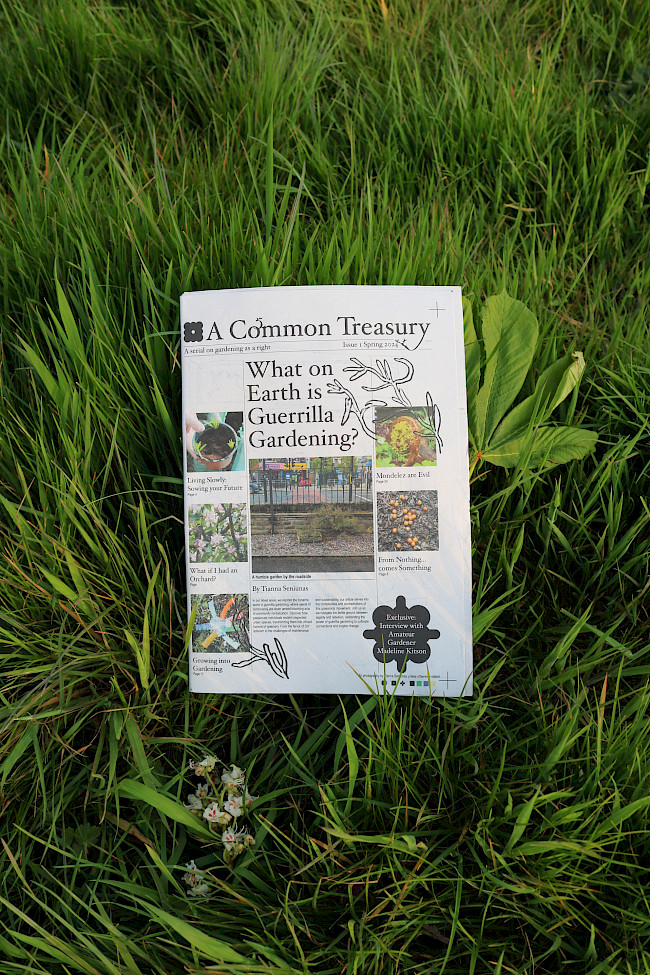
A Common Treasury
Tianna Seniunas
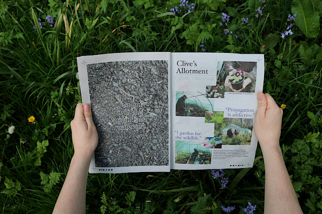
A Common Treasury
Tianna Seniunas
Above Everything
Tianna Seniunas
Above Everything
Tianna Seniunas
Time and Space
Tianna Seniunas
Time and Space
Tianna Seniunas
Time and Space
Tianna Seniunas
Surreal Museum
Tianna Seniunas
Space Separation and play
Aleysha Saddiq
Space Separation and play
Aleysha Saddiq
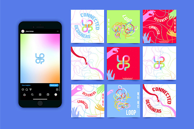
LOOP
Aleysha Saddiq
Reinventing a Classic
Aleysha Saddiq
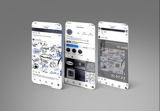
Rushh
Aleysha Saddiq
Please Don't Wake Me
Ruby Porter
Please Don't Wake Me
Ruby Porter
The unnatural world
Ruby Porter
Ruby Porter
When you rub your eyes too hard
Ruby Porter