Ciara Paterson
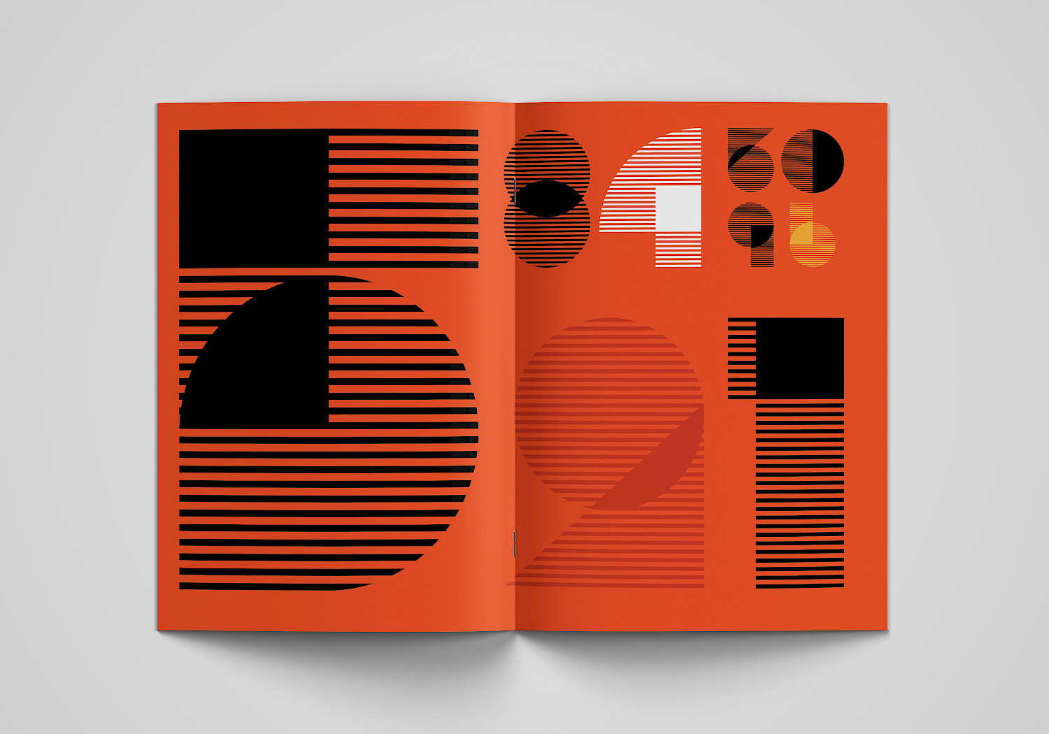
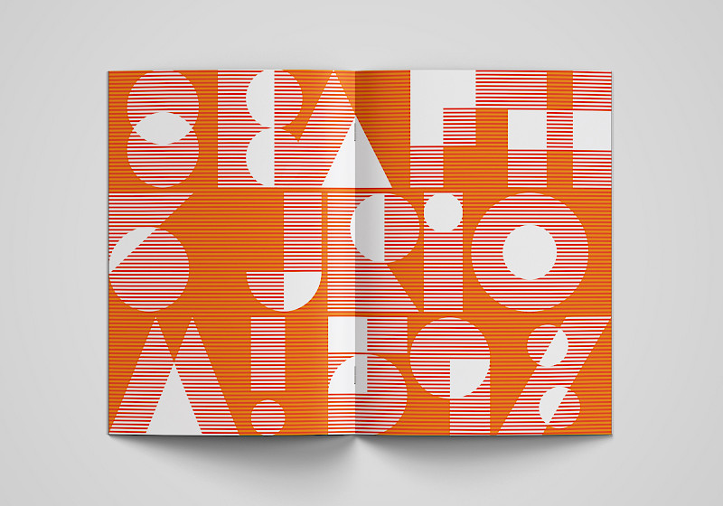
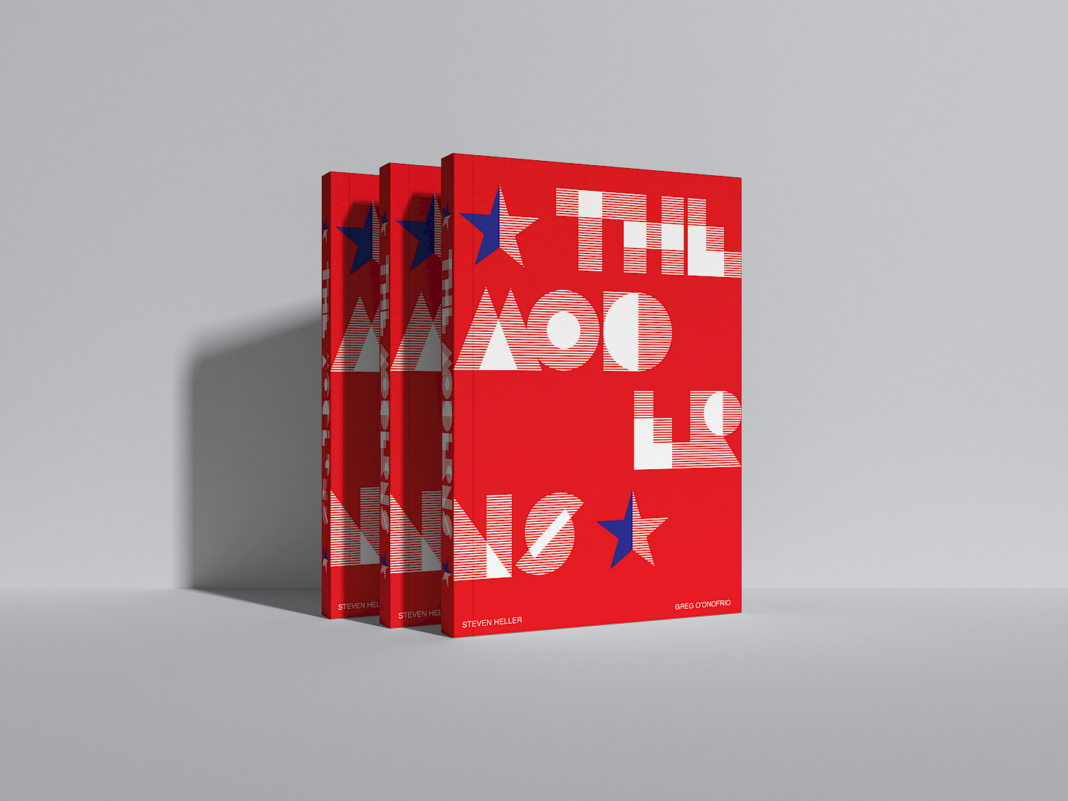
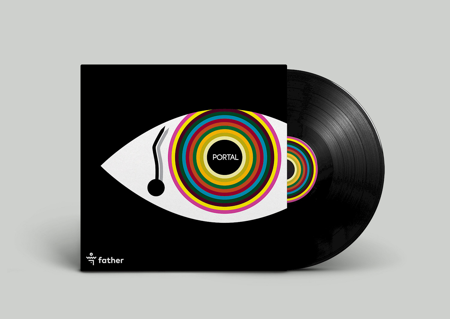
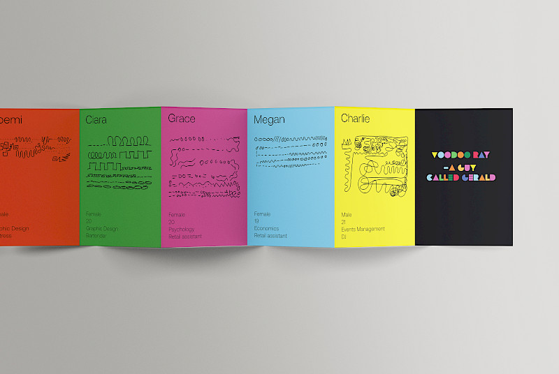
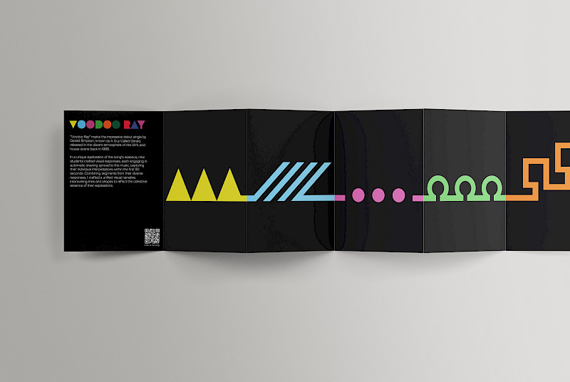
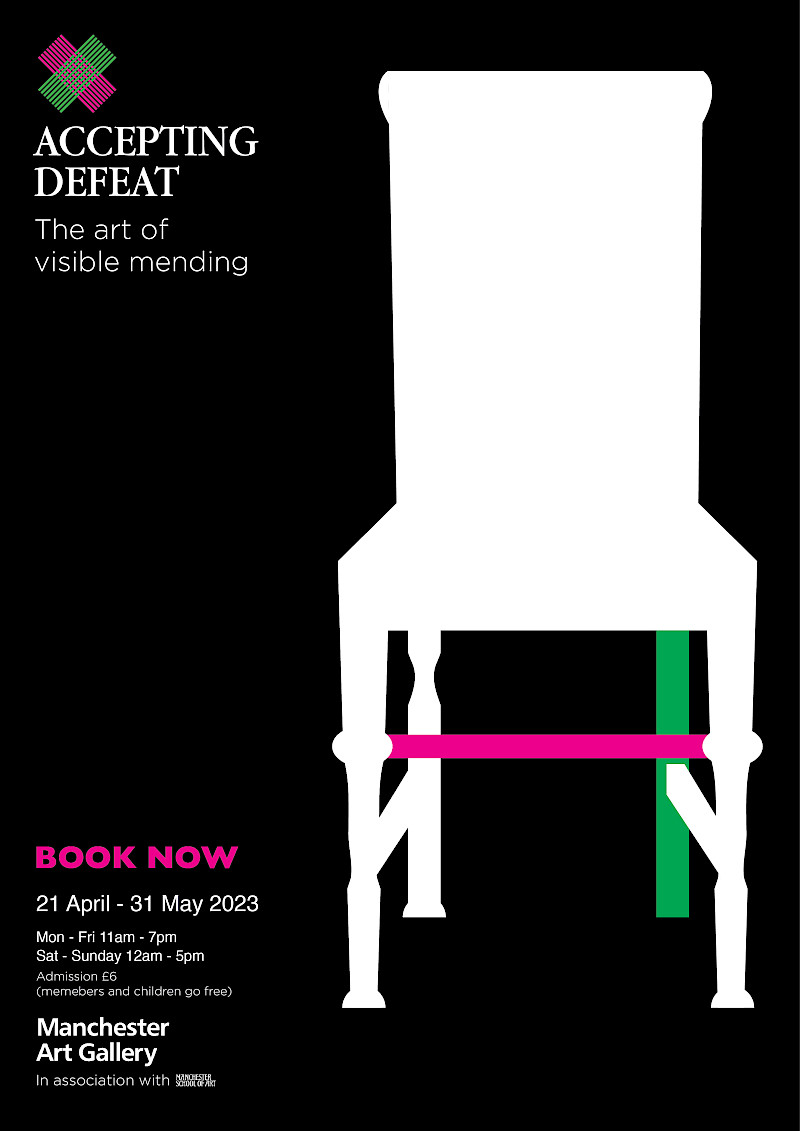
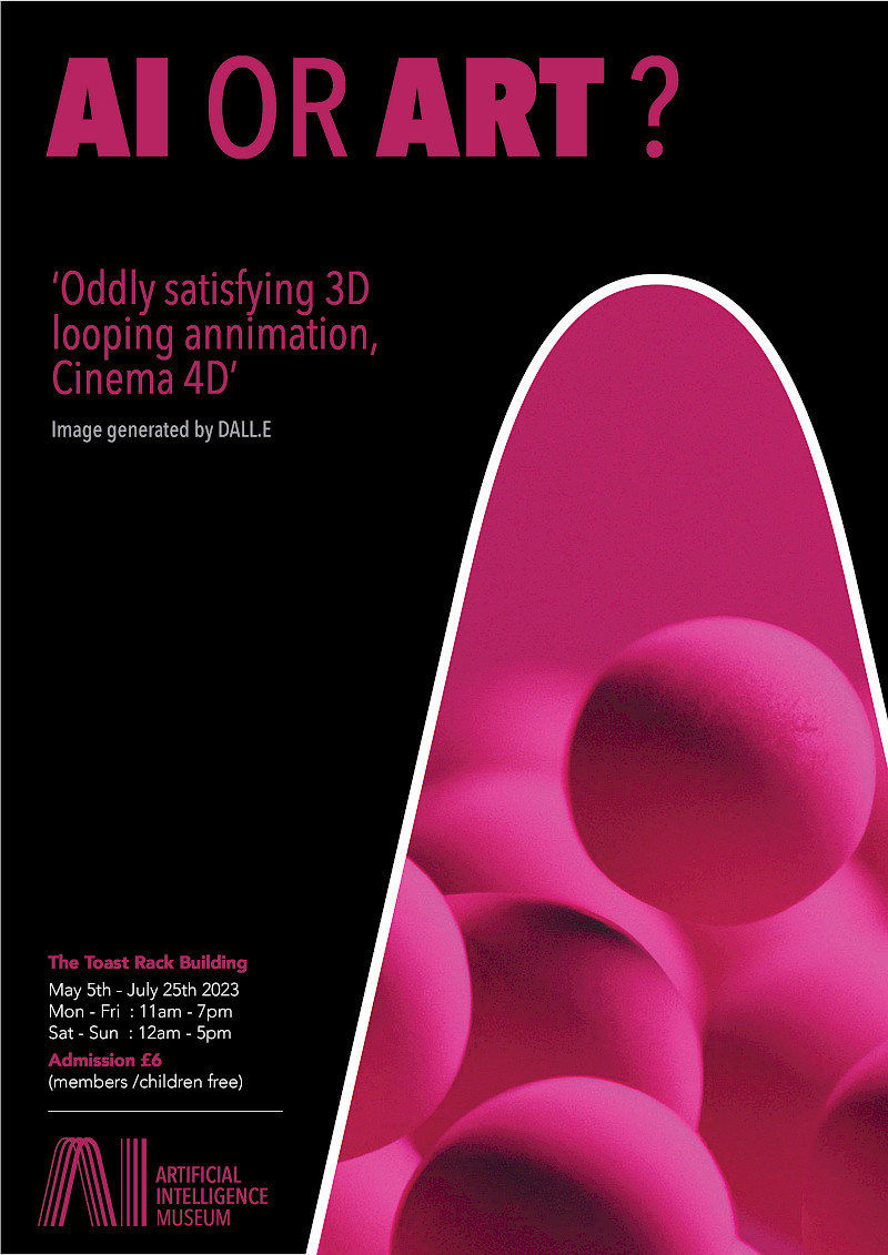
I have been studying at MMU for four years now and it has taught me a lot about myself and design. I find a lot of inspiration in mid-century modern aesthetics and I specialise in vector graphics, I'm captivated by the simplicity and precision they offer. Julian Opie's timeless designs and Yinka Ilori's contemporary flair deeply influence my work. Fascinated by colour, shape, and systems, I strive to create harmonious compositions that blend tradition with innovation. Through my designs, I aim to distil complex ideas into visually compelling forms, bridging the gap between creativity and functionality.
THIS IS THE PLACE
I finally found my style
