Aleysha Saddiq
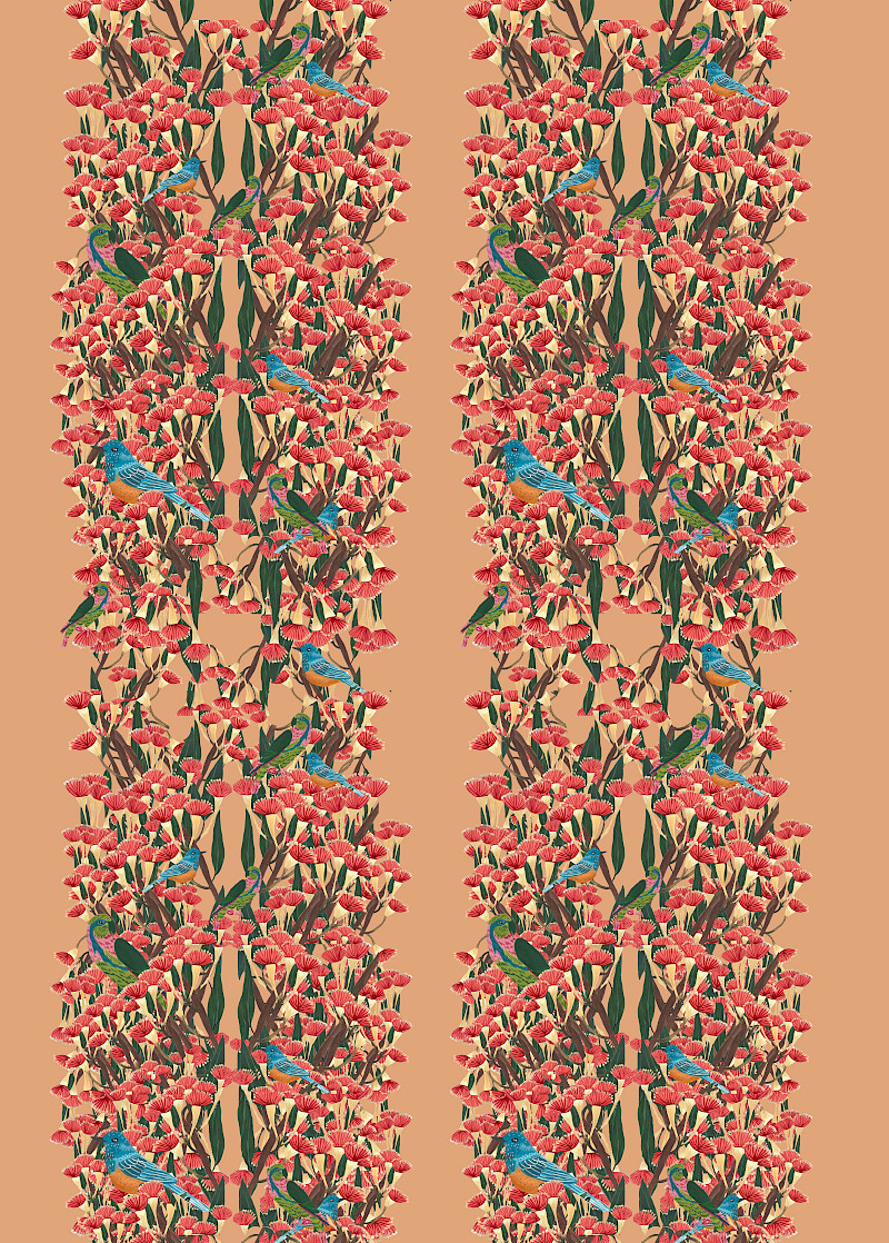
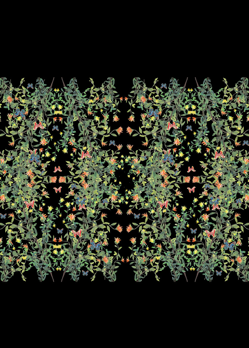
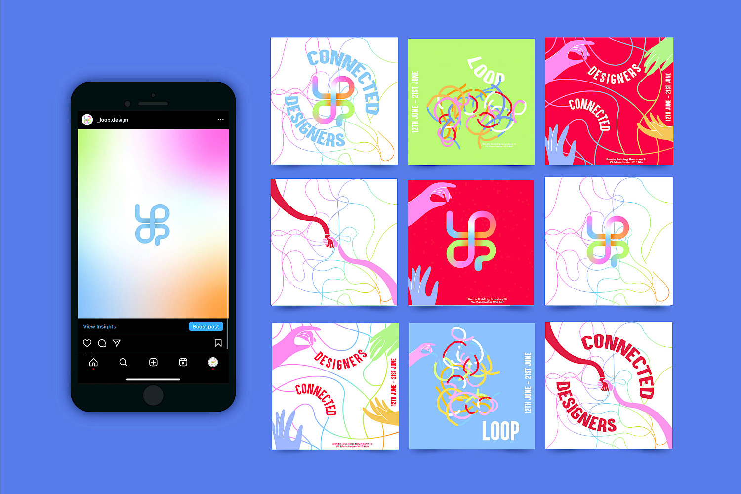
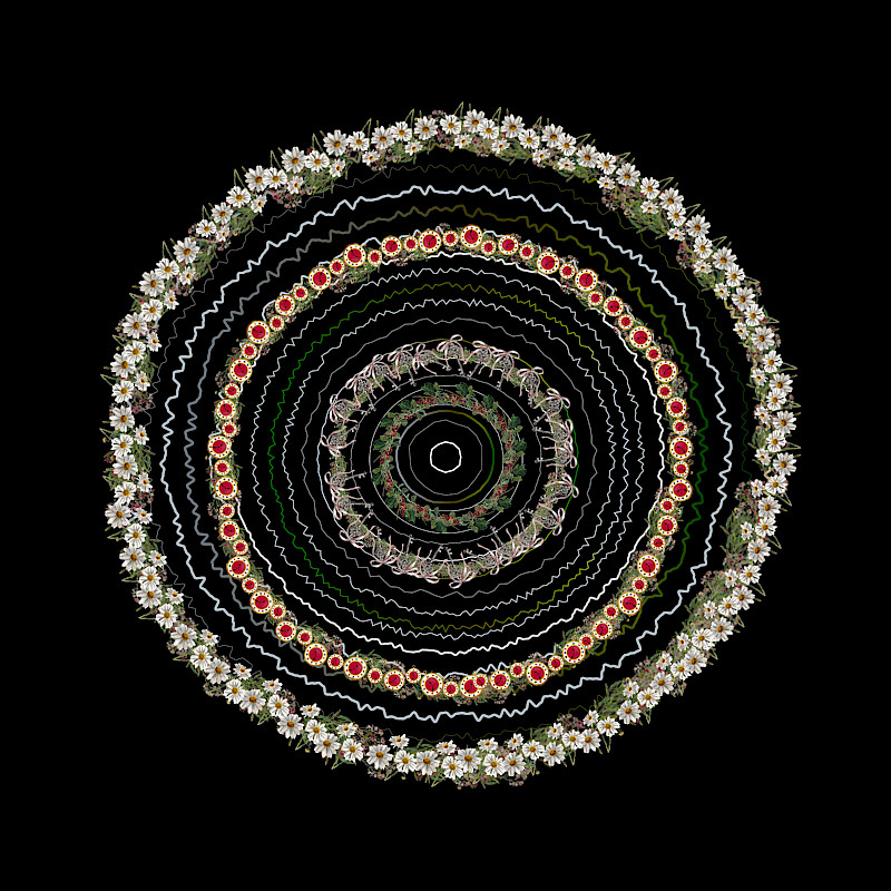
Born and raised in Birmingham, I'm a graphic designer fuelled by a love of illustration and branding. With a passion for fashion and pattern design, I blend creativity and strategic thinking to craft captivating visual narratives. My journey in design started with my love of painting and later sparked into a pursuit of innovation, whether I'm conceptualising sleek logos or breathing life into dynamic brand identities for businesses. I thrive on the aesthetics and functionality of my designs, constantly pushing boundaries to deliver impactful solutions that resonate with audiences. In every project, I strive to create visually striking styles to leave a lasting impression.
THIS IS THE PLACE
I found my style
