Aaron Moss
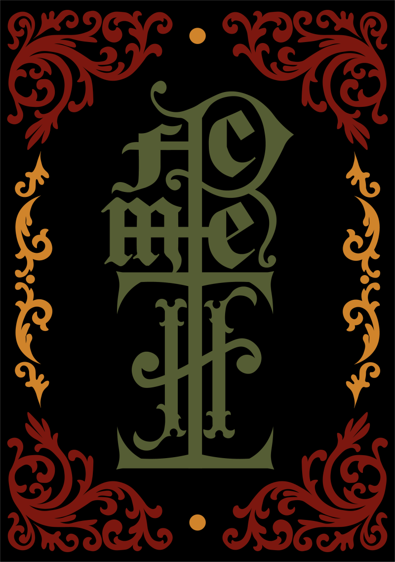
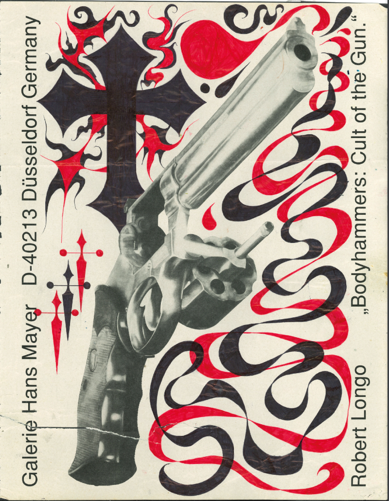
Hey! My name is Aaron, and I’m a multi-media designer from Liverpool who specialises in graphic illustration, typography and art direction. My practice is informed by a range of influences, such as art nouveau style illustrations and deconstructionist typography. I love maximalism, and always like to go big, whether it is small intricate designs that sprawl across or bigger all-encompassing designs that encapsulate the page. My strengths lie in hand-drawing, Adobe software, type design, and photography, which are all mediums where my creative practice thrives. As I graduate, I look forward to seeing what the world of graphic design has to offer me - BRING IT ON!
THIS IS THE PLACE
where the printers are shocking.
